8 essential tools your startup will need in 2020

When it comes to choosing the right tools, it’s important to choose the ones that make sense for your needs and work best for you.

While defining what’s right for you, you must consider cost efficiency, productivity, ROI, and the number of third-party app integrations.

Don’t sweat we’ve saved the labour for you, here is a list of the fastest growing tools to be useful in 2020 for a startup.

1. Take workstream collab to a whole new level

When working with a remote team, calling and emailing each other is not the way to get things done. Infact, relying on platform that keeps all the communication styles together is crucial.

Slack is the most used team conversation tool among smaller and independent users. Around 60% of startups pay for Slack’s workplace communications software. It is popular among group that’s more platform-agnostic, integrating almost 800 apps.

Trusted by: Upwork, Gitlab, Pinterest, Salesforce, and more.

2. They say only the most organized will survive!

Every startup needs a desk manager where you can store all your ideas. Where you can manage broad-range of projects and daily To-dos.

Asana streamlines projects and prevents details from slipping through the cracks. It’s a great tool for start-ups which have several clients and multiple ongoing projects. The tool is popular among small to medium-sized teams because of its easy task workflows.

Trusted by: Airbnb, Dropbox, Khanacademy, Lyft, and more.

3. Ensure your brand reach with social engagement

Your business’ online presence is vital for your marketing and brand image. Using the right social media monitoring and management tools you can enhance customer engagement.

Buffer lets you manage and schedule posts on many social media channels. You can even schedule all your content at once or schedule before days, saving you a lot of time. It’s quite an essential tool for businesses starting with online marketing.

Trusted by: WebFX, AJ&Smart, Huckberry, The Seattle Times, and more.

4. Communication works for those who work at it

If you are just starting, you are not going to have customer service and sales team right from the very start. You need a way to communicate in the most efficient way with the users.

Drift lets you integrate chatbots and real-time conversations on your website. It provides a full suite of tools for live chat, scheduling sales meetings, and more. This marketing and sales platform helps to generate more qualified leads.

Trusted by: MongoDB, HubSpot, TreeRing, Clio, and more.

5. Add real-time feedback in your business decisions

Survey tools help in reaching your goal of offering best product to your customer. As customer feedback helps from validating your MVP to choosing ideal marketing strategy.

SurveyGizmo is an online survey platform for small businesses or intermediate users. It conducts and creates questionnaires, quizzes, polls, and surveys. This tool can also get integrated into other digital, and social media platforms.

Trusted by: Adobe, Verizon, Sonos, The Home Depot, and more.

6. Solve user problems with intuitive designs

Screen has become the most important place in the world. People look at screens so much so that they’ve developed a critical eye for designs. It’s now more important than ever to adopt tools for design management, prototyping, design, and ideation.

Figma is a design tool for complex prototyping, wireframing and UX design. It is ahead of Sketch and InVision in areas of learning curve, design layout, app speed, and interface. It has also outranked Adobe XD in connecting processes of prototyping, and design.

Trusted by: Zoom, Uber, Berkley, Dribbble, and more.

7. Change the way your development team creates software

Changing your development workflow again and again is not a good idea for your business. Especially if your company relies on its software for mission-critical applications. That’s where you need a distributed version control system.

Git is a favorite among millions of developers and open source contributors. You can build software, manage projects, host and review code. Git is a frontrunner among Bitbucket, Microsoft TFS, Glitlab and more.

Trusted by: Netflix, Reddit, Lyft, Shopify, and more.

8. Enhance performance with loaded security and testing

Manual testing is slow and error-prone. This is where test automation tools shine. These are best poised to take advantage of the latest automation trends like ML as well.

Ranorex Studio has a comprehensive set of features for web, mobile, desktop, and API testing. It also provides all in one test automation across devices, platforms, and technologies. It integrates with tools like Travis CI, Git, TestRail, Jenkins, Jira, and more.

Trusted by: Varigence, Sage, Cisco, Fujitsu, and more.

Software industry is very dynamic, hundreds of tools are released on a daily and they disappear just as fast. For the very reason choosing a reliable and promising solution can go a long way in ensuring your business’ stability.

We have an end-to-end experience of working with organizations big and small. If you need design or development related assistance, we’re always happy to help.


7 actionable tips for being a great programmer

What makes a great programmer?

If you’ve spent a significant time speaking in between curly braces then you must know that it’s not just about shipping code that works. You need to be able to write code that’s easy to read and refactor. Soft skills are also crucial to understand requirements and communicate the same with your teammates, so that nothing gets lost in translation.

Here are 7 similar tips to help you through the process of becoming a pro

A woman working on a computer

1) Use pragmatic comments and consistent naming convention

Programming is like any other language and if you really know how to speak or write programming then developers after you won’t have to struggle to crack naming conventions or comments on your code.

Comments on code are generally a bad practice because it means that the code’s not good enough. If it needs additional explanation, then it can be written in a better way. You know it’s a bad code when you see unnecessary and repetitive comments or commented codes.

Programs must be written for people to read, and only incidentally for machines to execute –Harold Abelson

It’s not that all comments are bad. In some situations comments can be really helpful, like warning comments or reminder comments.

It is always advised to name packages, classes, variables, and functions consistently to make code easy for the next developer to work with. You can use your naming conventions for dynamically and statistically typed languages. It will enhance the readability of code.

2) Test and debug your code smartly

We all make mistakes at some point while developing software. It is a part of any process. No one gets it right in the first attempt.

Fix the cause, not the symptom- Steve Maguire

Identify hidden flaws through implementation and final module testing in different stages of development cycle. These include requirement analysis, designing, development, implementation and integration stages.

IDEs like Eclipse, NetBeans or IntelliJ IDEA works best these days for writing test programs, testing, and debugging code.

3) Keep it healthy

Old functions and replaceable variables can add to the dead code tally. To get rid of such code, delete old function or a class from the location completely otherwise it will get compiled during the run of the project.

Of course bad code can be cleaned up. But it’s very expensive – Robert C. Martin

Besides, timely removal of unnecessary code can reduce your code size by 30% to 40%.

Use Codepro Analytix, Cobertura, Sonar, and other such tools to improve the quality of your code.

4) Choose tech for longevity

Selecting tech based on immediate requirements may prove to be detrimental in the long run. When investing in new technology and tools, make sure that it aligns with your future goals and requirements.

We always look for everything in the immediate proximity, that is a mistake – Thomas Bernhard Ghen

For example, VBA, Delphi and Perl were once popular. But they are obsolete now. Developers either use top tier languages like Java and Python or second-tier languages like Scala and Swift to build contemporary programs and applications. There is also a third tier of programming languages like Rust and Crystal that you can use for learning and experimentation.

5) Master soft skills

When working in teams, understanding your fellow programmer needs and in turn making them understand your needs requires effective communication skills.

Soft skills get little respect but they will make or break your career – Peggy Klaus

Encouraging interactions within the team can also help in building your own discussion forum. Create a learning environment within the team by developing curiosity and adaptable approach.

6) Under-promise and over-deliver

You need to be realistic when setting project deadlines. Keeping a buffer of a few extra days in your project timeline can be helpful for any unexpected delays.

Make it work, make it right, make it fast- Kent Beck

And in case everything goes smoothly, kudos to you for completing the project before the set dates.

7) Focus on solving a real-world problem

Research on real world problems and try finding the solutions for them. This will help in building your programming skills. Besides it provides a sense of purpose, especially when you’re trying to adopt a new skill. It’s easy to get distracted and lose the motivation when you’re faced with complex problems.

First solve the problem then write the code – John Johnson

You also need to develop creative outlook and problem solving skills to solve problems that are too complex for conventional approaches. Simply learning a programming language won’t help until you focus on solving real-world problems.

Bonus tip: Practice…practice..and more practice.

With these tips integrated in your process and enough practice, you’ll be on your way to greatness. Just as this guy..

Simply put, there’s a lot to gain and little to lose while taking the time to really understand the core concepts. Keeping in mind it requires a deliberate practice to improve your work and build credibility with others.

Why it’s a bad idea to ignore older adults from your app demographics

Modern technology has two problems: Devices have too many integrated features and everything is smaller.

A good implementation of more-than-what’s-necessary features can give some users an all-in-one experience. While a bad implementation can make it a nightmare to use for an often ignored demographic which is older adults.

Who exactly are these older adults:
Older adults are users aged 50 years and above. The learning curve isn’t that smooth for this demographic as compared to millennials or Gen Z.

UI that has too much going on with it often confuses older adults and they tend to blame themselves for not being able to use technology rather than the design.

But, one can’t put their lives on hold just because of their age. It’s simply a question of need. If they can go to YouTube and learn how to make a cake then they can also learn how to get a cab with Uber.

Infact, generational stereotypes are getting out of the way while building app interfaces for this demographic. As this cohort is not so far behind when it comes to using Facebook, Uber, WhatsApp or YouTube.

Myth #1 Targeting old users deemed as being the last Internet frontier

Video of Snapchat dog filter

Attracting older adults as part of the user-base was considered to be a niche market. Maybe ageing adults aren’t the target of Silicon Valley’s latest service or dating apps but startups believe there is value in addressing the elderly’s needs.

San Francisco-based company Honor (custom home care for seniors) has recently closed a Series C round. It has raised a total of $115 million in funding in just four years.

Myth #2 Elderly do not want to use modern technology at all

It’s not like they don’t understand technology and associated benefits. They want to use the tech but it’s targeted towards and tailored for younger audience. Besides older people are the ones who face trouble getting in a car and driving to get groceries or medical supplies. They need these apps as much as any other group of people.

Martin Gerstell, 94, volunteered at the National Gallery in Washington last month, used the Uber app his granddaughter installed on his iPhone.

Why should older adults matter to designers?

Man on a DJ console

From getting into the swing of mobile phones and computers to watching monologues of the late night show on YouTube or owning a fitness tracker, for decades people aged 50+ have used digital technology in one way or another.

  • Almost 70% of old people all over the world today have some sort of internet exposure on a daily basis.
  • According to the census report, by 2030, about 20% of the U.S. will be old.

The number of older netizens using smartphones is significantly more than ever but contemporary digital products continue to ignore and fail this demographic.

As Don Norman observed, bad design abounds, in both digital and physical products. Current interaction designs often feature startling sounds, tiny targets, illegible text, and other features that make the online world unfriendly to older users.

Good design for older adults is often recognized as good design for everyone

It’s worth giving a thought that when you’re designing for maximum accessibility you’re automatically designing something that is engaging and easier to use. Design guidelines below are consistent with the principles of Universal Design in most of the big enterprises.

  • Distinguish the primary buttons from their surrounding UI elements by proper pairing of color, contrast, layering, shadow and highlights.
  • A simple navigation is essential to allow users to easily and quickly get from point A to point B. Flexible patterns like grids, minimizing sublevel, keeping menus in a single function, etc. are among today’s best navigation practices.
  • Button and text sizes should be kept scaled up. Like keeping icons labeled with bigger text whenever possible or preferring Sans serif typefaces for on-screen readability.

Feeling bogged down while designing an ideal interface for this ‘optimistic’ crowd? Start a project with us for creating an inclusive experience that’s unique and accessible at the same time.

iOS 13 design | What’s changed and what remains?

Ever wondered why Apple allows only selected employees in its Industrial Design Studio?

Surprisingly, it’s a part of their design concept and not a security concern.

Apple isolates their industrial design team to allow them to indulge in deep work. It lets them make cutting edge design decisions without having to worry about the practical and limiting aspects of its implementation.

Such creative isolation is one of the reasons behind Apple’s incredible products. Products that are amazing to look at and are effortless to interact with.

Apple then unveils these ingenious products in their annual events. This year’s launch events also followed through with new iPhone 11 series donning a double and a triple camera setup, Apple TV+, Apple Arcade, a dedicated OS for iPad, multi-core ultra-spec Macs for professionals, and UI upgrades for the new generation of Apple devices.

But it was the design announcements that caught our ‘viewport’.

iOS 13 has been in the developer’s beta since the announcement at WWDC 2019. Here are a few notable UI/UX designs from the beta that made it to the end users.

New Default Modal Presentation style

Screenshot of iOS UI
Image source: Applypixels.com

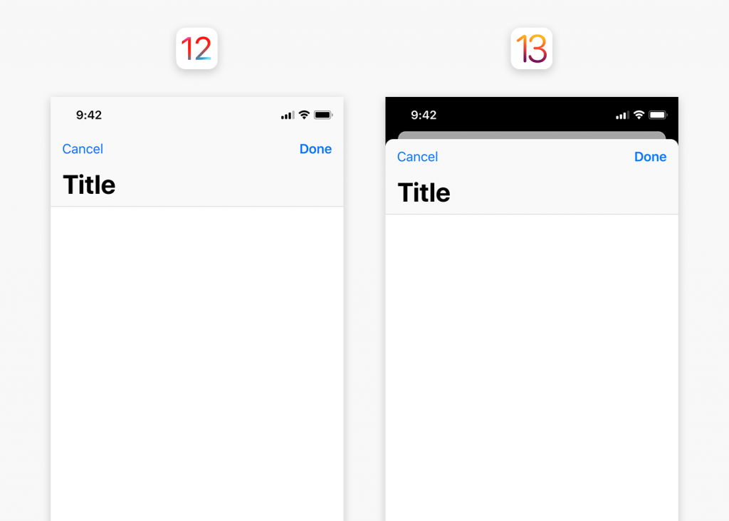
It’s been almost two years since iOS interface ditched capacitive buttons for swipes and gestures. The new ecosystem relies on card style modal sheets which lets the user dismiss or present recent screens with swipes only. Modal presentation style is now default due to which view controllers appear as a form sheet overlaid one over another and not in full screens.

This card-like appearance allows users to dismiss screens interactively with a downward swipe. And the layered design provides users a sense of context about where they are in the application.

Modals are really convenient but they’re not fit for the apps that has scrolling, pinching, or swiping as their fundamental interaction. Photo editing and reading apps for example.

Revised System-Wide Gestures

iOS 13 gestures

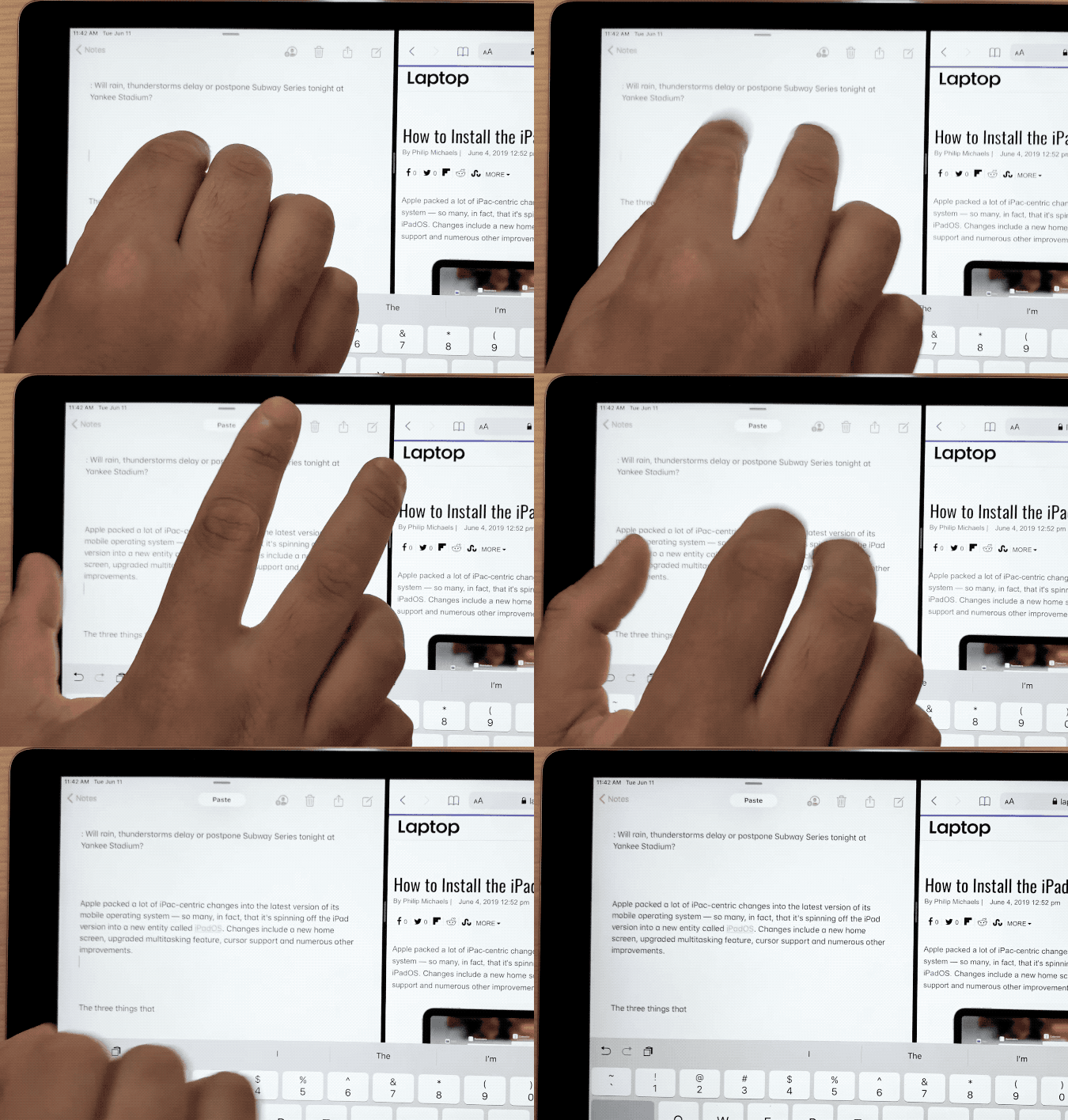
Selection gestures in custom text views:

Thanks to the new text editing gestures! There will be no need to shake the entire device to undo a text (only if someone even bothered to do that).

  • One can simply tap to select, pinch in and pinch out to copy-paste with three-fingers.
  • One can also undo-redo by swiping left and right with three fingers.

In addition to that, it will allow users to quickly manage their text editing on either of the devices i.e. iPhone or iPad, without using formatting shortcut bars.

Multiple selection gestures in tables and collection:

Apple has introduced a new way of quickly selecting contiguous batch of items in table and collection views. By simply dragging two fingers on a list or collection of items to draw a selection.

It’s important for easy and seamless user experience to add gestures when left with very little space on screen. It will immensely help designers overcome space-based challenges.

However in hindsight, so many gestures may leave users overwhelmed before they get used to it.

Dear Apple, it’d be great if you did something about…

Monochrome photo of Apple logo in a dim lit office

  • Incoming Phone Call UI
    It’s something that iPhone users want Apple to learn from Android. Why a full-screen app jump? It covers the whole screen, pushing back the application you are using. This call UI needs a refresh, and like android can show a banner up in the top that allows users to dismiss the call or let it ring in the background and be done with it.
  • Swiping App Switcher
    Since iPhone X Series’ redesign, users have been reporting the inability of swiping away all the apps in the app switcher in one go. Surprisingly, it’s still there in iOS 13. Apple is not fixing this problem because clearing recent apps in the App Switcher doesn’t improve battery life or device’s performance, as all the apps are in suspended state.However, removing all of the recent apps from the app switcher only has aesthetic value where the user wants to be able to scan the app switcher quickly for their most used apps. But taking away the option to swipe away the mess is a bad design choice. It’s up to the user if they prefer a clean and efficient experience or a cluttered one.
  • Camera App Settings
    There are tons of improvements in iOS13 camera and photos application, but it still doesn’t allow to change video recording resolution within camera app itself. For that, users are supposed to go all the way into Device’s Main Settings > Camera. Whereas the interaction is only worth a button and two taps in the app.

Similarly, there are few other features that are buried in the iPhone Settings that are meant to be in the app in the first place.

Wrapping up

Contrary to popular belief the design is not always about what a user wants. Most of the times it’s about utilization of the new tech-laden devices. It might mean some compromises here and there but at the end of the day it’s for the software stability.

Maybe Apple keeps things the way they were built, because they know better. But Apple, if you’re listening at least change the in-your-face call notifier screen.

5 mistakes to avoid while designing tooltips

Tooltip is a great UI pattern for user onboarding and feature discovery. But there is a thin line between useful and annoying tooltips. This post will help you draw the line.

Your tooltips are either helping users by telling them about the features that are exclusive to your product or they are interrupting users in between their important tasks to tell them how brilliant your new upload feature is. It’s a mistake to question your user’s intelligence. Tooltip design often fails because of common mistakes like these.

Here is a list of 5 mistakes that you can avoid to boost feature adoption and product tour completion rates with your tooltip design.

1. Where are the hints when you need them the most!

Image of a man acting confused in a shopping mall

One of the most frustrating things about tooltip design is visibility. While designing unique interfaces, placement and size of tooltips are often ignored. A user can’t use something if it’s hidden.

Most common implementation of transient tooltips doesn’t take touchscreens into consideration. Hover triggers have tiny hit points. Anything tiny is bad for accessibility. These actions require fine motor skills to land and hold on the hit point for a while.

2. Must have one upper case, one lower case, special char….poof!

Ant Man shrinking

Consider tooltip as friction in user experience, if the users have to go out of their way to perform a difficult action, chances are they’ll skip.

If the interaction in your design requires a lengthy explanation, then tap or hover to reveal action becomes an unnecessary burden.

3. Oh! Here is a tooltip telling me to write in the field it’s obscuring

Lady running through kitchen

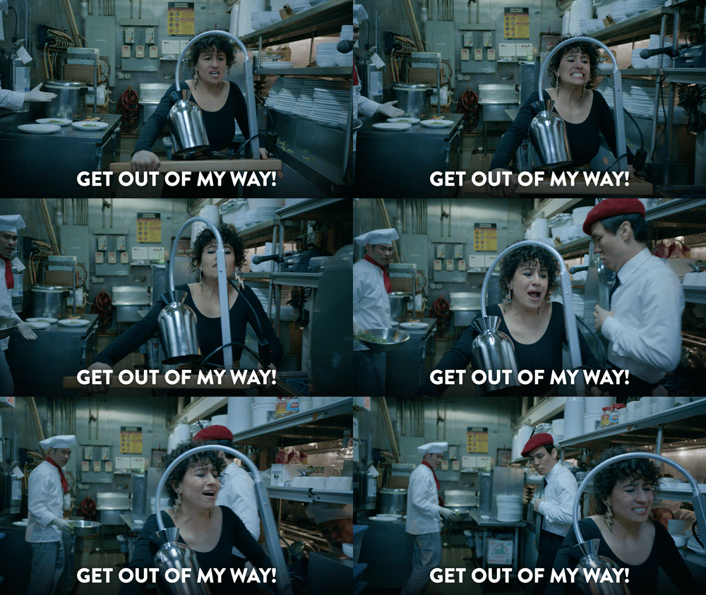
Some transient tooltips are designed to expand over the input field while some stretch past smaller screens. You can’t read and act simultaneously when the tip is inaccessible or covering the input fields.

Tips are supposed to help the user with the interaction and not obstruct it.

4. Should have told me earlier that tapping this button will terminate my session

Train pilot emergency breaking

Timing is crucial in tooltip design. The tips should be aligned with the user flow. Feature adoption and user’s understanding of your product depends on the relevance of tips and not the frequency of it.

A user will only be interested in reading about a feature when they need to use it. Overwhelming the user with information for the sake of feature discovery will only make them skip the info.

5. What does it have to offer?

Last but not the least, comes your tooltip copy. A boring and irrelevant copy might cost you the user motivation to even encourage an action. Motivation, Ability, and a Trigger are the three crucial elements in BJ Fogg’s Behaviour Model that prompts a user to take an action.

Copy is an indispensable part of a tooltip because it motivates the user to take action. Your tooltip is doomed to fail if your copy isn’t conversational or it doesn’t reflect your value proposition.

In a nutshell

Even the most intuitive UI needs tooltips while onboarding new users or introducing new concepts. The difference between not-so-obvious and obvious is not that obvious. Think about your target users while making these assumptions. Explaining a basic feature to an experienced user might annoy them.

Facebook, Asana, and Slack are some of the best examples of great tooltip design. Their tooltips are a part of the user flow. Facebook has a subtle, conversational, and attractive approach towards tooltips, which informs and encourages action as well.

If you’re seeing significant drops in your user onboarding or feature adoption then give us a shout here, we’ll be happy to help you optimize your tooltip design.

Unboxing popular PWAs | Techniques used and impact

What is common between Pinterest, Tinder, Uber, Trivago, and Airbnb?

All these companies experienced a surge in their product’s performance, user-engagement, and conversions by going mobile-first with progressive web apps.

Why did they go for PWA you ask? Legacy websites of these popular platforms were doing good for big screens but not so much for the small screens. Considering the ever increasing growth of mobile users and loss of potential market they decided to prompt users towards their native apps.

After seeing people bounce from their native apps too, they decided to go with progressive web apps.

This blog covers progressive techniques that Pinterest and other major companies use to build PWAs.

Pinterest reduced its Javascript bundle size via Route-Based Chunking

Code-splitting reduces time to interactive by loading only the code that’s needed beforehand while the rest of the code loads lazily.

Pinterest broke-up & shaved hundreds of KB off their JavaScript bundles weighing 650kb. Pinterest split it’s multi-megabyte JavaScript bundles into 3 different categories of webpack chunks (Vendor, Entry and Async). They used webpack’s CommonsChunkPlugin (replaced with SplitChunksPlugin in webpack v4) to break out their vendor bundles into their own cacheable chunk and added React Router for code-splitting.

As a result, Pinterest was able to take down the size of their core bundle from 650KB to 150KB.

Uber and Tinder also took a similar approach and….

  • m.uber comes in at just 50kB and loads in less than 3s.
  • Tinder took down its core bundle size from 166kb to 101kb and reduced its load time from 11s to 4s.

Faster loading for Tinder and Nikkei via Inline Critical Path CSS

The bigger and more css files you have, the longer the page takes to load. Inlining critical CSS eliminates Render-blocking scripts.

Tinder used Atomic CSS to create highly reusable CSS styles to inline all the critical CSS in the initial paint. Tinder used Google Analytics and CSS stats for each release to keep track of what has changed. It saw change in average load times went from ~6.75s to ~5.75s. Thus, removed critical CSS from their core bundles.

Nikkei, a Japan based media business, inlined all the critical CSS with 0 render blocking stylesheets. This optimization helped Nikkei to reduce its first meaningful paint by more than 1 second.

What else can you do besides code-splitting and inlining CSS?

Asset caching via Service Workers

Service worker is a lightweight net proxy which allows web applications to cache all of its necessary resources to load substantially faster for returning visitors. Essentially, it helps in caching main JavaScript, CSS, and static UI assets.

One way to generate a Service Worker file and a list of assets is via Workbox Webpack plugin. Many web applications take advantage of Workbox Webpack plugin for network resilience and offline asset caching. That further has helped these companies to speed up Time To Interactive on repeat visits and first meaningful paint.

Treebo saw 31% improvement in TTI and loaded in under 4 seconds, whereas Pinterest reduced its TTI from 23s to 5.6s.

You can refer to Google Offline Cookbook for other caching strategies.

The Future

Making speed one of the core metrics is an important step towards delivering a hassle-free and cutting edge experience to your customers. More and more websites are opting for an offline-first web. It’s only practical to adopt the ‘write once and use anywhere’ approach against writing natively for every other platform.

Google and Microsoft are also working towards a future where PWAs are available alongside full-fledged apps in app stores. It’s safe to say that PWA is in fact the future of the interwebs.

Progressive techniques can give your website a much needed performance boost like these apps that you just read about. Thinking about making the move to PWA? Talk to us here.

Kotlin 1.3.50 | More than just a performance upgrade

Kotlin has emerged as both substitute and supplement to C++ and Java. In 2018, the language had over 96,000 repositories on GitHub and had already reached 1.5M+ users.

More than 50% of professional Android developers now use the language to develop their apps. Google claims that this figure will increase dramatically. Since in future Kotlin will be the first to receive new Jetpack features.

The new Kotlin 1.3.50 release kicks off with various tooling and quality improvements to develop applications much faster. Let’s take a look at the major improvements from this release.

Convert Java-Kotlin with fewer compilation errors

The one-click Java to Kotlin converter tool helps to convert an existing Java project, one file at a time. The converter is not meant to produce 100% error-free code, instead it’s built to reduce compilation errors.

The converted code might show nullability issues that require human intervention. Manual corrections fixes the code for the time being but it doesn’t foolproof the code from runtime errors that show up in the form of nullability mismatch.

The new improved version of Java-to-Kotlin converter (available in preview) tries to infer nullability more correctly based on the Java type usages in the code. And helps in making it easier than ever to convert code with fewer compilation errors. The generated Kotlin code is easier to manipulate too.

Improved Debugging

Bytecode has a lot of technical information and displaying all of that can make the code bulkier and unreadable. Kotlin ‘Variables’ view now highlights only the most relevant variables, which aids in easier debugging.

  • You can set a breakpoint inside lambda expression or at the end of the function as well.
  • Improved support for the “Evaluate expression” functionality in the debugger for many non-trivial language features. You can now modify variables via “Evaluate expression”.

New Intentions and Inspections in IntelliJ IDEA

This addition helps in learning how to write idiomatic Kotlin code, improve performance of IDE actions, and fix several known situations that were causing the UI to freeze.

  • IntelliJ IDEA now highlights deprecated imports from the completion list
  • You can convert normal properties to lazy properties and vice versa
  • You can automatically replace the primitive lateinit property with the by Delegates.notNull () syntax

Kotlin/JS now supports Dukat-Gradle integration

Dukat is a converter of TypeScript definition files to Kotlin declarations. By running the build task in Gradle, typesafe wrappers are automatically generated for npm dependencies and can be used from Kotlin.

You can now comfortably use the JavaScript ecosystem libraries in Kotlin in a type-safe manner without the need to manually write wrappers for JS libraries.

Other Kotlin/JS updates

  • Incremental compilation for Kotlin/JS is now up to 30% faster compared to 1.3.41.
  • Support for running and building Kotlin/JS Gradle projects using the org.jetbrains.kotlin.js plugin on Windows.
  • As with other platforms, you can use Gradle tasks to build and run projects and resolve NPM dependencies needed for Gradle configuration.

Kotlin/Native updates

Earlier version names of Kotlin and Kotlin/Native differed from each other. This release uses version 1.3.50 for both Kotlin and Kotlin/Native binaries, reducing the complexity. As the standard library updates to support the kotlin.reflect.typeOf() function for Kotlin/Native types.

  • Kotlin Native now ships with an exhaustive set of platform libraries on macOS/iOS and embeds actual bitcode in produced frameworks.
  • Kotlin-platform-native is now replaced with Kotlin-multiplatform

Here’s a link to the change log if you’re curious about the other features that are packaged in the Kotlin 1.3.50.

Let us know how you feel about the multiplatform Gradle plugins and handling nullibility errors manually. And ping us here if you need Kotlin development assistance.

Galaxy Weblinks Ranked Among Best Web Developers on Clutch

When you think of hotspots for tech, don’t zero in on Silicon Valley just yet. According to Expert Market, Boston is one of the top 10 tech cities in the world, and Galaxy Weblinks is proud to call it home. We’re thrilled that Clutch, a business services resource, has recognized us as a top web developer, with an average client rating of 4.8 stars. We’re committed to offering accountable web development, and we take steps to ensure that each project we take on receives the resources it needs. All of our clients love that we have dedicated project managers for each project. This ensures proper communication and updates that help our clients be on top of things. In one such project, we developed an e-commerce site for Fast & Light LLC, a digital marketing agency. We tailored our deliverables to meet their specific design requirements.
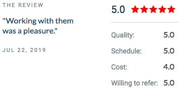
A screen capture of a review
The delivery of the website improved the agency’s internal efficiency by freeing their teammates for other tasks. They were happy to work with our team and found our resources friendly and easy to get along with. We redesigned a website for another highly satisfied customer, a women’s clothing boutique. We worked in Magento to improve inventory details and make links more accessible, along with a more intuitive UX.
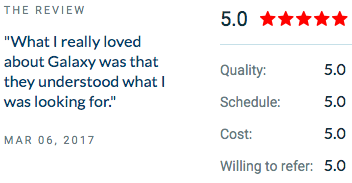
Screen capture of a review
We delivered the improved website in just a few weeks, and our customer was happy with its functionality. We also explained our process and worked with their feedback throughout the project cycle. “They were able to put my ideas right into place on the website and then immediately asked me for my feedback. The job got done so quickly and for such a reasonable price that I was extremely surprised.” – Owner, Women’s Clothing Boutique We’re thrilled to receive such praise from our design and development clients. Getting validated reviews from clients just goes to show our credibility. We love that Clutch was able to help us with it. We are a versatile software development company with strong core values. We believe in a world that intersects & interacts with software, we are focusing on building it as human as possible. You can also review our profile on The Manifest, a guide to B2B services. We’ve been ranked among the top 50 developers in India, our second location. Potential customers who would like to visualize a project can also see our work on Visual Objects. Many of the tools and platforms we’ve built are shown there. Interested in our work for startups as well as larger businesses? Contact us

Product tour lessons from Disneyland | What keeps you asking for more?

The experience of Disneyland is always an awe-inspiring one. No matter how many miles you have walked, you are always up for another Pirates of the Caribbean adventure or Space Mountain ride for the last time before you leave. No wonder Disneyland has become the epitome of mass engagement. Your product tour can also leave a similar impression on user if done the right way. Of course, we are not suggesting to go about building theme parks, that’s not a practical advice. But we can draw lessons from Disney’s ‘Happiest place on earth’ when designing product tours.

Ensure a shortest possible journey to the ‘aha moment’

A picture of Mickey Mouse and
Image Credits: Peter Lee
The ‘magical’ moment when the user realizes your product’s value is often expressed as ‘Wow’ or ‘Aha’ moment. Early realization of the ‘Wow’ factor of your product gets user’s undivided attention. All because you valued their time and have aligned your product tour to their requirements.

Leverage small details for superior user experience

You don’t have to hold on to your trash for long when roaming on Disneyland’s streets. There is a trash can present at every 30 steps. The reason being, visitors tend to discard their trash before that, as observed by Walt Disney. Thoughtful details like these make for a great user experience. Some of the ‘trash can’ examples in product tours are:
  • Option to pause and resume tutorials
  • Option to exit a feature preview
  • Positioning hotspots for minimal distraction
  • Progress bars to be present

Use multiple channels of engagement

Picture of Fireworks at Disneyland castle
No one gets bored in Disneyland. The reason being that there is something for every visitor. The key is to keep the users engaged. Increase user-engagement by introducing ‘meet and greet’ for new features, options for personalized interactions via in-product messaging, or a short product video. Keep the options open for your users as well. Let them decide how and when they want to know more about your product.

Pitch your tutorial with a story

Statue of Walt Disney with Mickey Mouse in Disneyland
Stories have the element of emotion embedded in them. And emotions are the golden path of connecting with your users. Tell your growth story through a short video, or highlight common problems that your product solves. Usage of visuals will evoke emotion and tug the user to explore more of your product, just like you’re drawn to the emotional element of Disney movies even though the whole premise is CGI.

Maintain a theme and brand image throughout

The areas in Disneyland, all have their own thematic music, characters, and pavement designs. Your product tour should also be consistent with your app and website theme. Consistent theming will help in easy recognition of your product in crowded market. Core values highlighted in your tour will set the precedence for building your brand. We know it can be a daunting task to get users to interact with your products, the way you want them to. Let the product tour highlight the fundamentals of your product and leave the rest for your user to discover on their own. Just as we love to explore Disneyland by our own preference and pace. We actively work on aligning these principles with our client requirements to design unique and high yielding user experiences. Get in touch with us here if you’re looking to design an engaging experience for your product.

What are Google Play’s new mobile app requirements?

Google Play set out many criteria in their app guidelines that you need to follow. These changes may cause some issues as you try to stay up to date. In this post, we’ll tell you what changes you need to make in order to guarantee that your app is fully compatible with Google’s new requirements.

Google made changes to the behavior of the API to increase security and privacy. The bindService() implicit intents in Android 5.0 aren’t supported currently. There are also new changes in the Runtime permissions. Since every Android app runs in a reduced-access sandbox, so the app has to ask for permission when it wants to use materials or information outside that sandbox. Google Play asks that you state the need in the app manifest and then you have to approve each permission right before the actual runtime.

This permission change is for Android 6.0 and higher. You can still use the Android Support Library to make older versions of Android compatible. Google Play also updated the Android Support Library with the release of Android 9.0 (API level 28); the new version is called AndroidX and is part of Jetpack. The existing support library still exists with the AndroidX library, but it also includes Jetpack’s most recent components.

Google Maven holds onto all versions prior to API 27 and Google Play says that they’ll be packaged as “android.support.” But, all new development will take place on the AndroidX library, so Google Play recommends that you develop new projects here. If you have an existing project, they recommend that you migrate it over.

To further increase secure connections, Google Play has changed the user added CAs to not be trusted by default in the case of Android 7.0. They also require explicit user approval from apps to access the user account in Android 8.0.

For MetaData, Google now has a small MetaData on top of each APK so that each app release is officially verified by Google Play. They don’t allow apps with any deceptive, incorrect, or explicit metadata that isn’t pertinent to what the app is about. This entails every area of the app — the title, description, all images, and icons. They also don’t allow user testimonials in the app’s description any longer. Authentication is important for users to know that an app is legitimate, so they’re spending time to ensure that each app functions as advertised.

Here Are Google Play’s New Requirements for Texts & Images

Google Play store now allows 2–8 screenshots for each supported device, i.e., smartphones, tablets, Android T.V, Android Wear, etc. But, to publish your store listing, you have to upload at least two screenshots for each device type. It needs to either be a JPEG or 24-bit PNG (no alpha) with minimum dimensions of 320px and maximum dimensions of 3840px.

Screenshots aren’t the only images that need to be formatted. Google Play requires one splash screen for an iPhone display and one for an iPad display, both retina and non-retina displays. Whether you’re using a photo or video, dimensions should be 1024px by 500px. If you choose a video, make sure to use an individual video’s YouTube URL, not a YouTube playlist or channel URL. The video shouldn’t be longer than two minutes.

Google Play now requires icon images to fit into the new, standardized icon shape — the square with rounded corners known as a “squircle.” It needs to be hi-res, material icons used through Android M, and adaptive icons for Android O.

For your text:

Titles – Should be between 4 and 30 characters – But, the new limit was moved from 30 to 50 characters

Descriptions – The short description has an 80-character limit – The detailed description has a 4,000-character limit

Keywords – They’re required and the new version has a 500-character limit – Users can also fill in this field while updating the application version

Before Launching, Follow Google Play’s Checklist

Key Takeaways

  • Google Play changed API behavior
  • Android 5.0 implicit intents are no longer supported
  • Android 6.0 and higher has changes in Runtime permissions (app must request permission of a material, then approve permission before runtime)
  • Develop new projects on AndroidX library
  • There is now MetaData on top of each APK
  • There is new length requirements for, Titles (new 50-character limit), Descriptions (80-character limit), and Keywords (500-character limit)
  • There are new requirements for images
  • Icon must be the square with rounded edges — aka a “squircle”
  • Two screenshots per supported device type (smartphones, tablets, etc.)
  • One splash screen for iPhone and iPad screen displays
  • For videos, link to an individual video, not a playlist

Good Luck on Your Launch!

Galaxy Weblinks stays up to date on these developments so that our clients don’t have to do time-consuming, detailed research. That’s why our clients love partnering with us for mobile app development — we don’t leave them in the dark nor overload them with lengthy information. We provide overviews, outlines, and how-to guides so that clients can feel confident when updating their app.

Feel free to use our above checklist to keep yourself on track. If you have questions about this process, leave us a comment or contact us. If you have questions about other app topics, then browse our blog!