Partnering With a UI/UX Agency | Why You Should Outsource

Developers spend 50% of their time fixing issues that could have been avoided if user research had been conducted before code development began. (MeasuringU)

Thinking about outsourcing in terms of UI/UX can be a little jarring at first but Galaxy Weblinks is here to change that for you. UI/UX is the foundation of your product, be it for customers or employees, and nobody wants a shaky foundation. Before writing the code and starting the build of your application, laying out a detailed UI/UX strategy is a must. According to Forbes research, Intentional and strategic user experience has the potential to raise conversion rates by as much as 400%.

Galaxy’s approach to UI/UX outsourcing, strategy, research, and design is a homogenized effort that focuses on merging the desired outcomes for end-users and your company. There is no universal solution that fits all, and we understand that every project is different, that’s why we match your needs with the right team of performant designers and engineers. Our team of critical thinkers works with you towards a common goal of deploying robust and scalable UI/UX solutions that yield great business results. 

Our Process is Agile and Dependable

We know that constant communication and collaboration are key in an Agile development environment. Hence, our process adapts to your needs to provide optimum results. With development shops in the US, Australia, and India we ensure that all the important strategic interactions and work happens during your typical workday. 

We are also equipped to scale our services to handle the intense workload on short notice so that you can meet your deadlines. Timezone troubles are a thing of the past with us, we’ve made our schedules flexible, just give us a call, and we’re instantly available to talk status updates and plans, just like your internal teammate. 

Research is Crucial for our UI/UX Process

We try to understand the users, their pain points, and the functionality they require through our research. The answers to these questions are critical whether you’re designing a new application, revamping an existing one, or optimizing for different screen sizes. 

Apart from user interviews, our typical UI/UX research offering includes:

  • Heuristic Evaluation
  • Competitor Analysis
  • Survey Creation and Distribution
  • Interview Recording Transcripts
  • Analytics Data Report Summaries

We have paired these services with techniques that help in our Design Thinking methodology and aids our decision-making:

  • Empathy: Conduct stakeholder interviews and user research. 
  • Define: Develop affinity diagrams, MVP definitions, user personas, and user journey.
  • Ideation: Use UI sketches and Wireframes to brainstorm.
  • Prototype: Create hi-fi wireframes with design styles and final screens for testing and developer hand-off.
  • Testing: Test and collect user feedback at every stage to eliminate problems at the onset.

UI/UX Outsourcing Benefits

Our teams are proactive and highly skilled. So it doesn’t matter if you’re looking to disrupt the industry with a revolutionary solution, or building upon an existing solution, we’re here as your dependable offshore partners to see it through equipped with the right set of technologies and skill set. 

Here are some benefits of outsourcing UX development that will put things in perspective for you: 

  • Reduced development costs: Building what your users desire in the first place eliminates the need for code rework, ultimately saving costs.
  • Competitive advantages: Better UX leads to better business.
  • End-user loyalty: Fast, efficient, and transparent experiences result in better user loyalty.
  • New opportunities: Researching and presenting a user with what they might need will result in new business opportunities.

Why choose us as your UI/UX Design Outsourcing partner?

Based in Boston(MA), Galaxy is recognized as one of the fastest-growing private companies in the USA in 2021 by INC 5000. 

Our clients love our work and laud us for our commendable outcomes. Whether you need software to create your business foundation, new product offering for your customers, or something disruptive, our team can help you work towards your goals.

Our recipe for success 

With our proven methodologies we ensure that your solutions are the right kind of disruptive and your legacy solutions are modernized and made future-proof. We employ:

  • 6D
  • Lean UX
  • Double Diamond
  • User-Centered Design

With outsourcing, you get access to a top software company with the right talent and tools to help you realize your business goals and that too without the hassles of talent hunt, hiring, and management.

Galaxy as an outsourcing partner works alongside you through every stage of the development journey to deliver the best outcomes your business deserves. 

About Galaxy Weblinks
We specialize in delivering end-to-end software design & development services. Our UI/UX designers are creative problem-solvers with a decade of experience in all facets of digital and interactive design. We create compelling and human-focused experiences delivered through clean, and minimalist UI. Get in touch with us here.
Enhance Your User Interface With These 5 Tips

When it comes to design, even the trivial seeming things can have a huge impact in creating efficient, accessible, and beautiful UIs. This blog will address those tiny changes that yield big results in terms of your design and user experience. 

As the nursery rhyme goes “Little drops of water, little grains of sand, Make the mighty ocean, and the pleasant land”

1. Be Succinct. Cut the fluff

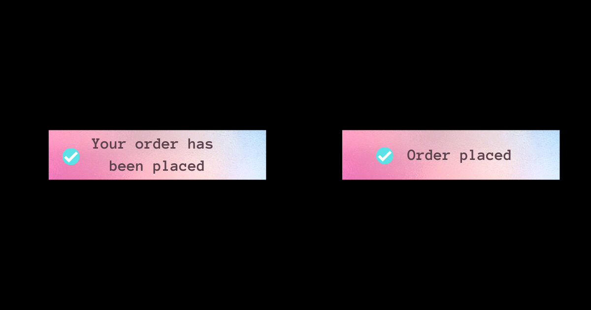
Work with your UX resources to keep the messages concise. Speak to your user in the language they understand. The general rule of thumb is to keep it simple. Avoid jargon and speak to them in a voice they understand, assisting them in achieving their goals more easily.

copy-trip

2. Increase the body font if your typeface allows

Articles, project descriptions, and other long-form content read better if the body copy is 20pt or more. It would also depend on the typeface that you’re using, but the more common ones look great at 20pt and provide for a better reading experience when going through exhaustively long texts. 

body-text

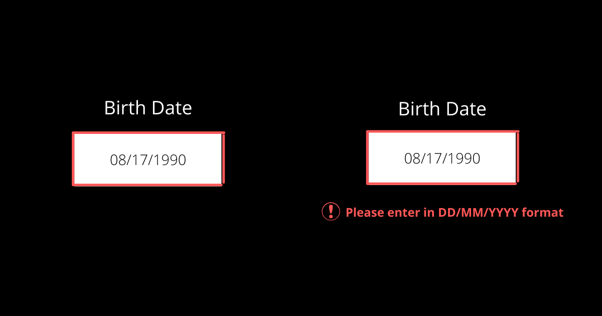
3. Use Icons and descriptions in error states

Colors can help convey messages but don’t rely on colors completely to convey crucial information. Using only colors in your design for important information like error states is like leaving out a large chunk of the audience at the mercy of guesswork. Introduce icons and descriptive texts along with the color to make it more inclusive and accessible. 

error-states-tips

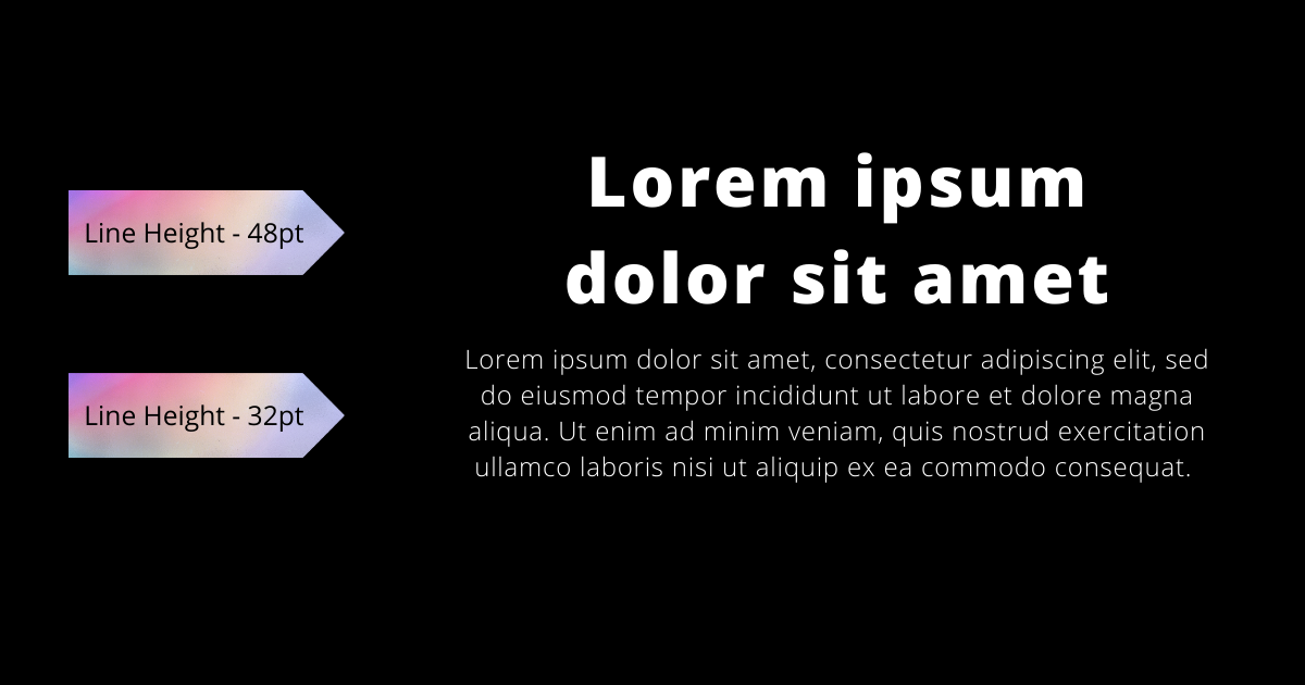
4. Decrease spacing and height in headings

Headings are shorter allowing you to play with letter space and line-height. But they are also bigger in font size than the body text, so the spacing between the letters appears optically larger. Reducing the letter-spacing will make headings look more balanced and provide a more optimal reading experience. 

line-height-tip

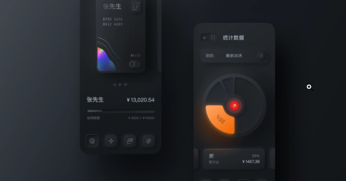
5. Utilize shadows and borders to highlight important stuff

Shadows and borders can help make the on-page elements appear sharper and more defined.  

With this nifty little tip, you can easily highlight on-page elements. Just don’t go overboard with the shadows, there’s a thin line between neat and tacky.  

Source: Smart_boy Dribbble

Wrap up

Us humans, we often complicate things that are fairly simple. Good UX can be as easy as going against your experimental instincts and sticking to the basics. These tips will help you in that basic pursuit. Use these tips as a guide for your next project, and you’ll be sure to deliver not only a functional product with great UX, but one that users will want to return to. 

About Galaxy Weblinks

We specialize in delivering end-to-end software design & development services. Our UI/UX designers are creative problem-solvers with a decade of experience in all facets of digital and interactive design. We create compelling and human-focused experiences delivered through clean, and minimalist UI. Get in touch with us here.

User Onboarding – Principles and Best Practices

A good user onboarding flow is much more than a simple tour of the product. Designing a good user onboarding process is essential for product growth and user retention. Without it, you may risk the retention levels plummeting. A product that does not assist the user in understanding its utility has a very low level of engagement.

That is true for any product, physical or digital. Try something that isn’t intended to be simple and self-explanatory. Remember the last time you bought something new and read the instruction manual before using it?

Continue reading for some core principles and best practices with fantastic examples!

Why User Onboarding?

According to a Profitwell user onboarding study, customers who said they received good onboarding on a new product were between 12% and 21% more willing to pay than the median. Users who responded negatively had a willingness to pay from 3% to 9%, indicating that poor onboarding does not necessarily detract much, but your product may lose a good willingness to pay.

However, retention is where things get interesting. When comparing the first 60 days of customers with poor integration perceptions to those with positive perceptions, customers with positive perceptions fall much lower in the first 21 days.

And they conclude that good onboarding is critical to encompass the value of a product with a customer or, at the very least, mitigating the slippage your customer will experience when you begin using the product. Especially for him or her to begin to see the value, significantly speeding up their journey.

However, this isn’t the case most of the time. Every step of the way, there’s a hidden risk of that user clicking the little red ‘X’ and never returning.

It occurs between 40% and 60% of the time.

It is rightfully referred to as the SaaS killer! Fortunately, that’s what we’re here for. We will share with you the 3 Principles of User Onboarding that will help you immensely. 

#1 For a business to succeed, onboarding must be a continuous process.

It all starts and ends with the idea that onboarding is a continuous process. Anything you look at can be viewed through the lens of Onboarding. Is this beneficial to the user? Is this moment clear to him as he navigates through your product offering? If we stop looking at the user’s journey at some point, what was once simple becomes a supplement that will require human assistance to solve. This is closely related to the day one mentality, in which every day is like your first day of attempting to assist the user.

#2 Onboarding is not a metric; it is a result.

That means we shouldn’t measure onboarding. We need to know how many users are registering, what the dropout rate is, and where, if any, our product’s “bottleneck” is. All of this is critical. The issue here is that the metric is the result of a job. If you follow the first principle (user obsession), this will almost certainly have a direct impact on the outcome. And how can the results be improved? Talk to your user all the time; don’t let this opportunity pass you by. Assist your user, and the results will follow.

#3 Obsession with Onboarding

Obsession with making your life easier and assisting you in getting started with your product. Obsessed with assisting the user in getting started autonomously without the assistance of others. It is unlikely that the user will engage if he or she is unable to enter your software or get started with your product. Understand your users’ realities. You don’t want to design for a market you’re unfamiliar with.

…

We’ve compiled six best practices for user onboarding to help you achieve your goal of converting new users into fully engaged customers who have integrated your product into their lives.

#1 Reduce Friction

Make experiences simple and practical! Determine what is not required to perform the key action on your product. Initial barriers are responsible if the user is abandoning just after the first few steps. Consider whether the content being inserted assists the user in achieving their goal or if it serves to solve a product problem. Even if the implementation is complex, the paradigm shift here is to guide decisions to solve problems for users.

Notion determines the type of account and requests authorization (if it is a Gmail, Hotmail, or similar account).

Source: Fullstory

#2 Know your customer and their needs

Sift Science has identified the two most important motivations of their ideal user: fighting fraud and preventing bad users. This onboarding model reassures the user that they are in the right place and reminds them of the value of the product.

Source: Sift Science

What is the reason your customers require your product?

If you don’t understand the big “why” for existing users, you won’t be able to master new user onboarding. Conduct customer surveys to learn what customers truly get out of the product, and then design your user onboarding experience around that value.

To properly serve your customers, you must be aware of the following:

  • Who are they? (e.g. their role)
  • What they desire (e.g. the metrics they care about)
  • What is the pain that your product alleviates?
  • What tasks must they complete? (e.g. what they report in their standup)
  • What is it that would prevent them from using your product? (e.g. what they consider risks)
  • The reason why any churning users end up churning (e.g. where they got stuck)

Once you’ve mastered these crucial (but easily overlooked) details, you can start treating user onboarding like a jigsaw puzzle rather than a guessing game.

#3 Use an onboarding checklist

A great way to organize your user onboarding is to create a checklist with a progress bar that includes all of the steps your new users must take. Checklists naturally elicit our desire to “close the loop” and encourage users to implement the key activation points. Add an incentive at the end, and you’re set.

Source: Postfity

Make it clear what skill level is displayed, what should be done, and, most importantly, why it is necessary. People like to have a reason for doing something. The combination of these factors aids in the development of simple and objective steps. Display a few steps at a time, and if possible, divide the task into smaller tasks. A 10-step onboarding process is a lot of work for the user and a waste of their time.

#4 Remove barriers to the Aha moment

An empty account equals an unsuccessful user on a platform that thrives on user content. Wistia lowers the barrier to entry by providing users with three simple options for getting started.

“Aha! I completely understand. I need this.”

That is what you want your users to experience as soon as possible. The Aha moment occurs when users recognize the value of your product and are willing to pay for it.

Source: Wistia

Tips for removing hurdles: 

  • Do not require account creation before attempting to use the product.
  • Request the user information in the later stages of onboarding
  • If you don’t have a free trial, share the Aha moment on your marketing site (include testimonials or highly relevant screenshot gifs).

#5 Videos for quick introductions

Videos are excellent tools for user onboarding. They can be used as a 1-2 minute introduction instead of a walkthrough or in a resource list. The more videos there are for highly visual products, the better. Why? Even if your user does not have time to use the product right away, they will remember it if they see someone else quickly reach the Aha moment. Snappa provides a one-minute blog header image tutorial so that users can see how useful the tool is right away.

Source: Airtable

#6 Webinars to help users master the tool

SEMrush has mastered the art of user onboarding webinars. Their “101” webinars teach new users how to use the platform, whereas their high-level SEO webinars increase user engagement over time, reinforce brand authority, and help push out content that attracts new users looking for professional development content.

There are few companies that do this well, but every SaaS platform has the opportunity to create introductory tutorials and professional development content tailored to their specific users.

Tailoring the onboarding journey does not end there 

Send emails based on behaviors such as time spent in-app or task completion after the initial welcome series to guide experienced users to the star features, and inexperienced users to the Aha moment.

Consider a project- or task-based trial rather than a time-based trial to avoid losing users who would be a good fit (just not right now)

Where in a user’s journey is it most likely that they will upsell and cross-sell? The answer will differ depending on whether the user is highly engaged or has not yet used the product.

Upselling and cross-selling can be automated by identifying the right subsets of users and presenting them with more product options. When you customize the experience and sell the right product add-ons to the right customers, you increase revenue while increasing customer satisfaction and delivering more value.

Every user onboarding flow differs depending on the type of product, but there is always an optimal way to entice users. We hope that the best practices and examples have provided you with some ideas for your next user onboarding design!

If you’re thinking ‘we do not have enough experience to deal with this or “what if I don’t have enough time”, contact us to get in touch with our UI/UX experts.

About Galaxy Weblinks

We specialize in delivering end-to-end software design & development services. Our UI/UX designers are creative problem-solvers with a decade of experience in all facets of digital and interactive design. We create compelling and human-focused experiences delivered through clean, and minimalist UI. 

Ecommerce User Journey – 15 Must-haves to Include

The COVID-19 pandemic had a significant impact on global eCommerce trends. With brick-and-mortar stores closing overnight, customers flocked to the internet to purchase their necessities. The pandemic hastened the shift to online shopping by up to five years.

mCommerce, or mobile commerce, refers to online shopping via a mobile device such as a smartphone or tablet. It will continue to grow in the coming years as a majority of people now prefer to shop on their phones. 

Even though mobile devices account for the majority of Ecommerce traffic, desktop sites have lower cart abandonment rates and higher average purchase values. Mobile Commerce is the way of the future, but if designers want to maximize profits now, they must improve desktop sites with Ecommerce UX best practices.

Yet, mobile sites fail to meet three key metrics: they have higher cart abandonment rates, low conversion rate, and lower average order values than desktop sites.

Four Crucial Pages of the Ecommerce Experience

Almost all Ecommerce sites on desktop rely on a similar sequence of pages to guide customers through the sales process.

  • Homepages that are uncluttered and offer irresistible value propositions
  • Category pages that are well-organized and simple to navigate
  • Product pages that have been polished and incorporate social proof and compelling content
  • Checkout pages that are simple to use, show progress, and make customers feel safe

…

Uncluttered Homepages

1. Product Names That Shoppers Understand

Internally consistent product names can be perplexing to customers. Provide context for decision-making. Names based on model numbers or underlying technology run the risk of alienating the general public. The same is true for titles that are overly cute or creative. Choose product names that indicate utility or value in the eyes of shoppers.

2. Enable Search From Anywhere

Ecommerce websites offer a plethora of products and therefore, the search feature becomes an essential way for customers to find products based on their requirements. Sticky search bars ensure that search is available everywhere on every page, but for the sake of conversion, it is best to remove search from checkout pages.

3. Highlight Deals and Promotions

Customers visit Ecommerce sites with a specific product in mind. Deals and promotions go unnoticed when they blend into homepages. Bright colors, bold text, and full-page photos are used in call-out advertisements.

If a promotion is the most important thing shoppers need to know about, make it the center of attention.

4. Make the Product’s Value Immediately Visible

Getting the product page right is important as first impressions matter. Customers must be able to quickly determine the worth of a product. We recommend that you assist the customers in visualizing how your product will solve their problems and improve their lives (the Jobs to Be Done framework is a useful starting point). 

Keep your product descriptions and technical specifications brief and to the point. Use photos and videos that demonstrate the benefits of the product. If the shoppers must read and scroll a lot, or watch long-winded explainer videos to understand the value, then you are doing something wrong here. 

…

Well-organized Category Pages

1. Display Best-Sellers

Bestsellers should be labeled with distinct icons or placed in bestseller sections. Why? Bestsellers provide social proof. When people are unsure, they will look to others’ actions to determine their own. This is especially true for first-time buyers.

A similar rule applies to newly released products. Displaying new and improved items is more than just a one-time sales tactic; it is a way to entice customers to return for future updates.

2. Ensure Ease-of-Use Navigation

The navigation must be simple. Customers should not have difficulty switching between category pages or enabling product filters. Sites with a large number of products in a single category should use left-column navigation to allow customers to sort products by various attributes (faceted search).

3. Display Products in Grids

Desktop screens provide ample space for product grids. Grids align with F-pattern scanning and allow shoppers to quickly compare multiple products. They are especially useful for items that are easily explained with pictures. To get the most out of grids, keep the number of items per row between two and four. Grids become significantly more difficult to scan when there are five or more products.

Bonus: List views can be useful, but they’re best for products that require more detailed explanations.

…

Polished Product Pages

1. Create large, eye-catching “Add to Cart” buttons.

When it comes to product pages, “Add to Cart” buttons must be visible. Make them large, contrast-heavy, and easy to click. Resist the urge to be witty and instead create call-to-action text that is clear and action-oriented.

When customers add items to their shopping carts, they must receive visual feedback. Many desktop sites do this with cart-summary overlays that slide in from the side of the screen for a brief moment (a creative way to allow shoppers to transition to checkout or keep browsing).

2. Upsells and related products can help you earn more money.

If customers are dissatisfied with what they see on product pages, they should not have to return to category pages to find other options. Show them alternatives at comparable price points or more expensive options with better features, reviews, or brand recognition.

It is also possible to suggest complementary items to the product page. Considering purchasing shoes? Why not get some shoelaces and arch supports as well? Make sure that related items have a “Add to Cart” option to reduce friction.

3. Make use of copy and imagery to demonstrate the good life.

Ecommerce content should be informative, but persuasion requires more than facts and feature lists. Use text and images to help customers imagine the good life that awaits them after they complete their purchase.

Again, desktop sizes are advantageous. There’s no reason not to use massive photos and videos or show products from multiple perspectives. The same is true for the copy. Don’t be afraid to use large headers and a lot of white space around text blocks.

4. Use Social Proof to Persuade

Shoppers are more likely to buy if they see social proof. Ratings and reviews have a significant impact on purchasing decisions, but desktop sites are large enough to accommodate other types of social proof:

  • Customer-taking product photos
  • Approval badges from independent review sites 
  • Celebrity and influencer endorsements
  • Expert quotes 

Social proof aims to make shoppers feel as if they are making informed decisions that are consistent with the positive experiences of others.

…

Simple Checkout Pages

1. Accept Various Payment Methods

When it comes to payment gateways, shoppers’ primary concerns are convenience and security, and these are two of the leading causes of cart abandonment. Fortunately, an increasing number of online payment options alleviate security concerns while also expediting checkout. Third-party payment options supported by well-known brands (such as Amazon and Apple) may be more appealing to customers than entering credit card information.

It is also worthwhile to consider “buy now, pay later” (BNPL) options such as Paypal Credit and Klarna. BNPL is a type of point-of-sale credit that allows customers to pay for products overtime after they receive them.

2. Give a detailed order summary.

This is highly recommended. We suggest that you provide shoppers with brief order summaries that include:

  • Details and quantities of the product 
  • A breakdown of all charges
  • Details on shipping and billing

It’s also a good idea to display product images, but make sure the attributes match the attributes chosen by customers (color, size, finish, etc.).

3. Think about Guest Checkout.

Guest checkout may not be appropriate for all Ecommerce retailers, particularly those whose business strategies revolve around the creation of customer accounts. It has, however, been shown to speed up checkout, prevent account creation fatigue, and reduce cart abandonment.

An alternative is to require email confirmation for orders, then follow up with deals in shipping and delivery messages.

4. Display Shoppers Checkout Progress

Ecommerce customers spend a significant amount of time and energy searching for products online. When they’re ready to buy, they want to know that the end of the process is near. A progress bar is a simple way to show shoppers where they are in the checkout process.

…

We hope that this practical piece curated from our eCommerce experience will assist you in developing the best Ecommerce strategy. And if you want to interact with your customers in a completely new way and increase your conversion rate, get in touch with our experts here.

About Galaxy Weblinks

Galaxy Weblinks is a company that specializes in creating the best online experiences for your users. We have experience customizing websites on a variety of platforms, including Shopify, WooCommerce, and Magento. Contact us today to discuss your Ecommerce project.

The Good and the Bad of Dark UI Designs

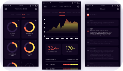
From mobile screens to TV sets, dark UI designs are seen far and wide and appreciated for the visual appeal that they offer. A dark theme depicts sophistication and elegance. However, dark UI designing comes with multiple challenges. If the implementation is poor, things can very well go south.

Digital products having dark UIs are perceived as powerful, elegant, and mysterious. They are a formidable trend across the digital spectrum. It’s said that dark mode can reduce eye strain, save battery life and increase accessibility. But, most of the time, dark themes are an aesthetic choice.

Over the past few years, dark themes are amongst the most requested features. Both Apple and Google have a dark theme as an essential part of their UI. Be it browsers, mobile applications of social media platforms, or VR/AI games, dark themes are everywhere as an option, if not a default feature. 

Source: Apple

Dark User Interface – The Good and the Bad

Choosing one of the two is a tricky balancing act. The dark theme is not suitable for all interfaces and neither is the light theme. Selecting the right options depends on brand fit, cultural suitability, and color psychology. Also, consider the emotional impact before asking your developer to go for either one. 

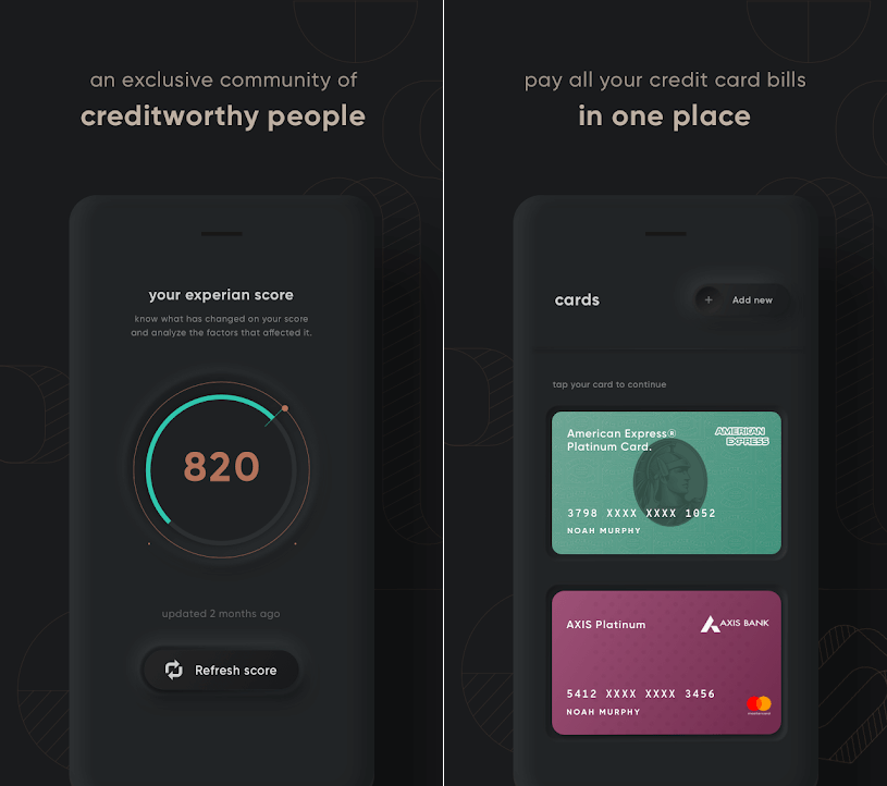
For instance – a financial app designed for millennials to take care of their credit card bill payments may look cool with a dark theme, but the same won’t work for a big bank’s website, serving the general, larger population. Too rich, too dark, and too stylish may frustrate people who just want to check their balances and transfer money.

Source: Cred

Dark UIs for B2B SaaS applications are notoriously difficult to design. Web UI components like widgets, forms, data tables, and dropdowns can look odd on a dark theme. Owing to the type, context, and environmental factors, certain brands and products are not an ideal fit and may prove an insurmountable challenge.

If your designers have not worked with dark UI design before, they might find themselves in rough, uncharted waters. In the world of dark UIs, norms are bent, pitfalls aplenty, and trends change quite often. 

Having said that, using dark UIs is a good call for a number of reasons:

  • With the minimalist design having only a few content types.
  • When there is appropriate context and use; like a nighttime entertainment app.
  • When a striking and dramatic look is needed.
  • To make a statement for the brand.

Not to forget, there are scenarios when dark UI is a bad call. When there is too much text (dark background makes reading difficult), a lot of mixed content types, or the design calls for a wide range of colors, the dark theme should be avoided. 

Impact of dark theme on UI design

As developers, we are always considerate of UI design trends and user preferences while making the best use of our time and resources. So, is adding a dark mode design a worthwhile use of the client’s budget?

We would say, this totally depends on the use case. As established earlier, the dark mode can sometimes be a hindrance to comprehension. We won’t recommend it for digital products where it could lead to big consequences. For instance, online banking services or regulatory platforms.

In other instances, we can turn to dark UI design to influence user behavior. If user engagement is an important metric for your product like Twitter, Reddit, etc, then the case for the dark theme will be stronger.

7 dark theme design tips from Galaxy

Dark theme design captivates the audience when done right. That’s what we aim for with all products that we develop. Here are seven design tips that we also practice:

  • Considering brand (identity, image, etc) 
  • Avoiding pure black
  • Avoiding heavily saturated colors
  • Ensuring enough contrast in colors
  • Softening white backgrounds
  • Matching color to the brand message
  • Communicating depth

Summing up 

It boils down to personal preference…

For most users, it all comes down to personal preference. Most of them don’t care about their eyesight or battery life, or have an aesthetic preference – they just like the way it looks and that is it. With iOS 14, Apple, who controlled their product’s design with an iron fist, allowed users to add custom icons and home screen widgets. Maybe this is not about choosing between light or dark mode, but about allowing users to configure what they like.

About Galaxy Weblinks 

Galaxy delivers end-to-end software design & development services. With a decade of experience in digital and interactive design, we create compelling and human-focused experiences. Our UI/UX designers are creative problem-solvers, delivering clean, and minimalist UI.

10 Design Principles for Exceptional User Interface

Creative visuals, attractive logo design, or intricate animations! What goes into making an exceptional user interface? A good UI includes a mix of factors that make it clear, consistent, simple, and user-oriented.

Defining the requirements of a good user interface is especially critical if you are considering outsourcing your project. Your design and development partner should understand the key principles that transform a user interface into a powerful tool for attracting new customers and retaining existing ones.

Let us go over the core principles of an effective and appealing user interface.

The 10 Fundamentals of a Good User Interface

Here is what goes into an appealing and intuitive user interface for a web or mobile application.

1. Consistency is the key

Source: Behance

In good user interface design, consistency rules the roost! Everything is affected, from the colors, icons, and fonts to the placement of menus and buttons. If changes are required and the designers who worked on the first version are no longer available, the situation becomes even more critical.

Top digital solutions do not astonish their users with radical changes. Instead, they use brand books and company style guides to maintain a consistent and unified style throughout UI design.

2. Hierarchy in screens

Source: Dribbble

Some inexperienced designers make the mistake of attempting to highlight everything on a single screen. Instead of guiding customers to a purchase or other desirable action, they bombard them with information.

That is why hierarchy is an essential component of a successful user interface.

It should be designed in such a way that users can quickly find the point of focus and understand what you’re trying to convey visually.

3. Flexibility 

Users now enjoy looking for a solution to their problems. That is why a good user interface should be supplemented with tabs, shortcuts, and hover tooltips. Such elements improve the interface’s usability and intuitiveness.

You may also like: 10 Tips to Improve Your Website Accessibility

For example, if an app allows you to upload photos, it should also allow you to crop, resize, rotate, and edit the image right next to it. The designers’ goal is to assist users in determining where such options can be found and whether such features are available at first glance.

4. Clear and intuitive user navigation

Where can I find the main menu? If you’ve ever asked yourself the same question, you’ve most likely encountered a poorly designed user interface. While visible to users, it should be “invisible” in terms of user disruption. A high-quality user interface should be well-structured and contain only the necessary elements.

For instance, a car-rental website should not be cluttered with unnecessary buttons, menus, and visual elements, but rather provide the option to rent a car right on the main screen. As a result, users will spend less time navigating your application and complete the transaction.

5. Target audience is well-defined

A digital product with a clear understanding of its target users has a better chance of retaining and engaging users. The primary goal of any web or mobile app is to alleviate the pain points of users, which is impossible to do without understanding how they interact with an application.

A good user interface is built on preliminary and in-depth market research, engagement of best practices from similar products, and evaluation of the target audience. This enables acting on a user’s needs and desires based on such an analysis and transferring the solution to the app interface’s pain points.

6. Transparency of user actions

When you click a button, you expect to see some sort of response. In UI design practices, leaving users without any feedback is considered bad etiquette. When users click on a menu, it’s a good idea to confirm the action with some sort of indication of successful operation, such as animation, color change, pop-up window, progress bar, and so on.

7. Limited number of gestures

Swiping, tapping, pressing, gesturing, or voice command are all options. All of these actions are used in the user interface to guide customers to the desired outcomes. Although it may appear to be a brilliant idea to use them all within an application, top interfaces such as WhatsApp or Facebook stick to a limited number of gestures.

When using an application, users should have a clear understanding of the actions that must be taken in order to achieve the desired result. If you tap to open a file, you should use the same gesture in all similar situations.

8. Additional tips and tricks

User retention is the primary task and, conversely, the primary challenge of any digital product. Fortunately, an effective user interface can help achieve the goal.

You may also like: 3 UX Gamification Techniques to Boost Engagement

Creating onboarding tips and showing them to customers is a good practice for very complex solutions. The UI carefully guides them through the app and helps them remember what each element is responsible for by placing small tips here and there, such as hover tooltips.

9. Attractiveness

This point is critical, despite being somewhat controversial in the eyes of some. A good user interface is one that is appealing and reflects the brand’s personality. Buttons, colors, fonts, and visual elements all contribute to a distinct brand story.

What appears appealing to one group of users may be repulsive to another. As a result, a successful user interface should be founded on extensive research. Furthermore, the visual aspect of user design should be used to reinforce functionality. Popular and well-known applications do not use colorful visuals that add no real value to the user interface.

10. Compliance with design standards

As previously stated, users must understand what to expect from a user interface.

Following Google’s and Apple’s primary and well-known design standards for Android and iOS is a good idea.

Take, for example, a search bar.

It is not a good idea to move it from the top of a page to the bottom. This way, the user interface will inadvertently make users struggle to perform actions that should be intuitive.

Conclusion

As you can see, good user interface design entails more than simply making an app or website look nice. It considers all of the users’ needs and creates an interface that reinforces consistency and assists users in completing their tasks in the most seamless manner possible. Use these tips as a guide for your next project, and you’ll be sure to deliver not only a functional product, but one that users will want to return to. 

Do you want us to get you or your company started on creating quality design components for your product? Reach out to us to get your project off the ground.

About Galaxy Weblinks

We specialize in delivering end-to-end software design & development services. Our UI/UX designers are creative problem-solvers with a decade of experience in all facets of digital and interactive design. We create compelling and human-focused experiences delivered through clean, and minimalist UI.

What is design thinking, and how do we apply it?

While dealing with complex problems that are poorly defined or unknown, design thinking comes to the rescue. By understanding the human needs involved, this design methodology provides a solution-based approach to problem-solving. Understanding the five stages of design thinking will enable anyone to apply these methods to solve complex problems, regardless of the issue’s scale, industry, or context.

Industries are actively adopting the human-centric approach to evolve existing products and generate new ideas to better serve their customers. Let’s look more closely at what design thinking is and how to apply it to your organization.

What is design thinking and why is it important?

Design thinking is an ideology as well as a process for solving complex problems in a user-centric manner. Its emphasis is on achieving practical outcomes and solutions that:

– Are technically feasible and can be developed into functional products or processes

– Are economically viable, the company can afford to develop them

– Meets a genuine human need, thereby making it desirable for the users

According to the design thinking ideology, to come up with innovative solutions, one must adopt a designer’s mindset and approach the problem from the user’s perspective. Simultaneously, design thinking is all about getting your hands dirty; the goal is to turn your ideas into tangible, testable products or processes as soon as possible.

Five actionable steps in the design thinking process

#1 Empathize

What? You will interact with and observe your target audience during the empathize phase.

Why? The goal of this step is to create a clear picture of who your end users are, the challenges they face, and the needs and expectations they have.

How? You will conduct surveys, interviews, and observation sessions to develop user empathy.

For instance, you want to address the issue of employee retention and ask each employee to complete an anonymous survey. You then conduct user interviews with as many employees as possible to learn how they feel about the organization. 

#2 Define

What? The next step is to define a clear problem statement based on what you learned during the empathize phase.

Why? Your problem statement identifies the specific issue you will address. It will guide the entire design process from this point forward, providing you with a fixed goal to focus on and assisting you in keeping the user in mind at all times.

How? While framing your problem statement, you will prioritize the needs of the user over the needs of the business. A good problem statement is human-centered, broad enough to accommodate creativity, while also providing guidance and direction.

For example, “My employees must be able to maintain a healthy lifestyle while working in the office”, is far more user-centric than “I must keep my employees healthy and happy to boost retention.”

#3 Ideate 

What? With a clear problem statement in mind, you should now try to generate as many ideas and potential solutions as possible.

Why? The ideation phase encourages you to think outside the box and investigate new possibilities. By focusing on quantity rather than the quality of ideas, you will be more likely to free your mind and stumble upon innovation!

How? During dedicated ideation sessions, you will employ a variety of ideation techniques such as bodystorming, reverse thinking, and the worst possible idea.

To illustrate – Based on what you discovered during the empathize phase, you hold several ideation sessions with various stakeholders. With your problem statement in hand, you brainstorm as many ideas as you can for how you can make your employees happier and retain them. 

#4 Prototype

What? After you’ve narrowed your ideas down to a few, you’ll create prototypes—or “scaled-down” versions of the product or concept you want to test.

Why? The prototyping stage provides you with something tangible that you can test on real users. This is critical to maintaining a user-centric approach.

How? Prototypes can range from simple paper models to interactive, digital prototypes, depending on what you’re testing. Have a clear goal in mind when creating your prototypes; know exactly what you want your prototype to represent and thus test.

Example – During the ideation phase, one suggestion was to provide free yoga classes. You set up a dedicated yoga room in the office, complete with mats, water bottles, and hand towels, to test this idea.

#5 Test

What? In the fifth step of the design thinking process, you will test your prototypes on real or representative users.

Why? During the testing phase, you can see where your prototype works well and where it needs to be improved. You can make changes and improvements based on user feedback before investing time and money in developing and/or implementing your solution.

How? You will conduct user testing sessions in which you will observe your target users interacting with your prototype. You can also solicit verbal feedback. You’ll make changes to your design or come up with an entirely new idea based on everything you learn during the testing phase!

For example, suppose you decide to put the yoga idea to the test for two months to see how employees react. People enjoy the yoga classes, but they are put off by the fact that they are in the middle of the day and there is no place to shower. You decide to move the yoga classes to the evening based on this feedback.

Success stories in design thinking

The most obvious contexts to benefit from design thinking are product and service design. However, the design thinking framework can be applied to a wide range of problems outside the realm of design!

Design thinking is increasingly being used in business to promote innovation and teamwork. IBM created the Enterprise Design Thinking framework to “help multidisciplinary teams align around the real needs of their users,” claiming that businesses that use the framework are twice as quick to market, 75 percent more efficient in terms of teamwork, and enjoy a 300 percent return on investment.

The insurance company MassMutual used design thinking to solve the problem of getting young adults to buy life insurance. Over two years, they conducted extensive user research in collaboration with IDEO. They then spent another two years prototyping and testing based on what they had learned. The result was the Society of Grownups, a set of digital tools designed to teach young people how to make wise financial decisions.


We hope that our blog has helped you understand the design thinking process. Contact us for a professional consultation on how to put a design thinking approach in action for your product idea to create a trending product.

Aligning UX Strategy With Business Goals

Businesses are ruled by customers and what they experience when they use your products or services. UX strategies help create coherent experiences across all the customer’s touchpoints. It comprises the plans and processes that would mold the design and development of your products. 

Here are some tried and tested key steps for aligning your UX design with your business goals and, ultimately, building a strong UX portfolio and a successful company.

Define business goals and objectives

Your design team should be aware of the business goals and a perspective on the various requirements and needs that your product is going to address. By sharing this information with the design team, they would give due diligence to the business goals while developing the product. 

To align UX strategy with the business, you need to understand and make everyone aware that UX is not a single person’s responsibility; everybody involved in product development is responsible. This implies that every team member will have ownership of the product. 

Keeping it simple helps in almost all the scenarios. When you are communicating business objectives to UX designers, try and do the same. Involve everyone from product leaders, stakeholders, designers and possibly, developers.

Start by answering these for clarity:

  • Users – Who are the users? Who do you target?
  • User needs – What are the problems that you want to solve through the product?
  • Product goals – What do we want to achieve? Be specific 

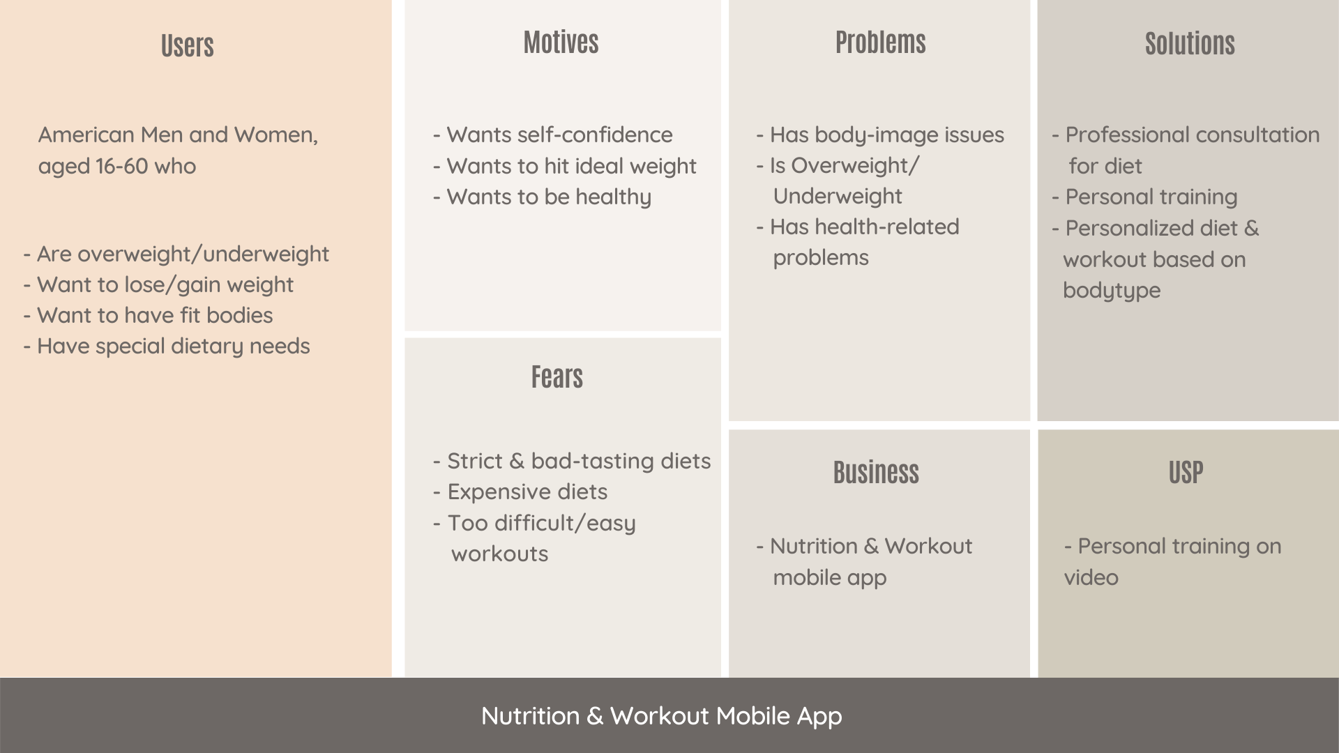
Introducing a framework can streamline your process and improve collaboration. We suggest you go with the User-Centered Business framework. It is very detailed and thorough. It is designed to highlight every important aspect of the product, business, and its users.

Here we have used a Nutrition and Workout app for example to showcase how the framework looks like. You can clearly see traits of users, what are their motivations, fears, and problems. And also how the app aims to solve problems and what is its unique offering.

Aligning

This framework focuses on –

  • Existing solutions – Initial research of what you’re competing against
  • Early adopters – Enthusiasts who test your products and do interviews about it
  • User fears – Addressing user fears with communication before it becomes a major pain point

Creating user personas

While building a product you need to find out what your users need. Once you find out what those needs are, then release features fulfilling that need. 

Personas are based on assumptions. However, you can identify and validate these assumptions with research and ensure that your personas fit the description of your target users.

A UX designer can take the help of these personas while designing for a paying user. They will know what benefits to talk about and what fears to address based on the persona’s fears, motivation, and goals. But everyone in the team must truly understand the product and its users to accomplish this. 

Aligning user needs with business goals

There is often a disconnect between user needs and business goals. And it’s no single person’s fault. Designers are just executing and the Product team is just building what stakeholders need. But in this vicious cycle, user needs remain unaddressed. 

When you start working within a framework–like User-Centered Business Canvas– and according to identified user personas, the business needs to start to follow suit. You just need to ensure that you define the business goal behind it with every stage of the framework. Like if the stage is Onboarding, you would have to define your business goals for onboarding and your expectations from users.

Here are some essentials to align business goals with user needs:

  • Test everything
  • Conduct interviews to validate the assumption 
  • Sort and prioritize features

Conducting design reviews

Feedback is a crucial part of any design process. It’s the only way to know if there’s any room for improvement. Design Review is an exercise to provide meaningful feedback to designers. All the attendees get a role assigned to them so that every individual can observe the design from a different perspective.

Here’s how to get started:

Invite everyone in the team, designers, developers, and stakeholders. Here is what we recommend- 

  • Assign roles
  • Present the designs
  • Work individually and collect remarks
  • Discuss and prioritize

For example – 

Person 1– looks at the facts

Person 2 – looks for problems and potential risks 

Person 3 – looks at what is good in the designs

Person 4 – looks for ways to improve the product

Wrapping up

Knowing your product and its users is essential for striking a balance between a usable product that users desire and a product that meets stakeholders’ business goals.

Our process will help you make beautiful-looking products that users like and stakeholders love.

About Galaxy

We specialize in delivering end-to-end software design & development services and have hands-on experience with app UI/UX design in agile development environments. Our designers, engineers, and developers help improve security, reliability, and features to make sure your business application and IT structure scale and remain secure.

Top 7 User Frustrations on the Web and How To Fix Them

What were the most challenging aspects of the website’s user interface that you encountered today? Users are often dissatisfied with minor details that go unnoticed. Vitaly Friedman, the famous author of Smashing Magazine, summarized the key areas that may exasperate your users. If you do not fix these issues on your website, it may harm your user experience. 

In this article, we’ll go over the top 7 most common user frustrations and how to address them. 

#1 Scroll hijacking

Scroll hijacking is when a website’s scrollbar is manipulated to behave differently. Scroll hijacking is commonly used to display specific animated effects. Crisp illustrations and fine animations, on the other hand, do not always make for a great web experience.

How to fix the issue?

So, how do we apply this incredibly cool effect practically and rationally? 

First, you must evaluate the user group and the type of experience you are attempting to create.

  • Is the group accessible to everyone?
  • How high is the visitor’s traffic?
  • Does it use multiple devices? 
  • Is the website ADA compliant?

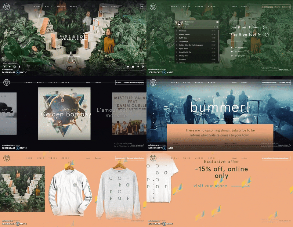
Are you planning to create a website for a niche group, such as a med-advanced tech user, an early adopter, or device-specific? If you are contemplating adding parallax scrolling effects, you can consider this example –

Source: Valaire

This page scroll design is fantastic! You don’t get the impression that a robot has taken over your ability to navigate the content. You have complete control over the scroll speed and your position on the page. It’s a fun experience that makes me want to go out and explore more! The location indicator is useful, and the sticky menu items provide a sense of stability to an otherwise erratic design.

#2 Tiny click targets

The smaller the interactive elements (links, buttons, and other user interface controls), the more errors the user will make when interacting with your website.

How to fix the issue?

  • Touch targets should be easy to use with your fingers. The touch target should be 9mm x 9mm in size on average. According to Material Design, touch targets should be at least 48 x 48 px in size.
  • Padding should be added around touch targets. Microsoft recommends padding between touch targets of 10mm.

#3 Not working “Back” button

One of Jakob Nielsen’s ten usability heuristics for user interface design is user control and freedom. It states that users require a marked “emergency exit” to leave the unwanted action without having to go through a lengthy process.

How to fix the issue?

The Back button in a browser is the equivalent of an emergency exit. If you are concerned that users will lose their data by clicking the Back button, it is best to warn them by displaying the message “Your work will be lost” when they click the Back button.

#4 Small-sized text

Despite the recent popularity of video formats, the majority of information on the internet is still written. As a result, good readability and legibility are critical for a positive user experience.

How to fix the issue?

  • The font size should be at least 16px. 16px for body text is a good starting point, but keep in mind that the larger the screen size, the larger the text.
  • Line height should be 1.5em or 1.6em for best readability.
  • Always test your designs on a real-world device.

#5 Unexpected content shifts

You’re about to press the link. You move your cursor over the link and click it, only to realize you’ve made a mistake. Instead of the intended link, you click on the ad. Isn’t that the case?

Typically, the content shift occurs as a result of dynamically loading content. Because this operation is asynchronous, dynamic content is inserted into the page and replaces existing content.

How to fix the issue?

To work around this issue, measure the height of the dynamic content and hardcode it as a (min-height) for the container in CSS as done in this verge webapp.

Frustrations
Source: Verge

#6 Sign up walls

Sign-up walls are a requirement to create an account to use a service. Sign-up barriers keep users from exploring the service.

All software, including websites, should be built with this principle in mind: You should always try before you buy.

How to fix the issue?

Users usually try something new, form an opinion, and then decide whether or not to use a service. In the context of news websites, for example, it is possible to provide a limited number of articles that users can read without creating an account and then ask them to create an account only when they engage.

#7 Confusing forms

Forms are an important part of the user journey; they are used to log in, sign up, check out, and so on. As a result, it is critical to provide clear instructions both before and after submitting the form.

How to fix the issue?

  • Avoid relying solely on color to denote an error. Always provide actionable feedback to facilitate a correct entry.
  • If the form is too long, consider dividing it into logical sections and displaying a progress bar to show the user where they are in the process.

Wrapping Up

One of the most important aspects of creating a great web design is keeping up with industry trends and implementing the ones that will work best for your web product. Contact our UI/UX design experts if you want to create custom software with a pleasant and unique user interface.

5 Tell-tale signs that your mobile app needs a design overhaul

With hundreds of apps being released every day, keeping up with the competition has become quite difficult. Testing and developing an app is still fine, but keeping up with daily challenges and new user requirements can be a mammoth task.

Moreover, most people either wait too long before making a redesign (which can be critical, especially when it comes to mobile and web apps) or can’t stop making redesigns, which influences user behavior and brand development negatively.

That is why we have decided to write about 5 signs that can assist you in identifying “just the right moment” to make a UI/UX refreshment.

#1 Heard of new cool service/trend in your niche

It gets a little complicated when there is a buzz about a new startup/ product that is in direct competition with yours. New apps are constantly being released in the market, and your users can easily switch if they think they will get a better user experience with your competition. 

It’s important to keep your finger on the pulse of the market, but you also need to work in iterations: create a redesign, gather feedback, see the new UX in action, and move on to the next redesign. This process usually never ends, especially if you started from the MVP stage and need to expand functionalities.

So, if you’re a growing product, the best solution is most likely to have an offshore design partner or in-house design resources to assist you.

For example, if you need a redesign to improve user experience and market growth, you can create a step-by-step redesign and transition from one flow to another. The most important aspect is to work with the designer to define the workflow and iterations by conducting in-depth analyses of the entire design solution.

#2 Received multiple bad user feedback

Who says your current design will be popular indefinitely? There is always room for improvement, and you must constantly analyze the user feedback. But don’t rush! You’ll need to collect enough data to define the main clusters and prioritize them. Only after key pain points have been identified should the redesign be entrusted to the design team.

You will be able to understand (or the design team will suggest) what changes are needed based on the feedback from users. Many people nowadays hire designers solely for this “audition document” and then work on the design themselves. How often do you think it produces good results? Nearly never.

#3 App and website’s bounce rate is growing

The most common reason for redesigning a website is a high bounce rate. A high bounce rate is not a good thing for apps (when users stop using an app after downloading it and delete it) or websites (when leads and sales are decreasing).

The true reason could be that your UX is not measuring up. In most cases, the bounce rate is not about the visual aspect (though it is still extremely important), but about the user experience. The bounce rate would be lower if your app was simple and interesting to use.

To improve the situation, it is preferable to conduct an audience analysis, review all feedback, and redesign the interface completely. Begin at the beginning and include the following in the redesign:

  • UX research in collaboration with the market, users, and best practices analyses;
  • The new function list and screen map; UI design;
  • Update the branding and graphic designs.

#4 Your most recent refreshment was more than 1.5 years ago

In our fast-paced world, the normal life cycle of a design is 1.5 years. “Do I have to pay for design and development over and over again?” The answer is a resounding Yes!

To begin with, users may become fatigued with a single design solution. Second, while you are doing nothing to improve your design, your competitors are. At the same time, new solutions are being introduced to the market. Third, are you certain there are no changes in your company that you would like to share with the community in the next 1.5 years?


Though a complete redesign is not required, a visual refreshment is required. Adding no functionality will not increase development costs, but you will begin to earn more leads, partners, and clients instead.

#5 You have a design that was created using a template or by a developer

Many people prefer to make very small investments in design at the start of a product’s lifecycle. 

Now that your mobile application has become successful, you need a one-of-a-kind, fully customized UI/UX design. In this case, conducting best practices analyses, selecting good references, and creating a new UI design that presents your brand’s advantages to the market will suffice.

Wrapping Up

The redesign is very likely to bring you new customers who are delighted with your mobile application. However, keep in mind that only a good redesign has a positive impact on the audience, and this is where things get tricky. Only work with reputable companies when redesigning your home.

The criteria could be as follows: a good company will present you with an audition of your current design solution, as it is critical to identify the key flaws in the current UI/UX part. Talk to our UI/UX experts today, if you can see any of the above signs in your present app or website.

About Galaxy Weblinks

We specialize in delivering end-to-end software design & development services and have hands-on experience with app UI/UX design in agile development environments. Our designers, engineers, and developers help improve security, reliability and features to make sure your business application and IT structure scale and remain secure.