Why is the Offshore Model better for UX design projects?

Note: This is an updated version of “Offshore UX | An option or need of the hour?” initially published on May 26, 2020. 

The world of business has changed dramatically since the pandemic. Real-time data and advanced analytics tools allowed the companies to adapt their strategy instantaneously. As witnessed after the outbreak of COVID-19, technology also facilitates instant communication with your team, no matter where they are located. Offshoring UX is now seen as a viable option. 

The consumers of technology expect a simple, intuitive, and visually appealing user experience. This was once considered aspirational and the domain of premium brands, necessitating months of research and large budgets. What was once exceptional is now a standard for all digital touchpoints, regardless of brand or budget. So, how can mid-tier firms with smaller budgets and shorter deadlines meet this expectation?

This challenge existed even 2-decades ago when the small businesses and big enterprises began offshoring software and product development. This approach is well understood and widely accepted and can be adapted to meet the needs of modern user experiences. 

In this post, we’ll talk about why it makes sense for your business to hire offshore contractors to handle your next UX design.

UX design has become a requirement

With the increase of technology in our daily lives comes increasing demands from consumers. Interfaces must be able to compete with the increasing standards. More products will begin to need UX designs. Being a market leader in your space, or even just staying afloat, will require it.

Even if you haven’t needed a UX designer in the past, there’s a good chance you will in the future. With that in mind, let’s talk about why offshore UX is a good business decision for your current or future UX designer needs.

Local talent can be hard to find

Because of the demand for UX designers, it can be hard to find local talent that is also available for full-time work. This is especially true if you want to hire top talent, which will command a higher price and be harder to keep on staff without some other company coming along with a better offer.

Thankfully, some of the same skills you look for in a full-time employee are what you’d look for in a remote employee. For both, you want someone who is a self-starter and will get the work done on time and as per specifications with minimal oversight on your part. As top UX designers realize they can make more work for themselves and takes on multiple jobs at multiple firms throughout the year, it becomes easier to find a qualified person for the job without having to commit to a full year’s salary.

The economics of developing nations

In the countries where the cost of living is low, the highest-paid professions may receive a little more than you would pay a UX designer. This means that UX designers in those nations can price themselves very competitively compared to western nations and still live a very comfortable life relative to their peers.

Of course, you’ll have to put some effort into finding the right candidate when you look outside English-speaking countries. Residents of most countries learn English as a second language, but you want to make sure that they speak it well enough that no language barriers exist. With offshoring, you’ll save money and provide someone with a better income than they could get in their economy alone.

Technology breaks down boundaries

Because it is such a visual art, there was a time in the past when doing UX work remotely would have been extremely difficult. This may be why there is still a reluctance on the part of many to embrace outsourced UX designers.

We now have technology that allows us to video conference and share our screens easily. There are cloud-based solutions, such as Miro and Invision, that allow for collaboration on even the most advanced projects so you’ll be able to give feedback to designers in a professional manner and ensure that nothing gets lost in the translation.

Combine that with the fact that all but the poorest of countries have access to high-speed internet, it is now possible to engage in real-time feedback even for visual projects like UI and UX. The boundaries that once stood in the way of taking UX design off-premise have now been torn down by technological advances.

Offshoring is flexible

If you’re a large business, you already have a design department with competent directors and senior designers. In that case, it will be the additional workers that take the vision of the senior members and help implement it that would make prime candidates for offshore workers.

For small businesses, it is impossible to hire a full-time staff to do your design work. Offshoring makes finding someone for a one-off job even more affordable.

Better Cost Control

Working with an agency allows you to control costs in a way that hiring someone in-house does not. After signing a statement of work (SOW), agencies are required to follow the scope of work outlined in the contract.

This specific type of agreement gives you more control over when work begins and ends, as well as how much money you commit to the project.

Increased Time to Value

Because agency design teams must meet tight deadlines, they typically adhere to strict, time-tested procedures. Whereas an in-house hire may take a week or two to get up and running, a good agency can ramp up and begin delivering within two to three weeks.

Often, agencies can simply do the work faster. For example, our UX team at Galaxy has been able to completely redesign relatively complex SaaS applications in less than three months, whereas an in-house team would typically take at least twice as long.

The bottom line is that agencies can move your project more quickly to the point where your investment begins to pay off.

Conclusion

For most companies, hiring designers locally is the way it’s always been done. With the coronavirus pandemic teaching us that remote work is not only possible but very practical, it may be a good time to consider the more affordable option. Now that we know situations can arise to force us into our homes, it would be a good time to take what we’ve learned from the outbreak and use that to experiment with new, cost-effective, and disaster-resistant forms of business.

9 UX trends that are here to stay in 2021

New trends are emerging in every industry vertical, UX included. To keep business thriving, you have to be quick to recognize, analyze and implement trends on priority. Furthermore, any enhancement in the visual aspects of your product would lead to a higher recall from the users. 

Our experts can not stop themselves from trying new trends. We have listed the ones that will make ripples in 2021.

3D Elements 

There has been a huge surge in three-dimensional designs across the web and mobile interfaces. This not only gives an edge to your flat design but also helps draw users’ attention to the primary features and aspects of your website and app. 

These elements hold user’s attention for a longer period and encourage them to interact with your product. However, all these 3D animations and illustrations need to be optimized so that they don’t increase the page/app’s loading time.  

Engaging Motion Effects 

Animated user stories, parallax scrolling, micro-interactions, etc all are liked by users across demographics. Motions bring life to your design elements like illustrations, animations, etc.

Parallax scrolling is another emerging effect to entice users for further engagement. When users notice the difference in scrolling your webpage, out of curiosity, they will spend a few seconds more. The right mix of effects will make transitions much more delightful for all your users. However, overdoing the same will push back users, thus a few effects on the most vital features and pages should suffice. 

Neumorphism

The mix of flat design and skeuomorphism is Neumorphism. It uses shadows and highlights to give an almost 3D look to the design elements. It layers the elements in a subtle and minimalist way. Designers use similar color pallets, standard shapes, and icons, etc here. This ensures that users don’t get any sudden or unwelcome surprises.  

Asymmetry Arrangements 

The classic layouts have lost their charm among users. Any generic design presented to the users is getting lost in the virtual crowded space. Hence asymmetry and creative approaches are taking the center stage. You will need to brainstorm a lot before you come up with the ‘perfectly asymmetric yet balanced’ structure. Brainstorming is necessary so that you are not compromising on the usability and accessibility aspects of your product at any point. 

Dark Mode 

Dark mode has been implemented successfully by many organizations, but many are yet to follow. Therefore, dark mode makes this list. The benefits of dark mode are now well recognized by users too. It helps in decreasing screen fatigue (something this pandemic brought to light), saves user’s devices batteries, and is worth exploring for your product offering.  

Designers can highlight elements more easily here and use high contrast elements for focusing on the primary functionalities. A win-win situation for all!

Improved Onboarding 

A swift onboarding process will hook users for a longer duration. We saw complex remote collaboration tools and video conferencing options being disliked by users because they were complicated to use and the onboarding process shown was not very helpful. 

A smooth onboarding process with a mix of subtle hints, micro-interactions, and the option to returning to certain learning aspects play a part in creating a lasting impression on users. Storytelling is also being implemented so that a connection with a certain character/avatar can be made by users. 

Color Palettes For Playful Backgrounds 

When the talk is all about standing out from the crowd, bright, neon colors do this for you easily. Designers are willing to play with bold colors like never before. Unconventional color mix, using popping colors on your website, or just highlight the main features are the craze now. 

All this is done so that users are seeing a different and experimental side of your organization. Mixing darker shades with bold colors, following a bold theme throughout your website and app is a great way to stay in your user’s mind. But again ensure that the colors don’t distract users from the primary features and are not bringing on any accessibility issues. 

Typography  

In line with playful color backgrounds, typography is also something that UI/UX designers are testing out lately. Font style, bold text, creative text display are all being played with. And add small animations to your text here and there, users will keep interacting with your app and website. 

Bold text, especially on the hero page screams attention like nothing else (in a good way of course). On one hand, web typography is getting bigger and bold, the apps are leveraging ALL CAPS and creative fonts to fit in varying screen sizes.

Uniqueness Trumps Perfection 

What differentiates you from your competitors? What unique design will create a long-lasting impression on your users? Designers are no longer going after being ‘perfect’ in their design across platforms. In 2021, you will see more creative experiments with design layouts, elements, animations to have a higher recall value. 

Color play, different typography, playing with layouts, and all that we have covered in this blog will all contribute to delivering a unique user experience. These trends have gained a lot of popularity within the designers’ community and will continue to do so until users express some other preferences. 
To know more about our UX services, contact us here. 

What Are the Best Practices of Outsourcing UX/UI?

UI/UX is the backbone of any product as it is the first thing that users notice or are drawn towards when they visit a website or start using an application. The success of your company is largely determined by how happy your customers are with your product offerings. This is the reason why businesses are increasingly paying a lot more attention to UI/UX.

When it comes to building a UX/UI team or outsourcing the work to a design consultancy for professional UX/UI services, there is a need to have a well defined process. The process includes several tasks that require decision making and can be crucial to ultimately delivering the right product. There are several benefits of outsourcing UX/UI including an up to 50% reduction in costs, access to professionals with diverse experience and different skill sets, scope to adjust resources based on needs, etc. Thus, allowing you and your team to focus on core business functions.

While outsourcing can be challenging, having best practices during the entire design UX/UI process would help mitigate the risks. In this article, we have compiled some of the key best practices of outsourcing UX/UI services.

– Carrying out research and formulating a plan

Each idea aims to solve a specific problem catering to the needs of its user base. So it is a crucial first step to carry out a thorough research to know your market, understand the target audience, identify the market gap, research your competition, and differentiate your product offering. Better research leads to a better product. If you don’t invest your time in research, you will end up with a lot of iterations which would mean increased manhours and capital. Hence it is important to carefully think out your product idea, define why and how you want to design the product.

– Choosing the right outsourced design agency

Choosing the right outsourced design agency is a crucial step. While selecting the right agency, keep in mind that the agency should be aligned with your organization as well as with the project requirements. The agency should have relevant expertise and experience, and this can be evaluated by looking at their portfolio, looking at the company’s reviews on Clutch/Dribble, as well as speaking to their references.

– Setting the scope at the start

The work scope should be established at the start of the project with clear deliverables and timelines. This allows the agency to plan resources and allocate time accordingly. Also, having a clear set of scope/deliverables allows you to plan the next phase of your project efficiently. Not setting a scope at the start could lead to several iterations resulting in cost overrun and project delays.

– Setting up effective communication

Effective communication is a key factor in the success of any outsourcing project, especially if the company is in a different time zone and has cultural differences. A key best practice for outsourcing UX/UI is using project management tools like Asana, Basecamp, Trello, etc and communication channels such as Slack, Zoom, Teams, etc. These tools enable teams to work together throughout the design phase efficiently.

– Relaying feedback throughout the design process

The UX design phase focuses on having a deep understanding of users – what they like and dislike, what they need, and what they value the most, keeping the ease of use, a key priority. The UI design phase focuses on anticipating what users might need to do and ensuring that the product has elements that are easy to access, understand, and use. Both of them are an iterative process and require continuous feedback between the design agency and business owner. Hence it is important to have a frequent and open communication dialogue to better understand the users and evolve the product idea ahead of development.

Conclusion

A good UX design enhances usability, accessibility, and pleasure the user has while interacting with your website or app and ultimately your company. Great user experience is hard to accomplish with a few expensive in-house teams. While you need to maintain control of your brand, UX is something you can and should outsource in order to better focus on the core business aspects. Adherence to the outsourcing best practices during the entire design UX/UI process could help mitigate the risks associated with outsourcing. If you’ve any doubts related to UX/UI and if you need assistance, then feel free to talk to us here.

How to Avoid the Most Common Mistakes During the UX Design Phase?

User Experience (UX) has become an essential part of any online business’ success in building a connection between your users and your brand. UX is a foundational pillar of all marketing efforts for any company focusing on online business, as great user experience delights your customers, creates loyal satisfied customer base, and helps reach out to millions of users online.

The UX design phase helps map out your users’ experience long before you have spent a lot of money and time in developing a technology solution for the users. While mistakes in the UX design phase are common and often lead to rework in the product development process. However, we should always try to avoid the common mistakes, and in this article we will highlight a few important points in order to avoid mistakes during the UX design phase.

– Be Succinct. Cut the fluff

The UX designers should aim to keep the messages concise. The general rule of thumb is to keep it simple. Avoid jargon and speak to them in a voice they understand, assisting them in achieving their goals more easily. The UX design should focus on an intuitive navigation that any user is likely to take. If your users are pausing to understand a certain function or are taking time to complete any task, the UX should be simplified.

– Limit your user’s cognitive load

Mishmash of fonts, colors and elements are common mistakes that designers go overboard in differentiating the design; however, focus should remain on consistent layout and limiting your user’s cognitive load. Overloading user cognition reduces user experience. When we tend to put a lot of information out there, the majority of it is bound to be forgotten by your users and even overwhelm them. A good UX designer should focus on optimizing your user’s cognitive load.

– Focus on your Call-To-Action (CTA) objective

Not focusing on your CTA is one of the most common mistakes in the UX Design phase. We recommend that the CTA should be the most highlighted element on the page. You can do this via color play, text labels, font, and varying size, white space, etc. There should be no other element more enticing than your CTA. Another point to keep in mind is that the CTA copy should be short but concise. CTA, in our opinion, should not exceed 5 words (ideal limit being 3 words).

– Focus on testing the design with users

A product design should not be based on assumptions. Instead it should be based on user feedback – user behavior, patterns, usability, etc. A good UX design needs to be tested with users, otherwise the entire objective of the UX design phase is refuted.

– Use of icons and descriptions in error states

Colors can help convey messages but don’t rely on colors completely to convey crucial information. Using only colors in your design for important information like error states is like leaving out a large chunk of the audience at the mercy of guesswork. Introduce icons and descriptive texts along with the color to make it more inclusive and accessible.

– Use of shadows and borders 

Shadows and borders can help make the on-page elements appear sharper and more defined. A good UX designer utilizes shadows and borders to highlight important on-page elements. However, just don’t go overboard with the shadows, there’s a thin line between neat and tacky.

– Focus on responsiveness 

It is essential to have a responsive design that looks great and loads quickly across all screen sizes and devices. The UX also needs to be optimized for slow connections and slow devices.

Conclusion

We often complicate things that are fairly simple. Good UX can be as easy as going against your experimental instincts and sticking to the basics. Keeping in mind these basic points will help you avoid the most common mistakes during the  UX design phase. If you’ve any doubts related to UX/UI and if you need assistance, then feel free to talk to us here.

Customer Journey Mapping For Better Website Performance

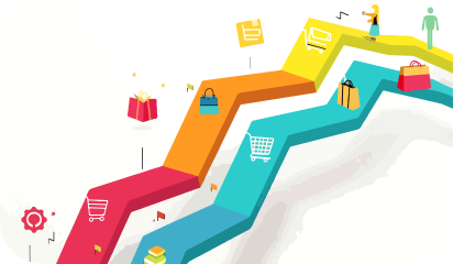
The most important question that project managers should ask themselves is, “How do I help my customers achieve their goals on my website while still achieving mine?” Focusing on that question is the starting point for improving your website experience and building a customer journey map. The first goal for preparing a customer journey map is to identify the customers’ requirements and what they are seeking using your website. Your team (Designer/ Developer/ Tester) should understand the entire process your customers go through.

The Journey Phases

This implies the different stages in the customer’s journey. They may vary as per particular scenarios. Each company can use data to analyze what these phases are as per the corresponding situation. Here are some examples:
  • For a B2B scenario (like rolling out an internal tool), the stages could be purchase, adoption, retention, expansion, advocacy.
  • For a big (or luxury) purchase (like test driving and buying a car), the stages can be engagement, education, research, evaluation, justification.
  • For an ecommerce scenario (like buying Bluetooth speakers), the stages can be – discovery, try, buy, use, seek support.
This will help you determine your journey phases according to your business type. There’s a common saying that you can’t understand someone until you’ve walked a mile in their shoes – and that’s exactly what customer journey maps do. They help you put yourself in your customers’ shoes and understand your business from their point of view. Based on this rationale, you can’t deny the importance of a customer journey map. Thus, we’ve created the following steps for crafting the best map to help your company website improve.

1. Set clear objectives

Before you can dive into creating your map, you need to ask yourself why you are making one in the first place. What goals are you directing this map towards? Who is it specifically about? What experience is it based upon? You can start by writing down the objectives on sticky notes or use a customer journey template. A customer experience map will help you narrow down one specific interaction with your business. You can have individual customer experience maps for each of the following scenarios of your business:

  • Reading your blog or exploring your website
  • Interacting with a customer support agent
  • Visiting your store or your ecommerce site
  • Using your product at home or work
  • Interacting with sales during the process of becoming a customer

2. Profile your personas and define their goals

Next, you should conduct research. Some great ways to get valuable customer feedback is through questionnaires and user testing. The important thing is to only reach out to actual customers or prospects. You want the feedback of people who are interested in purchasing your products and services and who have interacted with your company before or plan to do so. TIP: It’s best to pick your most common customer persona and consider the route they would typically take while engaging with your business for the first time. You can use a marketing dashboard to compare each one and determine which would be the best fit for your journey map. Don’t worry about the ones you leave out, as you can always go back and create a new map that’s specific to these customer types.

3. Monitor how your customers move on your site

It’s important to understand how users move through your website. For example, if you’re offering a discount code to all first-time visitors, then why is the sales low? The offer (or, ability) might be great, but consumers still lack the motivation to buy. In this case, it doesn’t matter how much products are discounted. This common scenario can be uncovered with the Behavior Flow report from Google Analytics. Make sure to examine different segments of users, whether it’s first-time visitors, returning visitors, purchasers, or create a custom segment for visitors with long session durations but no purchases: Google Analytics: Behavior Flow Look for trends, like specific drop-off points were so many users are leaving your site without converting. What page do most first-time visitors view after landing on your homepage?

4. List out all the touchpoints

Touchpoints are all the places on your website that your customers can interact with you. Based on your research on Google Analytics or basic research on your CMS dashboard, you should list out all the touchpoints your customers and prospects are currently using, as well as the ones you believe they should be used if there is no overlap. Apart from Analytics on your website, you need to determine how your customer might come across you online. These might include:
  • Social channels
  • Paid ads
  • Email marketing
  • Third-party review sites or mentions
This is an important step in creating a customer journey map because it gives you insight into what actions your customers are performing. If the number is more than expected, it is likely that your website navigation is complicated. However, if they are using fewer touchpoints than expected, this may imply that they are not convinced with your offerings and may leave the website early.

5. Map the pain points

Go back over the map and jot down pain points on sticky notes. Place them underneath the corresponding touchpoints on the journey. For added value, talk about the impact of each pain point. Is it trivial, or is it likely to necessitate some kind of hack or workaround? Even worse: does it cause the user to bounce off the website and leave their journey entirely? Get to know what roadblocks are stopping your customer from making their desired action.

6. Improvement Ideas

Start by prioritizing which touchpoints or pages to address first. You can rank pages by cost-effectiveness and or how easy they are to change. Improvement ideas are usually integrations, services, or features that we can enable. Then, it’s a matter of determining what to test. For instance, if research suggests that customers worry about getting locked into a particular plan after they sign up, tweaking your copy on a relevant page could minimize their hesitations.

Conclusion:

Once you have a better understanding of the customer journey, you can use that knowledge to improve your site by honing your messaging to match customer needs, smoothing out frustration points, eliminating extra steps, and even creating content. This will ensure your website is providing a seamless and effective interaction for customers, which leads to a better user experience. The companies need to anticipate the routes their customers may take, and optimize their customer experience along the multiple touchpoints rather than relying on one assumed journey. About Galaxy Weblinks We specialize in delivering end-to-end software design & development services. Our digital product designers are creative problem-solvers with a decade of experience in all facets of digital and interactive design. We create compelling and human-focused experiences delivered through clean, and minimalist UI.

A Guide to UX Design Deliverables

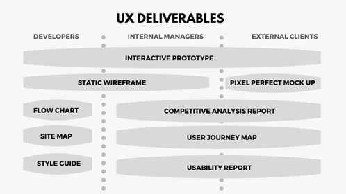
UX deliverables are a key part of building any application/product or enhancing an existing one. They may vary depending on the methods used, project, budget, and user demands, as every product is different. This, in turn, also impacts the communication between the designer and the client. Early on in the project, before the designer can share a mockup or prototype, it is common for designers to wonder what to share with clients and how often.

‘What do I show to my clients? What do they want to see? Are they concerned about my work process? When to be an open book and when to keep things to myself?’

This article lists the 7 most common deliverables created or produced by UX designers while making a new product.

These deliverables are ‘good-to-have’ in any and every project. They keep designers on track while ensuring that the clients, project managers, and designers are on the same page.

code

UX deliverables provide a clear foundation to build your designs on when you’re elbow-deep in developing your application, site, or any product.

Competitive Analysis Reports

An analysis of competitor’s products to map out their existing features in a comparable way. It helps UX designers to identify opportunities to innovate in a given area and understand industry standards.

Tip: A useful starting point for identifying strengths and areas for improvement is user experience heuristics. Heuristics include readability, consistency, clarity of text and labels, efficient navigation, etc.

Personas and UX Research Reports

With personas, you can easily empathize with users throughout the design process. The most effective personas are created from observation data and in-depth user interviews of real users. A good persona supports the UX research group!

The user research reports help in communicating research aims and methods, as well as getting buy-in from stakeholders. It’s also a great tool to translate the research findings into actionable items. They help in keeping everyone on track during the research project.

Pro Tip: There are many types of user research tools and techniques available like QuestionPro or LimeSurvey (survey tools), and FullStory or Hotjar (user session recording tools).

User Flow Diagrams and Product Roadmaps

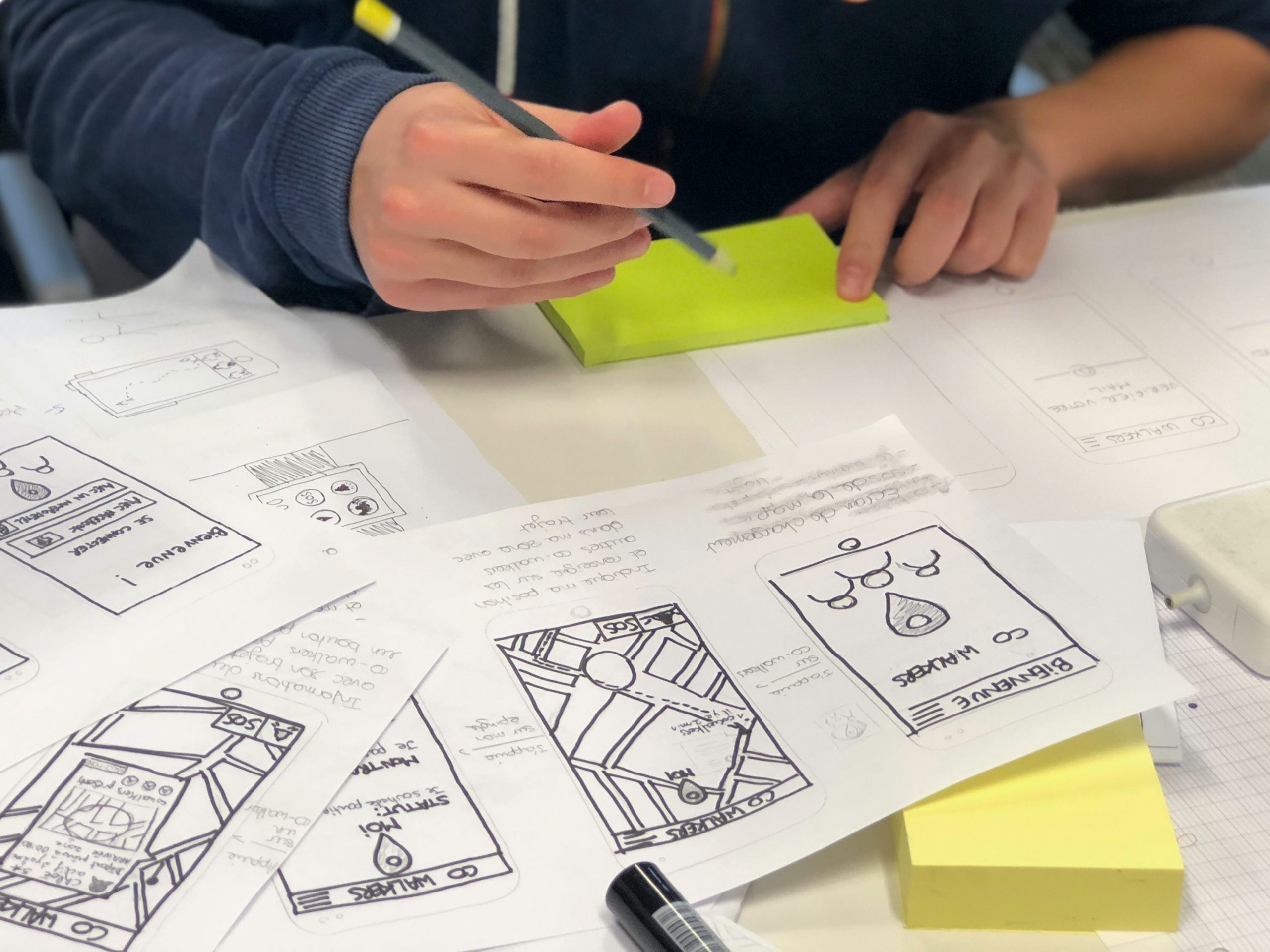
Sketches are simple depictions of a design concept. They can be quickly employed because only paper and pen are necessary for their creation. They are also easily shared between designers and also between users and developers.

Similarly, a product roadmap is a product’s evolution plan with prioritized features. It could be sticky notes, a diagram, or a spreadsheet. UX designer shares the product strategy with the team that needs to be applied to achieve its vision.

Tip: Limit the number of decision points to make it clutter-free/ less complicated. Make sure the scope of the user flow diagram covers a single goal or a single task of your user.

Static Wireframes

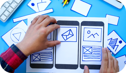
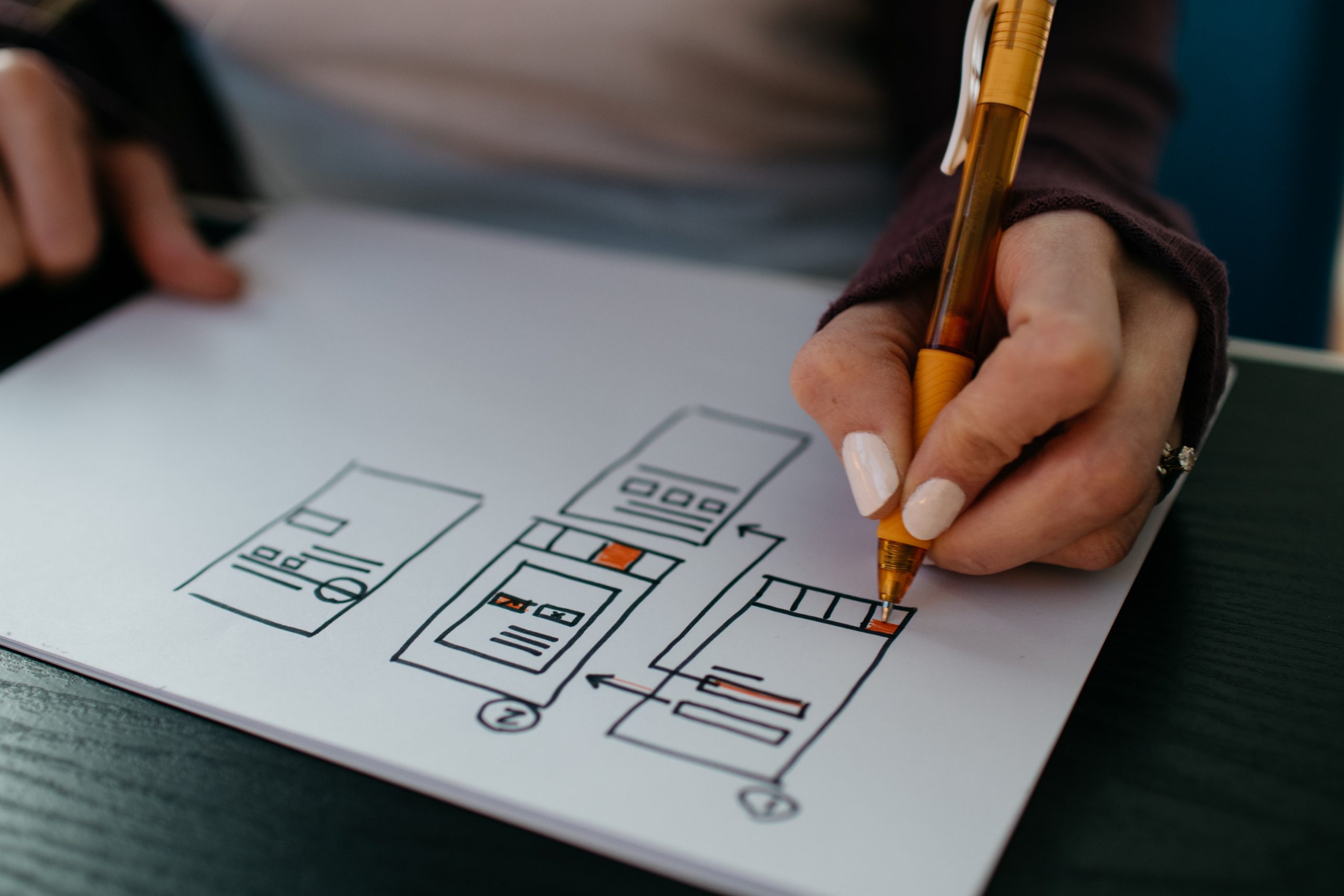
Showing your client a visual before you get into the details of the design can save you a lot of hassle. Draw a wireframe in a notebook and take a snapshot to share with your client or use tools like Figma, Invision Studio, etc. Their main purpose is to display the arrangement of the content, expected user behavior, features, and website layout.

Wireframes can also be presented as digital illustrations that represent the organization of the website/app. They can be particularly beneficial in saving a lot of time and money because they are easy to make and adjustable to work with.

Tip: If you plan to present a wireframe to the team, try to keep Wireframes simple and include annotations that help to create context and quickly deliver key ideas.

Interactive Prototypes

With tools such as Figma, Invision, and Adobe XD, the interface design level deliverables include interaction prototypes by default. Static images just cannot convey that interaction feeling. You’ll always find many small interactions or design adjustments only after you build the interactive prototype.

An internal review of a product prototype allows everyone on the team to see how things will work, and how an actual user interacts with it. It also helps users test a product that feels 100% real, provides ideas, and gives valuable feedback.

Tip: Test prototypes on real devices as much as possible, as nothing can replace experiencing designs better on a real device.

Mood Board and Visual Design

Have you ever heard from your client wanting a site that was ‘edgy, yet safe, but also cool and blue, but not icy or depressing hospital-scrubs-blue’? A mood board is a great tool for checking that your idea of the site’s look and feel matches your client’s.

Visual design is the last step before handoff to developers and the phase where a style guide and final specs are crafted. UI style guides are generally a series of guidelines or visual references or component libraries to help designers define or set the typography, UI elements, and interactions. This ensures product consistency across different design teams, companies, and brands.

-Combined design inception worksheet

Tip: Mood Boards should be visually stunning collections of ideas, full of textures and images that transform your pitching experience at the start of a project. Whereas, a design style guide can be generated in a few seconds from Sketch, and design-handoffs can be possible easily with Zeplin.

Hopefully, you now have a good idea of what a UX designer has to deliver or communicate with stakeholders.

If you’re thinking ‘we do not have enough experience to deal with this’ or “what if I don’t have enough time”, contact us to get a free UX consultation.

About Galaxy Weblinks

We specialize in delivering end-to-end software design & development services. Our UI/UX designers are creative problem-solvers with a decade of experience in all facets of digital and interactive design. We create compelling and human-focused experiences delivered through clean, and minimalist UI.

A walk-through of different user onboarding UI patterns

There’s a popular user experience quote: “A user interface is like a joke. If you have to explain it, it’s not that good.” While clever, that statement is far from the truth.

We agree that user interfaces shouldn’t be complicated. On the other hand, you can’t expect a new user to understand a new interface without any direction. That’s where user onboarding flows come into play.

This also stands true for the existing users who need directions to understand an updated interface or a new feature.

In this article, we will discuss those onboarding UIs that will help both new and existing users understand features – breaking the myth at the same time that user onboarding begins and ends with the first experience.

We’ll be discussing UI patterns like tooltips, hotspots, modals, etc. that have roots in specific types of “popup” window situations and are popularly used interchangeably in general web conversation.

Each of them offers some common purpose:

  • Contextual help: Offer helpful hints and support in the context of your product.
  • New feature Announcement: Draw attention to a new feature without interrupting a user’s workflow.
  • Influence User behavior: Gently nudge users to explore, learn, or take action.

When used correctly, they can be powerfully engaging. But when used the wrong way, they can feel like spammy popups that disrupt the user experience – ultimately causing users to churn.

It’s important to find the right balance between communicating with your users and just letting them do their thing. With that in mind, let’s discuss what they are.

In-context Tooltips

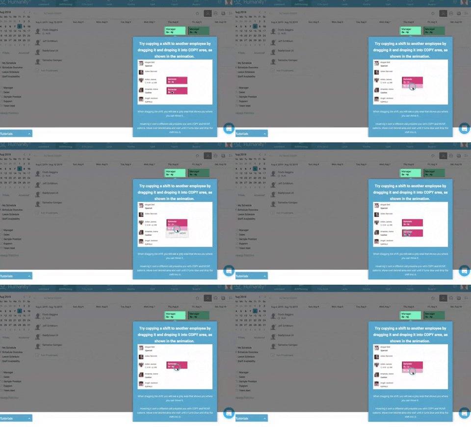
As opposed to a ‘first look’ experience, these tips appear as the user explores the product that can either explain the value of that feature/section or explain how to use it.

This technique waits for the user to take an action and presents the value right then and there. Similar to the tour, it is usually implemented as an overlay. Here is a list of 5 mistakes that you can avoid to boost feature adoption while designing tooltips.

3_giphy

Pros: The tooltips are in-context, so it solidifies the feature-value pairing, reducing cognitive load. This can also be created with 3rd parties like Appcues or Chameleon.

Cons: Some might never get discovered.

Popup Modal Window/Lightbox

A modal popup is great for announcements and situations where an action is encouraged, but not required. As with every customer communication, the information should be valuable and timely.

While some users may be in the habit of avoiding anything that pops up, embedded UX patterns could be something users look forward to when used the right way.

It’s similar to a lightbox that is used as a generic term for any popup that darkens the website and displays a dialog containing an image or other content. Often used to display galleries or content that should temporarily take complete focus from the rest of the page.

Generally, they can be dismissed with a cross button or by clicking anywhere in the darkened part of the page.

Gmail’s simple onboarding flow offers a good example of an effective modal window that creates delight, rather than frustration.

Pros: Immediately requires a CTA, the intended action is clear and direct.

Cons: Can often be a little intrusive.

Hotspots

They work similarly to tooltips. Some apps skip product tours and welcome screens and opt to show people tooltips and hot spots instead.

The goal of this user onboarding technique is to point out to users the certain features that play a key role in the user environment, even without noticeable warnings.

Pros: Allowing customers to explore functionality at their own pace and when they need to use different parts of the app makes this an excellent onboarding strategy. Especially for users switching from a different platform for the same product.

Cons: Users might get annoyed if you are using more than 3 hotspots on a screen.

Blank Slate Tips

Think of every not-yet-populated section/view of your product as space to nudge the user to create content. Use that space to educate the user on what type of content goes there, how to add it, how long it might take, and what value it will add.

Pros: It’s a great use of negative space. It’s persistent until they replace it with content. There’s nothing more daunting than a blank piece of paper! It leverages people’s completionist tendencies.

Cons: It might not be enough on its own.

Conclusion:

It’s important to find the right balance between communicating with your users and just letting them do their thing.

Put careful consideration into the “when” and “why” of your mobile tooltip design. Remember, tooltips are annotations – they should add value to the user experience, not overpower it.

There is no “right” or “perfect” user onboarding flow. What works for one site/product/app might not work for another. What works for one user might not work for another.

For example, you might need to onboard a developer vs. an average user.

Designing a user onboarding flow that works is complicated. It involves a lot of research, testing, and optimization.

Contact our UX design experts to shorten your users’ time-to-value, get them to that ‘aha moment,’ strengthen your brand, and do it all fast!

About Galaxy Weblinks

We specialize in delivering end-to-end software design & development services. Our UI/UX designers are creative problem-solvers with a decade of experience in all facets of digital and interactive design. We create compelling and human-focused experiences delivered through clean, and minimalist UI.

UI Best Practices – Designing buttons that score clicks!

User Experience Design is one of our core competencies. In this blog, we will share with you the best practices of designing buttons for your user interface that will attract maximum clicks. These UI button practices will help your users prioritize tasks by removing friction on-screen while sticking to the basic principles of UX elements for web/mobile applications.

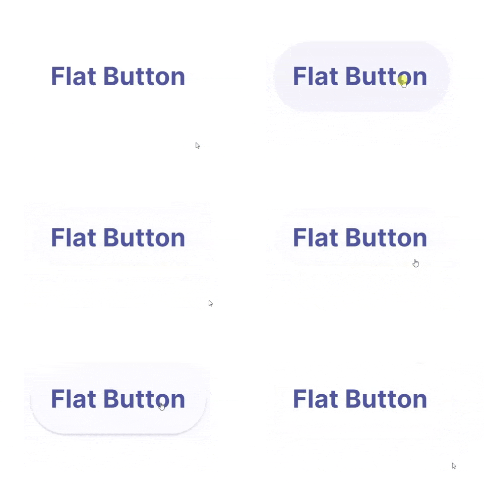
Many designers take inspiration from various new UI designs and apply in their applications like this:

video showing buttons in UI

But what’s wrong with this elegant on-hover and click state button?

Unfortunately, it’s lacking the very first basic rule of button design – “Make it look clickable”.

UI/UX designers should pay much attention to button designs to make buttons stand out, and read numerous articles, analyze and share ways, secrets, and principles to set the color, shape, position, size, and more factors.

Use those designs that follow basic ground rules of UI design. Especially ones that can not only lead users through a website/mobile app effectively but can also entice them to click for better sales.

And as a designer, you always need new clues, ideas, or inspiration to make a unique and useful button for your web/mobile apps.

So here are 5 latest and best button practices that you cannot miss out in 2020. And hope they can inspire you somehow:

1. Eye-Catching Hover Effects

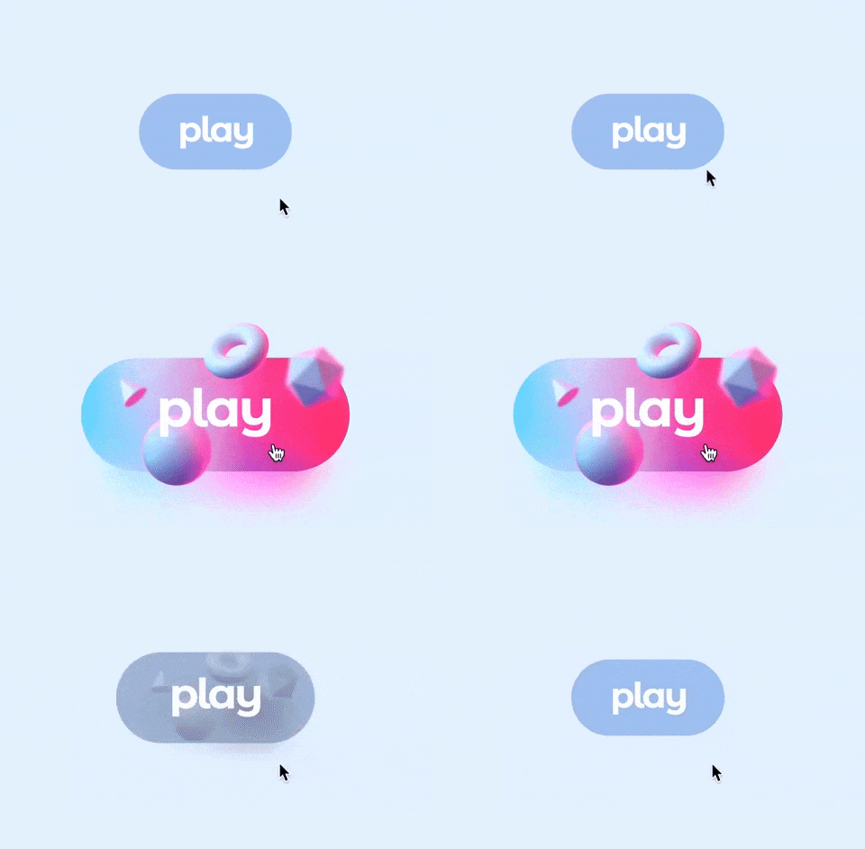
This Framer button uses a very appealing hover effect. When users move over or across the Play button, the whole button bounces out with a cool 3D Gradient design. Once users move the mouse cursor away, the hover effect will suspend completely. Such designs are eye-catching and interesting.

Video showing buttons in UI
Edoardo Mercati

What can you learn:

You can add various hover or interaction effects to optimize your button designs in your app or web design. They could be very useful to entice users to click and go to the next stage, such as playing a podcast, buying a product, filling contact information, or reading more details, etc.

You can add some changes in colors, shadows, shapes, texts, opacity, frames, and animations of a button according to your action requirements to make it more attractive for users.

2. Microinteractions for Delete Button

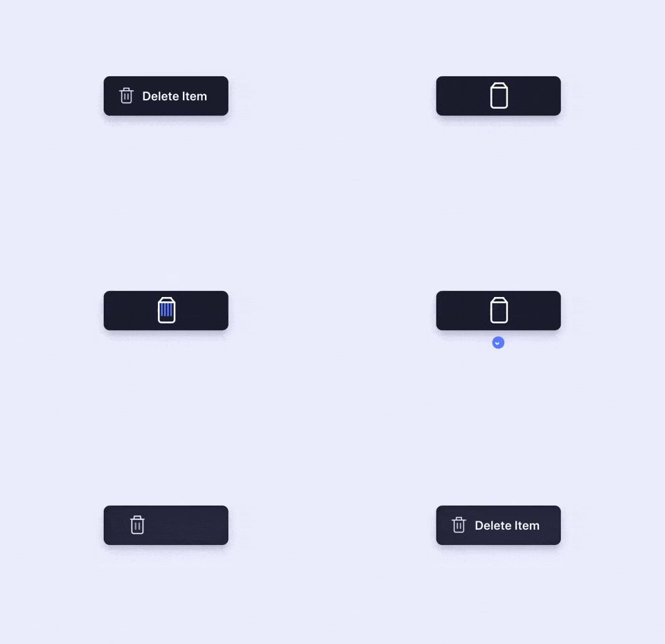
You can show the functions of buttons more vividly by using “button + animation ”. Once users click a button to delete, the action gets depicted by an animation showing the file getting shredded. This is a vivid and imaginative way to showcase the “delete button”. It is an effective way to engage the users while they delete multiple files.

Animation showing button in UI
Aaron Iker

What can you learn:

In your button design, you can add vivid animations to your buttons based on different scenarios, features, and labels to make your buttons outstanding and appealing. Overall, this is excellent to improve user experience.

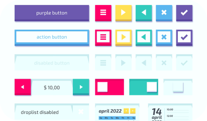
3. Provide Feedback with the Button States

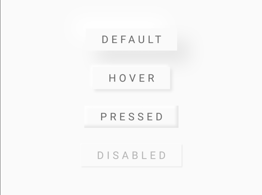
You should always let users know that the command was registered and promptly. This requirement isn’t about how the button initially looks to the user; it’s about interaction experience with the UI element. A good way to make sure nothing is lost in transition is to define the button states in your button design.

Image showing different types of UI buttons
Ryan

What can you learn:

Usually, a button isn’t a one-state object. It should change its state to let the user know that appropriate action is being taken. It becomes essential to provide visual feedback to users to indicate the current state.

4. Buttons with Shadows and Highlights

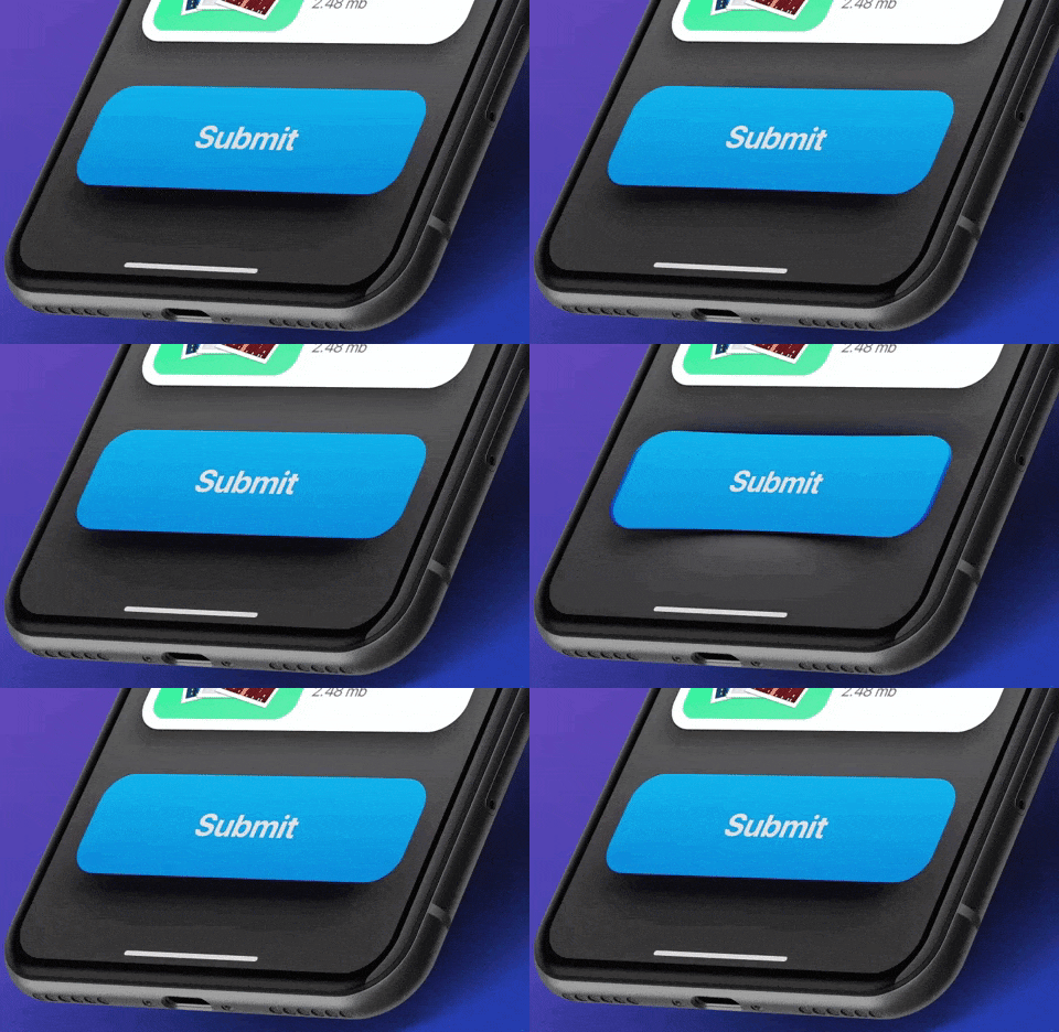
Drop-shadows make the element stand out against the background. They also highlight it as a clickable or tappable element. Objects that appear as raised give the impression that they could be pressed down. They’re also useful for improving the visibility of light-colored design elements, especially text. Even with flat buttons (almost flat, to be exact), they give subtle interactive cues.

video of buttons in UI
Lucas Haas

What you can learn:

Shadows are key entities in telling your users which UI element they are looking at. Users understand that the element is interactive if a button casts a subtle shadow.

5. Floating Navigation Button

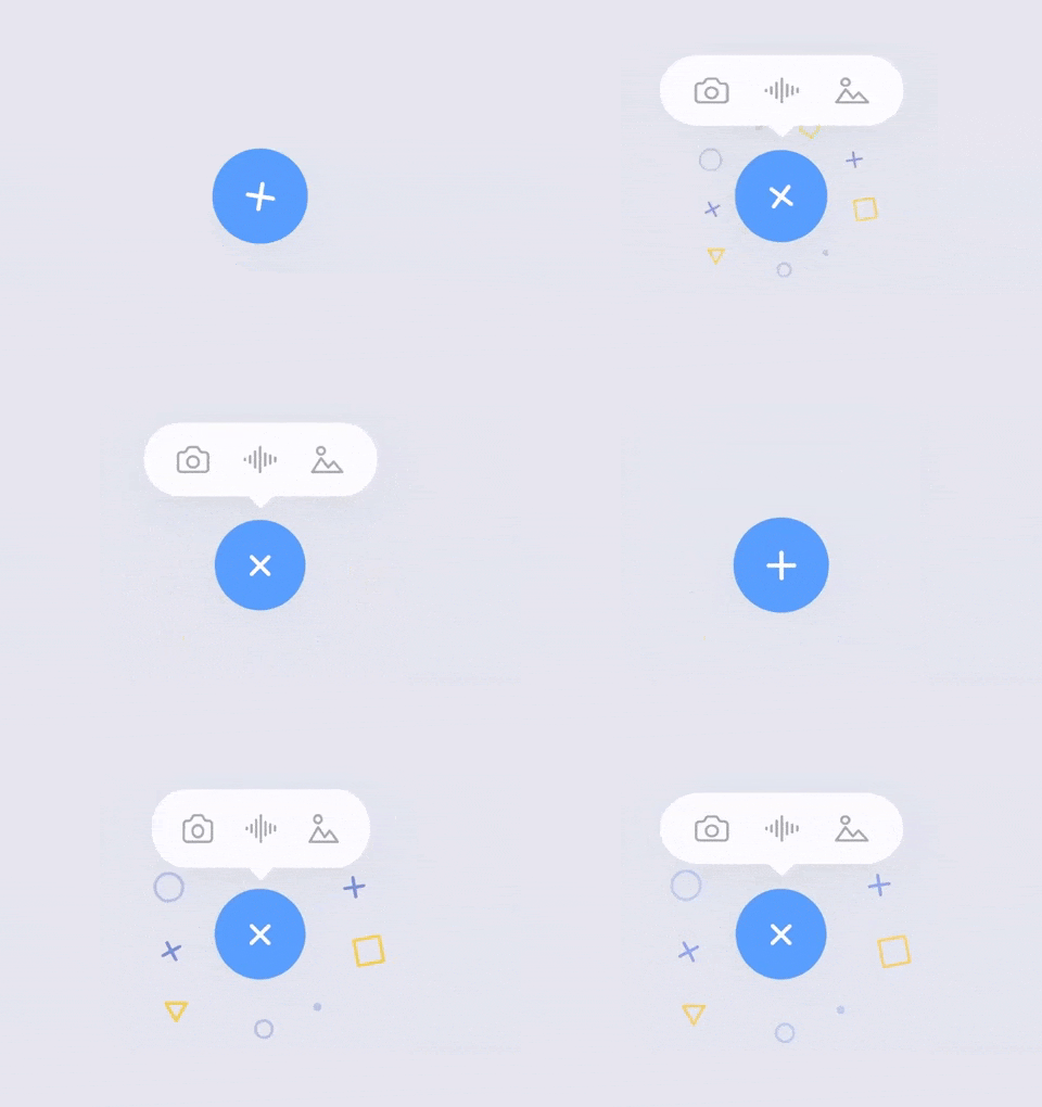
The tooltip uses a very cool floating button that attracts users’ attention and extends the functions of the web/mobile app. It is eye-catching and useful for your users and allows them to easily switch and choose other parts of the web/mobile app. And in this way, such floating buttons can be really interesting, attractive, and impressive for users.

Animation of buttons in UI
Milan Raring

What can you learn:

In your mobile or web app designs, you can create similar multifunctional navigation buttons floating in an interface to extend the functions of a mobile/website app. You can also customize a special way to expand the functions, options, or menus based on users’ interaction with these floating buttons.

Conclusion

Buttons are going nowhere! They will further evolve and get more interactive. Plan them with the utmost consideration, so that your users can enjoy the micro-interactions. Make them flashy, make them intuitive, and make them useful – and let users engage with your application.

A comprehensive guide to Mobile App Design

2.56 million and 1.85 million.

According to Statista research, these numbers are the number of applications available on Google and Apple’s app store, respectively.

Each one of these applications is trying to solve a problem. Problems like payment friction, learning, boredom, and whatnot. A million solutions for billions of smartphone users.

But, bear in mind that a problem can be approached in numerous different ways and not all solutions are up to the mark. Most of the apps are not thoroughly researched or planned and hence lack in UX, functionality, optimization, etc..

Having delivered 80+ successful enterprise and user-facing apps, we have learned and curated a set of best practices that help us deliver flawless mobile solutions. Here’s a comprehensive guide to Mobile App Design.

Establishing the ‘Why’ of your app

Trees with question mark on it

Yes, this is an obvious one! Some things that will be established after you have had your ‘eureka’ moment. Meaning, you know that you have to design an app that will solve your user’s problem with ease but you need to dive deeper.

To facilitate this, answer all the questions below before you jump in the design and development phase:

  • What is the problem that you are trying to solve for your users? (like assessing users mental health)
  • Can you define your app’s aim in a single sentence? (This will give you a precise answer to the question above)
  • How do you plan on solving the problem from your user’s viewpoint (and not yours)?
  • What is your USP?
  • How many competitors are there in the market and how do you plan to differentiate your product offering?
  • If your idea is unique, how do you plan on educating your potential users and convincing them to download your app?

These answers will lay the groundwork for your app thus it’s vital that they are clear and understood by all your team members. Write these answers, print them out, paste them in your office, but ensure that everyone is on the same page.

You can always go back to the answers in case there is a detour in your journey.

Creating a functional design

Two smartphone laid on a table with their displays on

Now that there is crystal clear clarity (pardon the alliteration), it’s time to design your app. You should start with wireframes and prototypes for validating your idea. Some tools that will help come in handy are:

  • Sketch
  • Axure
  • Miro
  • Adobe XD

People spend the majority of their time on mobile apps. This implies that the users are hooked to a certain set of apps. How to get in this inner circle?

A clean, simple, and intuitive UI is the answer. This seems a bit vague so let’s define some tips and methods that will help us here.

Storytelling via your UI

paper sketches of an app

We all love stories and mindful endings. And this can be done via your copy, illustrations, animations, etc. Storytelling will help your users share your vision and have better clarity of why your app exists.

  • Make your UI copy conversational and avoid jargon at all costs.
  • Leverage tooltips for better engagement.
  • Be clear when sending out an error message. Pinpoint whatever is wrong or missing.
  • Come up with a pleasing onboarding process

Thus you can humanize your app via a story and it gives the users a chance to look into the vision that you have for your app.

Familiar App Navigation

Person sketching mobile screens

Design your app in such a way that your users need no additional directions to navigate your app. We do not imply that you should copy from competitors. Rather, look out common practices that your user is habitual to, irrespective of the app category.

Stick to using UI elements like hamburger menu, tabbed navigation, or skeuomorphic icons, and so on. The aim is to avoid surprising your user on every click.

Keep in mind how people hold their phones

People holding their phones

We all hold our phones in many ways. Holding it in both our hands in landscape mode, holding the phone in one hand and using the thumb to scroll, using both hands for operating, etc.

Whichever the way, ensure that the vital interaction buttons are within the thumb’s reach and not in the stretch zone. Place the key functionalities and information somewhere in the center. And no elements are hidden behind fingers and palms.

Touch targets

graphic of bubbles

According to MIT’s Touch Lab’s Study, 10mm by 10mm is the minimum touch target size. We have to design for fingers and thumbs, not for cursors.

You can increase as per your need. Say if you are focusing on the elder demographic via your mental wellness app, it would make sense to increase the touch target’s size.

Also the spacing between touch targets should be adequate. They should not be so close to each other that it leads to wrong selection.

Use Established Gestures

person holding a phone perpendicular to their body

Using the same gestures may seem like a creativity barrier but if you don’t do this, your users will suffer.

Scrolling up and down, pinching for zooming in and out, etc should be used wherever possible. Also if you do wish to deviate a little, inform your users and even better demonstrate it for them so that there is no confusion.

You can also test this in your hi-fidelity prototypes to see if your users are struggling with understanding and using the different gestures.

Consistent layout

person holding a phone in front of their computer

Consistency is the lifeline of good design. You can design such an app via:

Visual hierarchy and weight via color play, typography, size, etc.
All your interactions, gestures, navigation should follow the same pattern throughout your app.
Your design should look the same across varying screen sizes and platforms.
If you have a live website, you should aim for a similar-looking app.

Easy Onboarding Tour

person using a tablet device

As mentioned early, your onboarding is a chance to curate your story and present it to your users. Don’t miss out on this.

You should not overwhelm your users with all the information in one go. You will turn your users away even before they complete the onboarding. Your tour should be a progressive one, encouraging users to keep moving on.

Break the information into smaller sizes for easy remembrance. And give the option to skip and resume the tour as per the user’s convenience. This gives the user the control and thus motivates them to interact more.

Keep the sign up simple and give the option to login via social media accounts. If possible, ask users to sign up in the later stages of onboarding. This way you get to highlight your value beforehand, thereby reducing the churn rate.

You will also need to take care of these practices –

  • You should have in-app search functionality, especially for ecommerce websites with huge product offerings.
  • Deter from asking unnecessary permissions. Continuing the above example of a mental wellness app, asking access to messages and contacts may not be well received by the user.
  • Minimize your user’s input. Enable autofill for your forms to speed up the signup process.
  • Keep your notifications to a minimum. Frequent notifications are annoying and may result in the users switching off the notifications altogether.
  • Optimize your app for voice search.

Your app should be designed in a way that your users do not think about the design of your app rather they focus on its functionality.

Testing Your App

person holding a phone while taking notes

Once you have invested your time and effort into designing and developing your app, you should test your app’s beta version on a focused group. Ask them for their honest feedback and improvement areas.

You have to test for your app for:

  • Functional testing for seeing the working of the functions and features.
  • Performance testing under different network bandwidths, older mobile devices, and servers.
  • Accessibility compliance
  • Interruption testing for how the app behaves upon incoming calls, notifications, low battery warnings, any cable attachments or detachments, etc.

Ready, Set, Release

After you ensure that your app is good to go out in the app world(s), sit back, and hit the launch button.

A side note here, things may not go as expected post-launch, so you need to have an open mind and pay heed to the feedback from your real users.

We, at Galaxy Weblinks, have been on this rollercoaster ride of app design, development, and release a good number of times, in case you wish to talk to us about your app and even new ideas, you can get in touch with us here.

5 Useful Tips For UX Designers 

How often does it happen that we put in days and weeks in designing the perfect UI design thinking that it will be a user delight.

But when the first analysis comes in, the numbers paint a different and a rather disappointing picture.

Every UX Designer under the sun has gone through this situation. Sometimes an overabundance of creativity can make us overlook the default practices.

In one of our previous blogs, we talked about the layout fundamentals that will ensure an attractive UI design. Taking that thread ahead, this article would highlight the UI tips and tricks which will work in improving your overall design.

Recognition Over Recall

App icons

In Jakob Nielsen’s 10 usability heuristics, he recommended recognition over recall.

For instance, it is much easier to recognize the skeuomorphic shopping cart icon when shopping online because it is easily relatable with our regular shopping experience. If we try to replace this shopping cart icon to another icon, say cards (signifying payment), it will be hard for the users to recognize and relate to it.

The recognition time is much shorter than the recall time due to the simple fact that our brains are wired to recognize the things that we see frequently as against fairly new ones.

Use industry standard visual cues, layouts, patterns when designing tooltips, icons, buttons, etc.

Give Feedback To Your Users

loading sign painted on a wooden fence

Just like we accept a response from the person we are in conversation with, the same goes when interacting with websites and apps.

Additionally, the absence of human interaction on the web necessitates a response for letting your user know what’s going on.

Common feedbacks can include:

  • A single change in color of interaction buttons
  • Letting your users know how much the load time is
  • Their progress on the tutorial and the product tour (if any)
  • Letting them know the exact requirements when creating new passwords
  • Pinpointing the error when filling out long forms

You can leverage microinteractions to keep your users engaged. Microinteractions are the cherry on top of your beautiful UI (that is if you like cherries :p).

Rotating buttons, color changes, different cursors when on links, etc are all great and subtle examples of microinteractions.

Design An Intuitive Navigation Route

Aerial picture of cars on a fly-over

This may sound a little vague so allow me to elaborate.

When we say intuitive navigation, we refer to the predefined routes and interactions that a user is likely to take. When your users pause to understand a certain function or take time to complete any task, look into the navigation route again.

Try to point out why your user left your website or app in the middle of the product tour. Were they given the option to skip the tour or they simply abandoned it in between?

Was there something that distracted your users? Perhaps they got confused because of the different elements present, etc.

We recommend that you try to anticipate where your users can get stuck and change it accordingly.

The idea behind an intuitive design is that it confers to the established patterns of the industry or from the market leaders as well.

Let Your CTA Stand Out

Sale poster outside a shop

This should ideally be a given while designing a winning UI. However, there is a big possibility of missing out on this one when you are in the flow.

We recommend that the CTA should be the most highlighted element on the page. You can do this via color play, text labels, font, and varying size, white space, etc. There should be no other element more enticing than your CTA.

Another point to keep in mind is that the CTA copy should be short but concise. CTA, in our opinion, should not exceed 5 words (ideal limit being 3 words). Avoid multiple CTA, for this reason, read the point below.

Limiting Your User’s Cognitive Load

Chess board

What do you think is easier, ordering from a 3 items menu or 30 items menu? For most of us, it would be 3. When offered with multiple options, the human brain tends to be indecisive.

Also, according to psychologist George Miller’s theory of chunking, humans’ working memory is capable of handling seven plus or minus two “chunks” of information.

When we tend to put a lot of information out there, the majority of it is bound to be forgotten by your users and even overwhelm them. Thus, why not limit it from the beginning itself?

You can always try to break down all your information into simple forms or categorize them to reduce crowding on any given page.

We know how difficult it is to design something that resonates with a wide demographic and we also know for a fact that it’s impossible to please every single one of your users. These tips will ensure maximum engagement and stickiness.

And if you want the UI/UX specialists to analyze and help revamp your UI then get in touch with us here.