Why it is better to partner with a Digital Agency than Freelancers?

Your business is growing and your team is doing their best to meet the tight deadlines and increased workload. You may be exploring the idea of outsourcing some of your web and mobile design and development projects. The next logical question is to outsource to a digital agency, or hire a freelancer?

I’m sure you’ve pondered over these questions while considering your design and development partner –

Which option among the digital agency or a freelancer will be the most cost efficient?
(Note – not “cheapest.” but “cost efficient”)

You might save some money by hiring a freelancer to manage one particular module of your product development lifecycle. However, you’ll soon realize that one person cannot do it all. You’ll very likely need an entire team of freelancers if you are looking for end-to-end design and development. This may lead your project to go over-budget while missing some critical deadlines.

Many factors should be considered while choosing between a freelancer or a digital agency. In this article, we will discuss how a digital agency can prove to be more economical vis-a-vis freelancer/s.

#1 Quality Of Work

People looking at a phone discussing something

Your freelancer may try and deliver the best quality of work but it may not be in line with your expectations, especially when the scale of the project is big.

On the other hand, a digital agency takes complete accountability of your project and maintains consistency in the quality of services they offer. They can arrange a single point of contact to facilitate all the coordination work. Thereby, you can focus on the larger picture. They also provide stringent quality checks and testing before your web/ mobile application is launched to avoid any nasty surprises.

#2 Project Involvement

woman biting on a pencil in frustation

Freelancers rely on you for direction! You might risk endless back and forth if there is any miscommunication in defining your requirements. You will need to invest a lot of time and effort while working with a freelancer.

Digital agencies are more equipped to understand your business needs as they may have more domain experts. They can convey your exact requirements to their in-house creative and technical team. Your project manager has the onus to ensure that the project runs smoothly.

For example, Project managers at an agency will assist you and your team in the most tricky questions related to your new product and the main features of a detailed specification for business tasks. Whereas, not every freelancer could single-handedly undertake all the tasks performed by the project manager and his team.

#3 Engagement Models
cycle chart of man money and time

Among the biggest decisions you are going to make about your project is how the development of your dream product is going to pan out. For that, you’ll need an engagement model.

This is one of the biggest factors that you miss out on if you hire a freelancer.

The successful development and implementation of your project are facilitated by flexible engagement models as they ensure client satisfaction and transparency.

It involves engagement types like:

  • Fixed price: This is ideal when the client has clear expectations in terms of the project outcomes and timeline. A Fixed-price contract is ideal for relatively smaller projects with determined deadlines, fixed budgets, and MVPs.
  • Time and Material: Ideal for a long term project with dynamic requirements and uncertain deadlines. The pricing is determined based on the hours spent on developing the project and resources needed. The model is flexible to accommodate changing project requirements and new features.

Why does it matter for you to have the right plan?

Choosing the right engagement model for your project can help avoid undesirable outcomes, such as friction between you and your outsourcing partner, dissatisfaction with the final product, delayed deliveries, and loss of profit.

#4 Technology Infrastructure

A man addressing people with laptops in a meeting room

Freelancers often lack the skills and resources to adopt new technologies and tools in case of emergency or ad hoc situations.

Whereas, agencies invest in the latest technology across their entire range of services. They have the best subscriptions, platforms, and most up-to-date technology; ensuring that your project is developed using the best of the resources.

#5 Scalability

A person covered in sticky notes

Generally, businesses switch to outsourcing to scale their business in terms of revenue and services offered.

But, if you hire a freelancer, he may have his limitations when it comes to the quantity of work he can offer. The scalability he offers also depends on the projects he is serving and his time of availability.

On the other end, a well-established digital agency has a big team of different skill sets and expertise areas. In the case, your requirement grows, or you have to meet urgent deliverables, an agency can extend its team of dedicated resources for your project.

#6 Skills

men working on a wooden house

You need to think about the range of skills required for your product development before deciding to choose among a freelancer or digital agency.

The benefit of choosing a digital agency over a freelancer is you’re not responsible for building a team all by yourself based on your project requirements. For instance – IKEA hired separate freelancers for Web developers as well as UI/UX designers just to figure out that they would need mobile app developers, as well.

Alternatively, you can save your time just by hiring a digital agency with a large pool of professionals who have diverse skills – all in one place!

#7 Reliability And Commitment
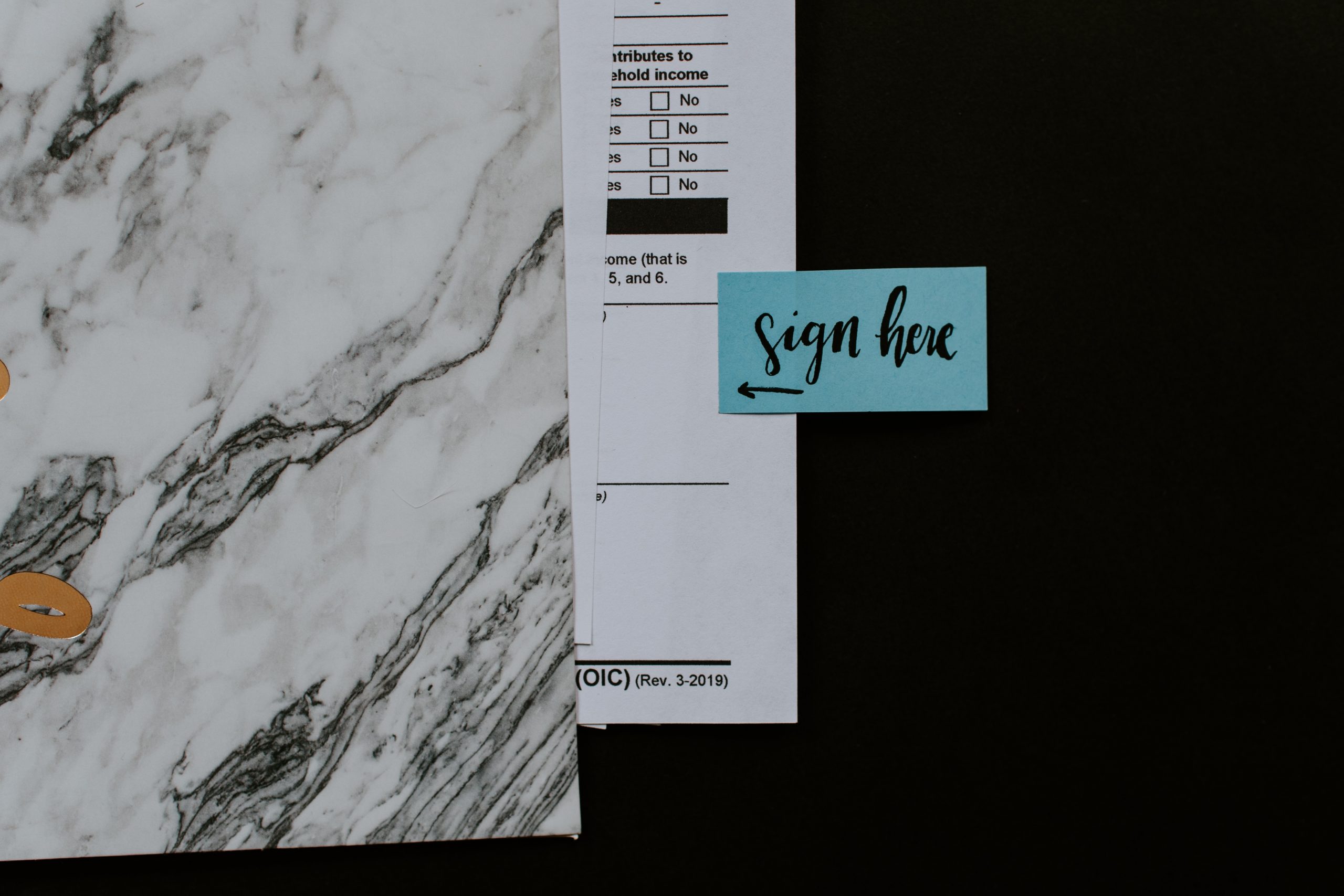
Document with a sign here sticker

Freelancers are usually reliable and accountable for the projects they undertake. However, due to the lack of a legal contract, there may be instances where they do adhere to the committed deadlines or couldn’t deliver the project as per your specifications.

Digital agencies swear by their processes that are built up over the years. This makes them accountable for what they do and allows them to make realistic commitments to their clients. Plus, there is always a Plan B in place, in case there are any unexpected glitches to ensure that the project goes on as planned.

#8 Communication Is The Key

Three telephones hung on the wall

Communication remains one of the most important factors to consider while opting for an outsourcing partner. Freelancers are usually easily accessible and easy to communicate with. Different time zones may hinder communications if you choose to outsource your work to an offshore freelancer.

Your digital agency partner will always provide a consistent communication channel. Generally, professional agencies follow a standard communication and reporting procedure, that is discussed initially with the client. Even the time zones are factored in here.

Digital Agencies deliver the required expertise and ensure an efficient work process as a service provider.

#9 Security And Legality

Typewriter with a page with term of service written on it

As a company, they’re able to follow proper documentation that offers you protection from legal risks or copyright infringement lawsuits in the future.

Whereas, freelancers hardly offer protection from potential legal risks regarding copyright infringement.

Conclusion:

Choosing the best option between a freelancer and a digital agency can prove to be difficult! While we all want to keep the costs in check, we also do not wish to compromise on the quality and go-to-market.

Choose a freelancer if the scale of your project is small and you do not seek multiple skill sets.

With an agency, pricing is typically based on individual services and projects. They are expensive but they account for every minute they work on your project. We recommend using an agency if you want end-to-end development of feature-rich and intuitive web and mobile solutions.
Instagram Made Me Rethink About Touch Targets

I’m sure you might have come across numerous articles on the web that talk about why we need adequate touch targets for each interactive element on any touch-based interface. (Especially mobiles which have a relatively smaller landscape.)

A ‘touch target’ refers to the area associated with an element that triggers the interaction when users tap on it. This area usually extends beyond the visual shape of an element when it isn’t an explicit part of its design.

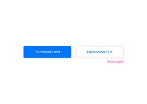
Have a look at these two buttons, for instance; one is filled while the other is just textual.

Even though the button on the right does not have a visual shape like the other one, its touch target (although not explicitly visible) extends way beyond the text area.

Ideally , these touch targets should be at least 1cm x 1cm (or 38px x 38px) in size, as suggested by Nielsen Norman Group, to promote better capability for users.

Now, I’ve been an avid user of Instagram - which I’m sure you may know, has been one of the world’s most popular apps for quite a long time now - and lately, it struck me that most of the elements on its interface do not follow the common norms for touch targets.

Have a look at this shot, for instance.

Horizontal spacing

In the first highlight, you may notice that all the tags are very close by with hardly any horizontal space left in between. When tags are relatively long, they are much easier to tap on even if they are set close to each other.

Vertical spacing

This type of spacing is usually more concerning in the case of small screens, as no matter how big an element is horizontally, if it is stuffed tightly between two other interactive elements, it’ll be difficult to tap on it.

The same is happening with elements in the second highlight. The action to ‘view comments’ and the ‘profile names’ are very closely stacked.

Another example would be the location link just above the picture in the shot below.

Despite all the discrepancies in spacing, I do not remember a single instance wherein I tapped on an element which I wasn’t intending to tap on!

And I think most of you guys did not, either. Unusual, right? Considering how tight those elements are spatially.

This leads me to believe that the area that we cover when we tap is not that large, after all.

The bigger yellow circle has a dimension of 1cm X 1cm (or 36px X 36px), while the smaller oval (formed by tapping with the right thumb) is 24px (or 0.6cm) long and 15px (or 0.4cm) high - which is essentially how much area we cover while tapping - and it may even be smaller.

If we go by this logic, maybe we can mend our designs to fit more content in a relatively small landscape without sacrificing accessibility… or not? I’d love to know your thoughts on this.

7 layout fundamentals for that oddly satisfying UI

We all love harmony in our lives. Harmony of tones and hues, of perfect shapes and negative spaces. Be it in music, interior design, or on the dense pixel sheet of our workstations.

Often times this harmony is disturbed by all-out arrangements of elements, essential or not, in tiny places. Resulting in claustrophobic or anxious experiences, like the one we have at a cluttered desks or rooms.

And you most certainly don’t want your users to feel that way about your app or website. A good visual hierarchy which takes spacing, fonts, colors etc, all into consideration helps in coming up with consistent and clean UI designs.

To ensure that users don’t abandon your websites citing cluttered design or app as the reason, here are some layout fundamentals that will help you in creating an eye pleasing design.

Use Grids

Person holding a phone

We all started learning numbers by writing them in square grid notebooks and continued using it for handwriting practices as well. Grid style is implanted in our minds without us being aware of it. Even painters don’t shy from using grids as an assistance to picture all the elements of a painting.

It helps in accurate spacing out and ‘social distancing’ of interactions, images and content within your design. The grids are not visible to your users, but anything out of alignment will catch their attention first (unless that is your intention). Thus, designing without grids will lead to inconsistent design.

A popular argument against grids is that it limits the creativity space of the designers. However, we believe in deploying grids from initial phases itself, and then move 1-2 elements which we want to be the spotlight. This ensures consistency among our designs and at the same time, we are able to get the users attention in a short span of time.

Scanning patterns

Many studies have confirmed that we scan content or texts from left to right and in patterns, the most popular ones being ‘F’ and ‘Z’. Your users do this to find information which is relevant and interesting to them.

‘F’ scanning pattern is subconsciously carried out in cases of content heavy websites like informational ones, news and magazines, blogs etc.

‘Z’ scanning pattern is done which has lesser content and which require less scrolling.

Once you know your visitor’s attention points, you can place your CTAs, value addition information and interaction buttons accordingly.

White space

picture of a foggy mountain

Negative space or white space is a vital component of visual hierarchy. White space helps the users in accessing an element’s importance. If there is a lot of negative space around an interaction, users by default perceive it to be significant.

Adequate usage of negative space will ensure that your users follow the pathway you designed.
Negative space will help in drawing your user’s attention to the elements of your choice and will increase the engagement rates of your website.

Spacing out the elements keeping this in mind will assist in creating a visually pleasing design.

Typography

Text on a screen

Remember those calligraphy classes our mothers insisted on for improving handwriting? Don’t know about the handwriting, but calligraphy letters sure did look great on paper!

And yes, there is a difference between calligraphy and typography but both work on taking your content to the next level in terms of presentation and visual aspects.

Your content copy is what will your user understand about you and your organization. It will communicate who you are and what value you will provide to your customers. And the right typography will ensure that your users focus on the text written and have no criticism for the font selected.

Typography in practice is not choosing fonts or making fonts, it’s about shaping text for optimal user experience- Oliver Reichenstein

Using too many fonts can be distracting for the user. Instead use color, alignment, size and smaller variations to align with the importance of the copy you wish to highlight.

Golden ratio

Fibonacci spiral image

The golden ratio, 1:1.618 is a mathematical discovery. But in design, it showcases the best proportional size of the elements and helps in creating an eye pleasing website and apps.

It can be applied to every element of your design right from white space, buttons and interactions size, typography, images and icons.

The overall design should also be in this proportion. Applying this ratio, ensures harmony and reduces any clutter or visual noise in your design.

Color Play

Picture of a test business card design

There are hundreds of emotions and moods connected with colors. The good (or bad) thing about colors is that they run their own show. Meaning, each color has a defined effect, the bright ones taking the center stage themselves, while the dull ones remain backstage.

Here also, taking too many different colors can strain the users eye and ruin the virtual experience. Colorful things do attract people but only to a certain point.

Even if you do wish to experiment with colors, you can come up with a color palette having a mix of colors belonging to a similar color family.

For interactions like CTAs, buttons, you can opt for bright or dark colors for getting your user’s attention. You can always play with the brightness, hue and saturation of the colors for establishing visual hierarchy.

Size

Sketches and a tablet laid out on a desk

Any large object put in an empty room is bound to attract visitors, moving past all the other objects. The same applies to your virtual contact points.

Size of icons, buttons, images, logos, interactions will be the deciding factor for all your users. Starting with larger objects, designers then size down as a visitor scrolls down the page.

A side note here, once the largest object is fixed, other elements should have a considerable difference in their size, otherwise there the design will become cluttered.

All the points mentioned above, when stitched together, build an UI that enhances your user experience by laying the foundation of a good visual hierarchy. Missing out on any points will lead unnecessary visual noise.

A good design is when your user is not bothered by your design in the very first place. Looking for a partner that can do the same for you, talk to our designers here.

How we make remote design sprints work?

In an ideal scenario we would all be working alongside our teams in our lovely workspaces built for maximum productivity and collaboration. But since that is not the case and will remain unchanged for a while, the only option is to adapt. Considering the circumstances our design team like every other team has gone completely remote and to be honest, it’s not easy.

But processes help. Here is our process laden with some good practices that helps us retain our productivity in a remote environment.

There are numerous questions associated with the who, what, and how of collaboration. Like, who all should be included, how to manage the time zone differences, which tools and exercises to be conducted, and lastly, is it even possible?

We will address the simplest query first – Yes it is possible! Read on to know how you can manage the other aspects that we mentioned.

Tools that make our lives easier

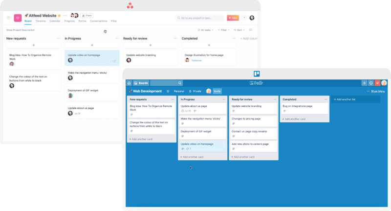
screengrab of trello and asana

We have Trello and Asana for project management. These tools come in real handy when you have a team working on multiple projects. You can make separate channels to keep different projects and related conversations unaffected from other projects. And for communication, Slack saves the day for us. It also lets us separate our sincere work conversations from our casual chats via channels. For video collaboration we use Google meet and Zoom.

Choosing the right suite of tools reduces half of your work/collaboration effort. They might vary for you so do your research and choose wisely.

Meticulous planning and preparations

video call screengrab

We start with a brainstorming session which sets the precedence for the sprint, wireframing and designing process. This chalks out a roadmap for reaching the solution. To make things easier for all the stakeholders involved, our project managers prepare a design brief that answers some basic questions at the outset. It includes:

  • Selecting the right participants
  • Informing everyone about the aim of the meeting and what roles will they play
  • The meeting’s specifics, including the time and date. Making a calendar event for this works out well for us.
  • Stationary and technical requirements, post-its, colored sharpies, quiet background, good internet connection that will allow all-day video conferencing, software to be used, as well as incorporating suggestions from the participants.

Once the brief is sent out, we do follow up calls with the participants. This will ensure that everyone onboard is on the same page to avoid any delays once the meeting starts.

Starting the design sprint

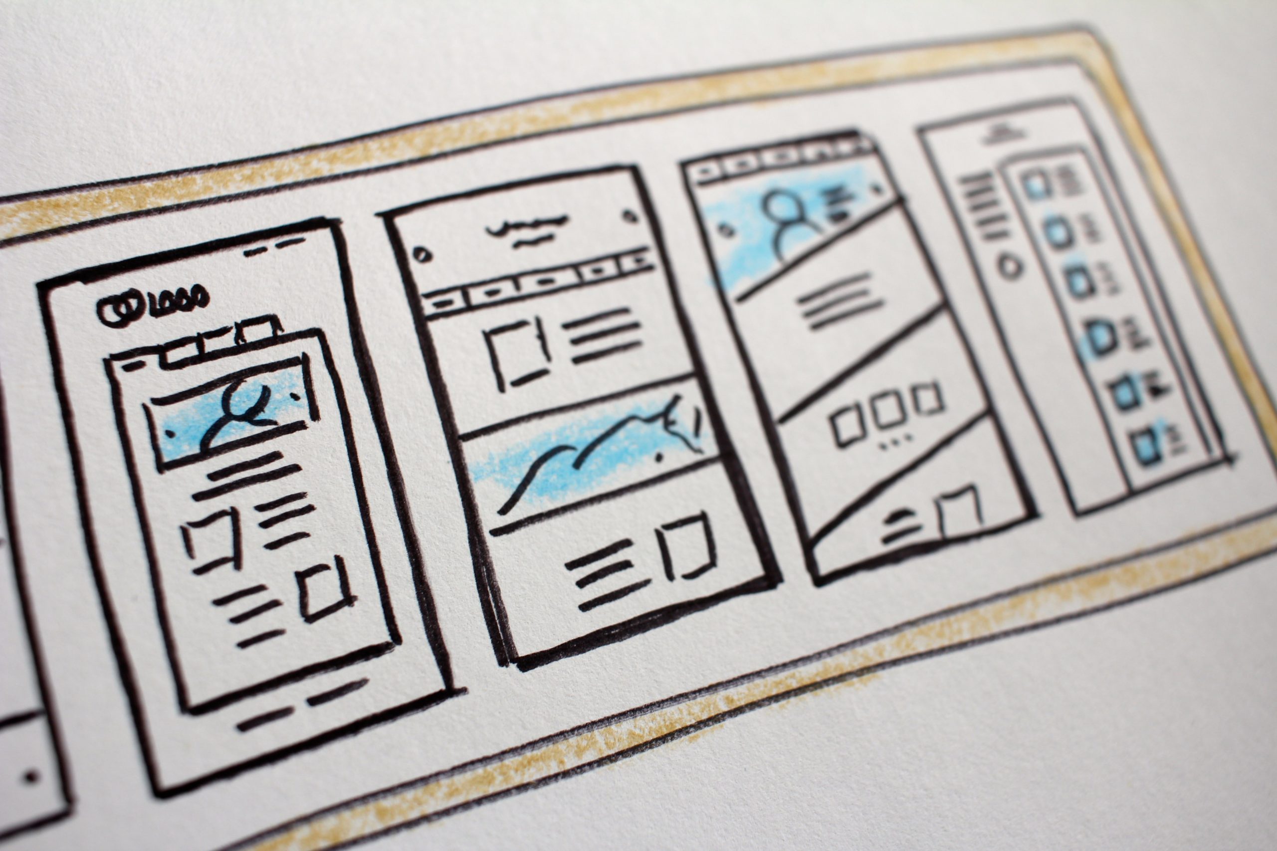
Interface sketches

This elaborate planning is put to test here. We carry out two exercises

1. How might we?

This exercise helps us answer the fundamental questions of the application.

For example, your team is creating an app that helps to keep track of a user’s pet’s meals, vet appointments, exercise timings, etc. You can start by thinking about how you might attract the right set of audience, encourage them to use the app as well as address the different problems of pet owners.

All these “how might we” questions will help you come up with an outline of your product or service. Each team member can come up with a few specific questions that will show possible directions for designing and prototyping the project.

2. Crazy Eights

Crazy Eights has helped us come up with some of our most creative ideas. Everyone on the team needs to come up with 8 different ideas. This gives us a lot to choose from and mix-up the ideas to come up with the best designs.

Creating a prototype and testing it with users

Person holding a phone in front of a laptop

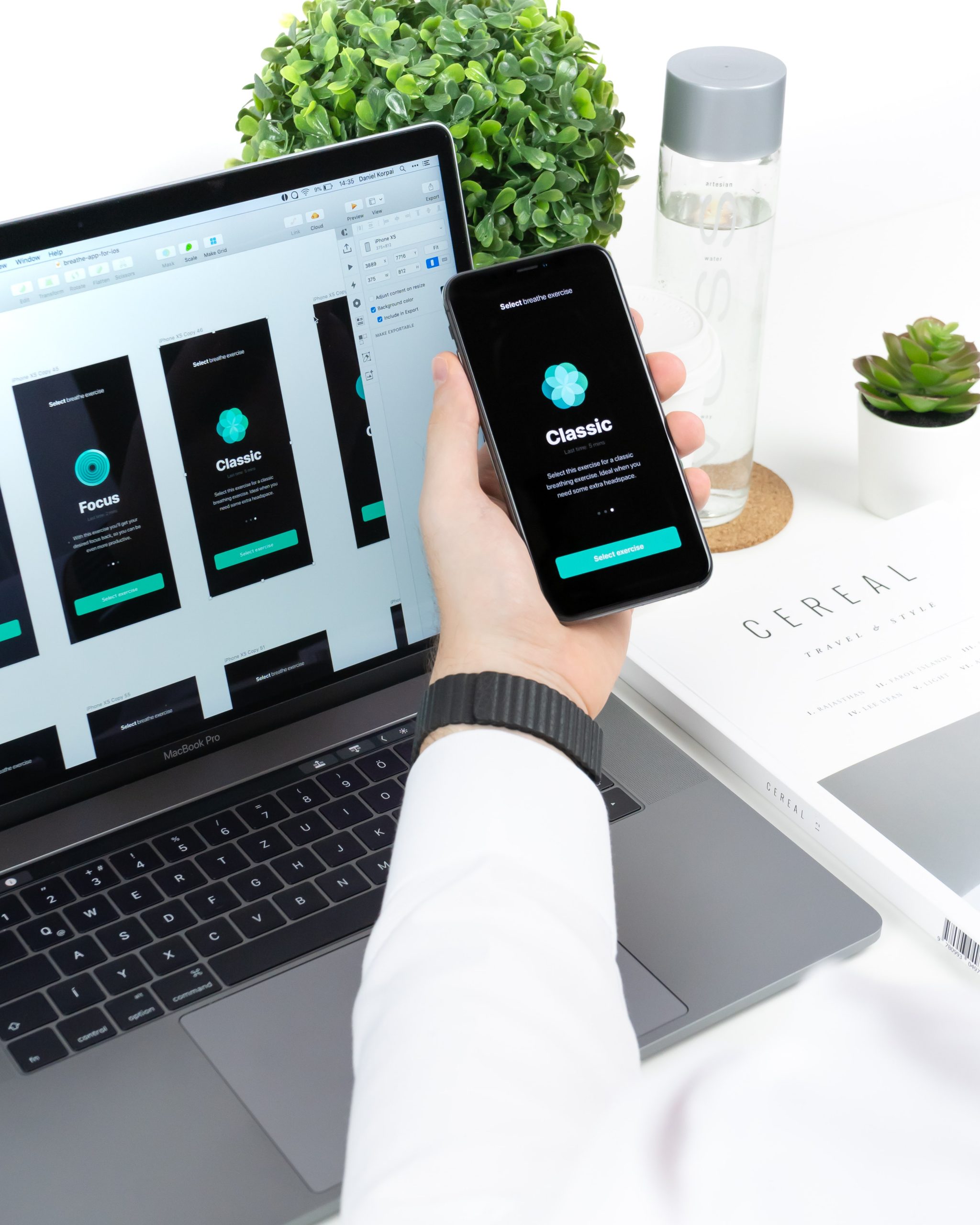
In this stage, we work on combining the ideas to reflect well into an interactive prototype. We build wireframes using Axure and Invision helps us add interaction to our presentation. This is then followed by high fidelity prototypes using Sketch or Figma.

Once the prototypes are built, we bring in unbiased users to put out ideas to test. We leverage UserTesting.com to conduct the testing process with our users.

Conducting remote testing

Person taking notes in front of a laptop

  • You should be able to see how is your user interacting with your prototype
  • You can communicate with them continuously for smooth interaction
  • Remote testing should not affect the overall process and thus give the most accurate results.

We test run our setups for avoiding any hiccups once the users are onboard. This saves our time and ensures a smooth testing routine. A Google sheet is created by our team, which pools together all the answers in one place for the questions asked.

This sheet has answers related to the overall app idea, problem areas, and specifics related to the app design. All these answers are shared with the interviewer who evaluates the answers with what she/he observed during the testing. If possible, we do live recording of the users when they are interacting with our prototype, with their permission. This live recording helps us eliminate any biases that could be done subconsciously from the user or the interviewer’s end.

Final takeaways

After successfully running remote design sprints for the past few months, we have come up with a list of prerequisites for running this process smoothly.

  • Live video conferencing is a must at all stages accompanied by a good webcam and microphone. A reliable internet connection helps avoid any lags or connection drops.
  • Setting up meetings considering all the time zones differences. We use World Time Buddy to schedule our meetings. In case you are spread all across the globe, you can keep rotating the meetings to make it easier for everyone involved. You can also record your meetings for the participants who were unable to attend.
  • A quiet work environment during this sprint. This helps in minimizing any background sounds and distractions, thus keeping everyone focused on the tasks at hand. With all of us working from home, this can be a bit difficult, but you should encourage your team to keep this in mind.
  • Have one on one conversations before and after the sprint to see how efficient this process was for everyone involved. Any troubles faced by your teammates will surface on these calls. This feedback loop is aimed at improving this process.
  • Your tool selection should take into consideration all the stakeholders involved, and how comfortable they are with the tools.

To Conclude

Planning and executing remote design sprints is a daunting task. We have been collaborating remotely before this pandemic confined all of us into our home. Over time, we have improved our process with constant evaluation and tool selections.

We would love to collaborate with you virtually and integrate our learning within your projects as well. You can get in touch with us here.

UX Writing: The Art of Designing Conversations

A staggering 88% of online consumers are less likely to return to a site after a bad experience, and often, it’s the words that make or break this experience. Bill Gates once remarked, “Content is king,” and in the world of UX, this rings truer than ever. UX Writing isn’t just about filling in the blanks; it’s about creating a narrative that guides, engages, and resonates with the user. This article explores the multifaceted role of UX Writing in shaping digital experiences, offering insights that blend strategy with creativity.

The Essence of UX Writing

UX writing is a vital aspect of user experience, guiding interactions between humans and digital platforms. It involves crafting conversations, from button labels to error messages, and its effectiveness relies on clarity, conciseness, and contextual relevance. UX writing is the unsung hero of user experience, leading users through a digital landscape without their awareness.

Conversation Design and User Interface Copywriting

At the heart of UX Writing lies Conversation Design, a discipline that shapes the dialog between user and interface. It’s about anticipating user needs and responses, ensuring that every interaction feels intuitive and human-centric. Similarly, User Interface Copywriting focuses on the language used in these interactions, blending clarity with personality to create a seamless experience.

Content Strategy for UX

A robust Content Strategy for UX underpins effective UX Writing. This strategy involves understanding the audience, their journey, and the desired outcomes of their interaction with the interface. It’s about creating content that not only informs but also engages and delights users, thereby enhancing the overall user experience.

Implementing UX Best Practices

A key aspect of UX Writing is aligning with best practices. This includes clear and concise language, maintaining a consistent voice and tone, and ensuring accessibility. For example, Dropbox’s use of friendly, approachable language in its interface helps demystify cloud storage, making it more accessible to non-tech savvy users.

Applying Actionable Insights

Actionable insights are at the core of effective UX Writing. This means not only understanding the user’s journey but also anticipating their needs and responses. Jst like when Spotify users search for a song that’s not available, the app doesn’t just display an error message; it suggests similar tracks. This proactive approach turns a potential frustration into an opportunity for discovery.

Microcopy in UX

Microcopy, a small text snippet, can clarify functions, address user concerns, and inject personality into the interface. It’s a blend of utility and creativity, providing essential information in a tone that resonates with the user. Airbnb’s search functionality uses a conversational touch to personalize the experience and set a relaxed tone, exemplifying UX Writing at its finest.

Digital Communication Design

Digital Communication Design in UX Writing involves the arrangement and presentation of text, incorporating factors like typography, color, spacing, and hierarchy to enhance readability and user comprehension. 

Good ways also involves presentation, as the layout on a screen significantly impacts information processing. Google’s simple search page is an example of this, designed for ease of navigation for all demographics.

User Experience Best Practices

Adhering to User Experience Best Practices involves creating content that is accessible, inclusive, and empathetic. It’s about understanding the diverse needs of users and ensuring that the interface is usable and understandable by all.

Voice and Tone in UX

The voice and tone used in UX Writing should align with the brand’s personality and the context of the user interaction. This consistency in voice fosters trust and reliability, while the appropriate tone can enhance user engagement and satisfaction.

Accessibility in UX Writing

Accessibility is crucial for ensuring content is perceivable, operable, understandable, and robust for all users, including those with disabilities. This approach not only meets legal requirements but also expands the reach and inclusivity of digital products. Microsoft’s inclusive design principles demonstrate this, catering to a wide range of abilities and reaching a broader audience.

Human-Computer Interaction (HCI)

Understanding HCI principles is crucial in UX Writing. It involves recognizing how users interact with computers and designing text that facilitates these interactions in the most efficient and satisfying manner.

Real-World Digging

A study by NN/g found that clear microcopy can boost task completion rates by 22%, while user-friendly language in error messages reduces frustration and increases satisfaction. Effective UX Writing can boost a website’s conversion rate by 17%.

Conclusion: Crafting Digital Excellence with Galaxy Weblinks

UX Writing is an art that requires a deep understanding of user psychology, a flair for language, and a commitment to creating intuitive and engaging digital experiences. It is important in crafting digital experiences that are not only functional but also emotionally resonant. It’s about creating a conversation that feels personal, informative, and inclusive.

At Galaxy Weblinks, we understand the power of words in the digital space. Our approach to UX Writing goes beyond mere aesthetics; we focus on creating content that drives engagement and fulfills user needs, ultimately contributing to a seamless user journey. Our expertise in UX design, digital marketing, and web development is not just about building platforms; it’s about crafting experiences that resonate, reflect, and respond. Let Galaxy Weblinks guide you through the nuanced landscape of UX Writing, where every word is a deliberate step towards enriching user experiences.

Practices to quickly shift from in-person to remote user testing

The sudden change in lifestyles; professional and otherwise, has made remote work critical for many fields around the world, including UX testing.

Remote user testing has been there in the process since many years making sure that our users are having the best possible experience with our product. Especially mostly by those business organizations who reckon the fact that consumer-centric products sell better.

Although the biggest challenge is not the geographic distance while performing user testing. It’s instead, planning the right strategy, finding the right participants, and communicating with the right tools available. Absence of which can have a negative influence on testing results.

Choose the type of user testing that fits your need

There are two main types of remote usability tests, among which you should select one according to your need and to further validate your designs.

Moderated remote testing

In this type of testing you and the participant both communicate via phone or video conferencing software.
This technique is often used earlier in the design process that allows you to offer support in real-time and ask further questions for deeper clarification from the users as particular issues arise.

Unmoderated user testing

These tests are completed through survey forms mostly alone by the participant, without any phone or video call.
It works well while testing a few specific elements in a time and budget crunch, like a particular widget or a minor change.

Since every business is going user-centric, moderated remote testing has been adopted to interact directly with the target audience and gain a rich understanding of their goals and pain points.

So, if it suits your testing needs to gently nudge a quiet participant to share more about what he’s doing, then here are the best practices of shifting from in-person to easy going and cost efficient remote user testing.

Plan your ultimate testing goal

Define your target user and decide which specific areas of your site or app you plan on testing. In your test prep meeting remotely, discuss the agenda to focus on the goals of testing. It’s important to:

  • Develop straightforward tasks that have well-defined end states.
  • Prepare introductory and/or test materials so the participants will know what is expected of them as well as what they can expect from you.
  • Define the turnaround time of user testing, defining number of participants for each session.
  • Craft good task scenarios that are clear to your participants and have no ambiguity in understanding what you want them to do.

Explore mediums to recruit right testers

Since tests are remote, you are able to recruit people from just about anywhere! It is important to make sure they are representative of your target audience as you are choosing from a pool of participants around the world. There are ways where you can find them:

  • Social media channels such as LinkedIn, Twitter, and Facebook are good options for contacting people who may be interested in testing out your product/prototype.
  • There are a number of recruiting services that exist out there. Some are traditional where live representatives contact users from all over the place and screen them based on your requirements.
  • Others are almost fully automated web-based services where you can basically run a recruitment project on your own just by a few clicks, and potential candidates are automatically added to your project and ready for your approval.

How many participants do I need?

You want to avoid recruiting too few users yielding in insufficient results; nor do you want to recruit too many users and waste time and resources on additional tests.

It’s always better to learn from 6-8 users for each user role, update the design to fix the issues identified, and then test again.

But as a general guideline, if you are on a small budget and interested in DIY usability testing, 5 is a good number to start with. If budget is not a constraint its best to consult experienced professionals to determine the number of users.

Arrange Session and Kick-off Call

Join over a call with your participants using software like Zoom, GoToMeeting, or Lookback. (Stakeholders and other observers can join too). After a brief introduction to explain the setup and establishing rapport, share your screen with the participant, give them control of it, and ask them to complete tasks while thinking aloud.

Observe the participant’s actions, hear their commentary, and see their facial expressions (if webcams are on).

Ask probing questions to explore the participant’s understanding of the interface, just as if you were sitting beside them. Identify and diagnose any usability problems in the design.

Based on those insights, you can provide concrete, actionable recommendations for improving the product’s user experience – all without anyone leaving their homes.

How Costly is Remote User Testing?

Getting a moderator, participants and the product in the same room for about an hour per participant can get really expensive. Expensive enough that this kind of user testing is just not within the reach of many designers.

Moderated remote testing helps with the nasty bills by allowing the moderator to interact with users online through sharing screens instead of face-to-face. Even by choosing a relatively expensive user testing tool, the cost of on-site and remote testing can seldom be compared.

Conclusion

In a global situation like this, when you’re under pressure with deadlines looming – usability might seem trivial enough to skip. Don’t make this mistake: it will cost you more in the long run. Usability testing will, of course, require a degree of investment in time and money, but it pays off.

Remote usability testing has become more and more popular as companies work to cut costs without sacrificing the ability to gain insight into future product success. It is up to us UX designers to know the in’s and out’s of this methodology in order to utilize it most effectively.

Why Design QA should be a non-negotiable part of your process?

Did you ever happen to spot some inconsistencies in your product’s design that were not there in your prototype? The color being a bit different, some changes in the font style or micro interactions not working the way they are supposed to.

You think that some of these errors could have been avoided if a designer was shown the coded version before the app release. And you are not alone in thinking like this. There is a solution to combat this problem.

The answer is… Design QA.

So what exactly is Design QA and how does its implementation resulted in streamlining our product cycle. Here are some tips and tricks for you that we learned along our journey.

Defining Design QA:

Design QA is a cross verification process done by designers. It entails checking for any inconsistencies in your copy, visual aspects, micro interactions, and the likes of the code developed before the release of your product.

Why is it neglected from design sprints?

In many organizations, design sprints are very elaborate, taking a full week or longer. And this is prior to the developer hand off. Once this is done, designers move on to other projects with no further updates on the previous product. Bringing designers back for the review is not considered by many. And some other common reasons we hear for neglecting design QA are:

  • A misconception in the design world is that a designer’s work is done after forwarding Zeplin links and Invision prototypes. But that is seldom the case.
  • Design QA discussion can cause friction between designers and developers, making it an uncomfortable conversation to have at times.
  • Design QA is seen as an add on step in an already elaborate design sprint. When teams are working under time constraints, collaborating with designers for more reviews is not ranked high on the priority list.

Why did we implement it in our process?

The reasons for design QA to be a part of our process is nothing different from what the experts vouching for it say. We pitched it to our clients explaining its importance and what benefits will they get after its successful implementation. Some major factors that drove us to inculcate it within our process were:

It’s a pretty underrated time saving hack

Design QA will be good for your long term goals. Getting a few extra hours of your designers is better than a few extra days of your developers to search, spot, and iterate for design inconsistencies after the app release.

Better collaboration between your designers and developers

When designers and developers are in the same room (or call) it will help in solving the issues at hand quickly. Your designers will be aware of the technical issues that developers are facing and will account for such issues in the future.

Developers will also get insights into how designers have envisioned the final product and code to bring out the same in the product.

No surprise design inconsistencies

A designer’s work does not end after a simple functionality test of buttons and interactions. Instead, they evaluate the design elements behavior right from the speed of the interaction to the feedback of an action being performed, will there be a slide-out option or slide in, you get the picture.

Minimum design debt

Design debt is accrued over time when small changes and improvements are kept for the next sprints every time they are brought up. As this pile keeps on growing, it results in a bad user experience. And there will be a point where no amount of small tweaks will make it better and you end up rewriting your whole product.

Integrating Design QA in our existing process ensured that we never went back to square one because of design debt.

You’re convinced that it belongs in your process, now how do you implement it?

We know that it is easier to say rather than execute any changes in your workflow. But how to transition from ‘thinking’ to ‘doing’? Here are some tips that have helped us in including design QA within our workflow.

  • Start out together

The first and most vital thing that we have learned is to involve stakeholders from various product stages in the initial meetings. This helps in seeing the feasibility of the product’s features and setting the right expectations for everyone onboard.

  • Sort issues on the basis of priority

You will face numerous issues when testing the final product from the design point. But not all these issues have to be solved right away, some can wait till the next sprint cycle or are the icing on the cake type features.

When discussing with your developers, define priorities to get the critical issues addressed before ones that are only for aesthetic value addition, this way you are making your developers life a tad bit easier.

  • Have a checklist ready

We all know how good our memory is when we need it the most. Having a reference checklist when design QA is carried out will ensure that we don’t miss out on essential checks. Look for text alignment, colors, content placement and spacing.

You also need to check for the accessibility of the design. Here again, a checklist sorted on priority basis makes it easier for everyone involved.

  • Start the review the moment you get your hands on functional prototypes

We believe that there is no fixed timeline that needs to be followed when it comes to review cycles. Infact, the earlier the review cycle starts, the better. Waiting till the last moment can lead to unexpected delays in the launch of your product.

Getting a designer review on the product’s features will keep the development going in the right direction.

  • Give reasoning behind your feedback

Just saying that “this does not look/feel right” defeats the purpose of reviews. You should back your reviews with proper reasoning and even document them for references. This will not only help your developers but your designers as well to evaluate what they like the best and why.

Design QA has helped us ship perfect products reflecting the original design intents. This has worked wonders for us, especially when collaborating remotely. To get your stakeholders onboard, you can utilize the same reasoning that aided us in actively streamlining our workflow.

Redesigning lessons from Super Bowl

About 100 million people tune into Super Bowl every year. The game is big because the money is big. Companies spend an average of $5 million for a 30 second screen time between plays. Apart from that the Super Bowl generates $300 million in commercial revenues. With all this money and eyes included, Super Bowl’s 2000s online persona would have been a bad fit for today. Around that time the TV spots were doing great; they were emotional and hitting the right spots, online space on the other hand was the exact opposite. A texty mess. This blog takes a dive in the website redesign of Super Bowl and helps you draw conclusion in case you’re also asking yourself ‘If I should redesign?’. Practically speaking, we didn’t have the modular frameworks back then and there was so little to work with. HTML, PHP, CSS, and maybe Flash. In hindsight lack of choices seems better. Then why even bother doing this unfair comparison, you ask? Because with this comparison we’ll help you answer a decade old and the most crucial questions of all: Whether you should redesign or not? Let’s answer this big question with a couple of smaller ones-
  • What is the end goal with your website?
  • What are the problem areas?
  • What will redesign cost?
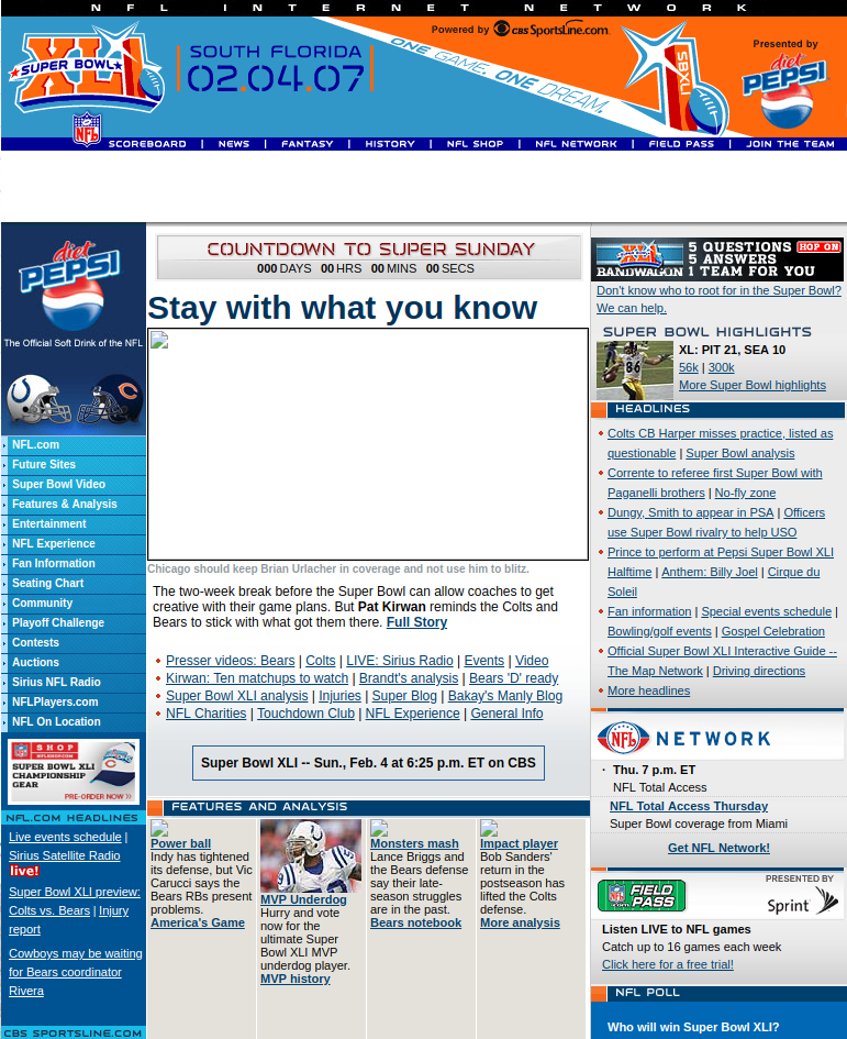
This is a capture of the old Super Bowl website before the redesign. It shows a 3 column layout filled with all sorts of content with no visual hierarchy and respect to white spaces in sight.
Screenshot of superbowl.com 2009
The Homepage looks like a headache made out of HTML. For a dedicated page this homepage sure seemed like a missed opportunity to draw attention towards the primary goal of NFL; getting more people to see the game night. Which brings us to the goal of redesign.

Goal of the redesign

Your reasons for redesign can be purely aesthetic like getting bored of your existing design to something strictly business related; existing design being not good enough for conversions. Rebranding also could be one of the reasons to redesign, when you’re trying to launch a new product or service. Like Super Bowl rebranding their colorful and lively logos for an easy consistent brand image in the form of a new logo post 2010. Once you’re clear about your goal you can start working on the website or tell the people, who are doing it for you, exactly ‘what you want’. For the Super Bowl homepage the goal would be to get more people to watch the game, while providing other information like venue and time, all at a glance. Something that doesn’t make the visitor work for little but crucial information.

A picture is worth a thou……

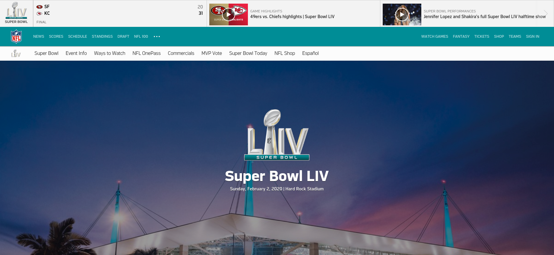
Screenshot of Super bowl website
The new design uses the same principal. Just a few days before the game, the homepage features a simple hero image with the game venue cleverly placed in the backdrop. The new website leverages contrast to make the important information stand out. Like who’s competing, when, and where? There is also a CTA, that clearly mentions what to do next. Being the only action visible before the scroll makes it easier for the readers to complete their journey to the goal.

What are the problem areas?

Like any other website suffering with bad UX, the design team responsible for Super Bowl’s also had to answer questions such as this. When you’re sure about giving a makeover to your website. Usability reports and insights will help you reaffirm the reasons for your redesign. Having the data-backed reasons to do so won’t hurt. Ask your agency or hire specialists to evaluate your website, think heuristics, visual QA, and accessibility tests. Knowing exactly what’s wrong helps you gauge the magnitude of the solution, since redesign is not a days job. So now you’ve figured out the goal of your redesign and the problem areas that you need to work upon. Now all you need is a plan.

How will the redesign work?

Redesign for an enterprise is like clockwork, where all the cogs need to be engineered to fit without fault. Ask these questions to ensure smooth operation of your clockwork:

Is the development in house or outsourced?

It’s not necessary to keep the redesigning in-house if you have a team of your own, since outsourced dedicated teams can produce equivalent or better work more efficiently. When an outsourcing team handles the grunt work, your design team can dedicate their important time for planning how the redesign will go about. If you lack resources, you can completely outsource the design otherwise you can opt for design assistance.

Who leads the overall project and vision?

Inclusion is great for collaboration but it can distract the team from the goal. It is important for your redesign that there is a nay-sayer that keeps the team on track and keeps the project and vision from becoming something else, a hybrid of everyone’s opinion. Just as a Quarterback in football.

How will progress and success be measured?

If there were no yard markings then the football players won’t know if they get another 4-downs or how far they have come on the field. Clearly defined milestones of progress and success will do the same for the team working on your redesign. It prevents constant to and fro later in the process that only results in delays and inconsistent outcomes.

What are your timelines?

Football games typically last for 60 minutes, divided in four quarters of 15 minutes. It helps decide the pace and play of the game. For somewhat same reasons timelines are important for your milestones too. After defining the milestones you’d also need to plan when you’re expecting them. Getting chunks of predefined deliverables in time helps set momentum for project completion.

How much will a redesign cost?

If you manage to find the right agency and all the cogs slide right into place, then you won’t have to worry about the overheads. A medium to large website redesign can cost around $10000 to $50000 depending on the customization and functionalities you require. Before throwing that kind of money on a redesign project you must ensure that you’re getting a handsome ROI out of the whole exercise. If you’re thinking that ‘Just doing it’ would fix all your issues then it’s nothing more than a shot in the dark.

Takeaways

  • Keep Navbar sticky and visible at all times
  • Avoid multiple CTAs on a single screen
  • Give content some room to breathe
  • Make your copy clear and concise
  • Prioritize content according to your goals
When it’s the right decision, redesigning your website can have a positive impact on your business. But, if it isn’t the right decision, a site redesign can be a huge waste of time and resource. If not redesign then what? Custom landing pages, targeted ads, and localization are a great place to start.

Using quantitative research methods to improve UX

There are times when the solution to a design problem may “instinctively” pop into your head. Yet, in some scenarios, your instinct might be a valid method in solving design problems.

But, one subjective decision on whether the CTA must be bigger or not, can cost you drop in conversion on the line and ultimately, millions.

Moreover, it’s pretty hard to convince people or your stakeholders when your designs are solely based on intuition. Because they always go in trusting your work with the blindfold half-on and are prepared to point to quantitative data backing-up your hypothesis.

Quantitative user research gives you numbers that you can rely on. Take an example of an online supermarket platform where a lot of decisions are taken w.r.t. the color scheme, UI elements, categorization of products, place of variants option, etc. Quantitative research helps you measure the success and failure of such design aesthetics; you just have to do the leg work.

Take a look at some of the quantitative user research methods and how they can be implemented in your research process.

A/B and Multivariate testing

Doors

There is always some disagreement among the designers over the placement of small UI elements. Let your user’s choice be the deciding factor here. Build different variations or versions of your web components or page and present the same to your users. This method will assist you in determining which CTA button is being preferred by your users, or which typography is more appealing to them, and alike.

Their engagement with each experience can be measured and collected in an analytics dashboard and analyzed through a statistical engine with the prior versions. Through comparative testing you can learn which version attracts more clicks or to demonstrate the positive/negative impact of new features or changes to a user experience.

A word of caution: there should only be one difference in all the variants. It will be easy to draw consensus this way and give you definite reasons for selecting one design over the other.

Card sorting

stciky notes with sharpies

Card sorting is used for structuring your information architecture. It is a cost-effective method as you can provide users with labelled index cards or online card-sorting platforms when conducting remotely. Let them arrange it according to their understanding of topic and ask for debrief later on. Such sessions help participants to do the labelling and categorization as they like.

In an e-commerce website, you can see if under “Packed food items” users are searching for both instant and frozen food items or expecting them in separate categories. Even when you ask them to come up with their own categorization, you can always know how your users group information – are they thinking of nomenclature like “Gourmet Cravings” or looking for simple names like “Food and Beverages”.

Once you have all the data, look for common items, category names or themes, and for groups that were frequently paired together. It helps you organize content so that it suits your users’ mental models, rather than the point of view of your company.

Tree tests

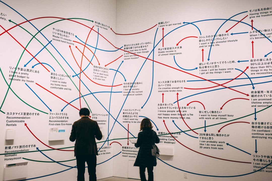
two people looking at a giant mind map

It is a task based analysis wherein you ask users to look for individual elements from the navigation structure that you have built. Tree tests help in improving your navigation by observing how real users navigate your site rather than just going on assumption.

Continuing the e-commerce example, let’s assume you ask the participants to locate “instant noodles”. Your users may go in searching for it under “packed food” category instead of scrolling down to find the “instant food” category. This is how it is often conducted to design page layouts and navigation menus.

It’s the reverse of card sorting. Instead of creating own categories, tree testing asks users to work with an existing set of categories, and highlight where they believe an item is most likely to be located.

Google analytics

Post release, you can use Google Analytics (GA) to see the type of daily users visiting your website. You can compare it with the persona(s) that you have built. You can see where your users are dropping off and what activities they are performing. You can leverage insights on user trends, page with the highest interaction, and how are they navigating.

For instance, in the e-commerce venture, analytics will help you understand your user demographics, type of device they are using, product preferences, how far are they scrolling, et al.

GA makes data visualization easier. There are multiple options to represent your data like line graphs, pie charts and bar graphs, thus making it easy to explain it to all the stakeholders involved. Thus, with the information in capable hands, GA can do wonders for your business.

Back To You..

To achieve your ultimate goal of intuitive and easy-to-use interface, backing your design decisions with data from quantitative research will help you build experiences that are fit and relevant for your target audience in the long run.

Hence, instead of depending solely on subjectivity or qualitative research, design must be validated with quantitative research, and proven design practices, as design exists to solve real problems, which inherently makes it objective.

Your product’s success ultimately boils down to how well you have done the user research. As a UX studio our team is equipped to tackle any UX challenge thrown their way. For any assistance related to user research and analysis, feel free to talk to us.

What are Design Systems and why do we vouch for one?

Design System is one of the most excessively used design terms in the software industry right now, so much so that it has given birth to a parody Twitter account that calls people out on their overuse of the concept as a mere keyword.

There is a lot of uncertainty about its definition, different professionals have different definition of Design Systems. But here’s one that will put your mind to ease.

A Design System is a set of deliverables(not a deliverable itself) that acts as a single source of truth for design and development teams to realize a product. It evolves constantly with the product, tools, and new technologies.

What a Design System isn’t

Going with the wind a lot of companies tend to claim that they have a Design System in place. But in reality, they’re just pointing towards their Sketch libraries and style guides.

You can’t call libraries or style guides Design Systems for the same reasons you can’t call individual notes of music, a song.

You can’t make a functional software with just some static designs and patterns, just as you can’t make a song with a music sheet filled with notes and melodies, you’d also need instruments and singers to conduct a piece of music.

How to find the right one?

Design Systems can be simple, comprehensive, strict, loose, mono or cross-platform. Based on the scale of projects or operations, you can define what kind of Design System you need. Because it’s always easier to find things when you know what you’re looking for.

Start by asking the right questions:

  • Number of people that’ll use the system?
  • What are their profiles?
  • Are they willing and able to adapt?
  • How many products, platforms, and technologies?
  • Degree of consistency across them

Based on the scope there are two types of Design system. You can either go for a Modular Design System or an Integrated one.

Modular

Module based Design Systems are good for large scale projects like e-commerce, finance and government websites. It’ll enable you to scale quickly and adapt to multiple user needs. There is one downside to module based system though, it can be expensive to build and maintain.

Integrated

An integrated system focuses on one unique context. It’s also composed of parts, but these parts will not be interchangeable. This kind of system suits products that have very few repeating parts and that need a strong and often changing Art Direction (portfolios, showcases, marketing campaign).

Based on the process you can either build a Centralized or Distributed Design System.

Centralized

In a centralized model, one team is in charge of the System and makes it evolve. This team ensures that the System covers everyone’s needs.

Distributed

In a distributed model, several people of several teams are in charge of the system. The adoption of the system is quicker because everyone feels involved but it also needs team leaders that will keep an overall vision of it.

Regardless of the type of system you choose, a Design System consists of:

  • Interaction models
  • Typography
  • Page layouts
  • Components
  • Colour
  • Sounds
  • Tone and voice
  • Words, grammar, and mechanics
  • Spacing
  • Code snippets paired with elements

Why building a Design System can be transformational for your organization?

If you’re a big organization, it’s likely that you have multiple products and services that need to reflect a consistent brand identity. A Design System helps you do that with it’s efficient organization and one-click implementation across all the assets. A Design System has all the pieces engineered to fit together like a lego set, as and when needed. Which makes designing highly scalable, reliable, efficient, and robust.

Here are the benefits of a Design System

  • Productive and cost-effective. Reusable components lets the team be efficient and deliver faster, as they don’t waste time on repetitive tasks or useless meetings.
  • Brand continuity across all products or services. If a UI element which is a part of hundreds of screens is changed, it conveniently reflects in all the places it’s used.
  • Better collaboration and knowledge sharing. With every essential piece of information easily accessible in the system, onboarding new team members also becomes easier.
  • No need to code. Everything is in one place just ready to be picked out and used without having to code. Just copy the required snippet and implement the visual element of your choice.

An extensive design system alone won’t solve your problems. You’ll also need good designers to create a unique and reusable system and good developers to interpret it their own way.

Let us know if you’re on the lookout for something just like this. Pardon the Coldplay wordplay.