An inside look at our Design Teams’ Remote Collaboration

Design professionals today are not confined to office spaces for design thinking and execution. Teams don’t have to stay in proximity to deliver the best design work. This is an era of remote working and even with team members located across continents, companies need to keep up the flow of creative innovation.
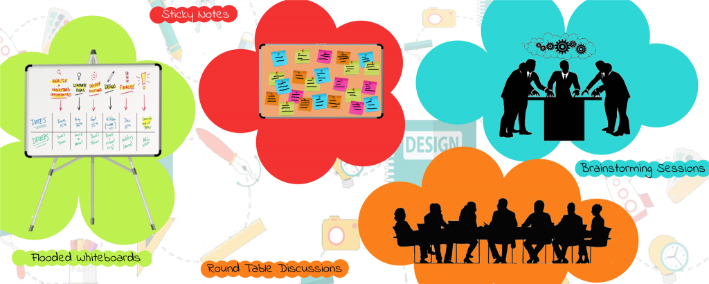
Design Team Collaboration in Commonly located Spaces

Remote working in regards to design projects is not a cakewalk as the value proposition depends on collaborative design sessions and team cooperation. Challenges like juggling through time zones, scheduling meetings, communication breakdowns, bad collaboration, etc., keep the designers on their toes.

Design projects are tricky. The bigger they get, the more complex it becomes to track activities and prompt the designers to get the tasks done. When it comes to remote collaboration, it doesn’t get any easier as designers can’t interact face-to-face. Given the illustrative nature of the designing, designers are supposed to work shoulder-to-shoulder and be able to draw, point, note, and gesture to get the work done.

At first, it seems like these tasks don’t fit well into a virtual teamwork setting. But that isn’t true. In the last few years, prevalent cloud technology has made remote collaboration smooth and sought-after by design agencies. So much so that it has redrawn the employee structure across companies.

How our Design Teams Collaborate Remotely

Our designers use cloud technology, multimedia, internet communication, and an array of cutting-edge technology tools. They partake in design sprints, brainstorming activities, face-to-face team interactions, and constant exchange of feedback and suggestions.

We use a structured and transparent communication setup that helps us navigate through the glitches of remote collaboration. Our communication spectrum goes from asynchronous and text-based communication to video conferencing. Our design leaders effectively discuss the action plan with the team, including what each unique team member is supposed to do, and by when. On the plus side, this helps foster a symbiotic practice and a sense of camaraderie among Galaxy’s design staff.

1) We count on the best collaboration tools:

Whether working remotely or in-person, sharing designs and gathering feedback are the most important facets of design validation and prototyping. In the process, the possibility of small details being overlooked and context being misunderstood remains. To avoid that, we employ Slack— a well-crafted collaboration platform that supports audio and video calls, all kinds of media file transfer, and integration with other tools. This makes our communication transparent, fast, and smooth.

Slack: Slack is our meeting room, notice board, water-cooler, call tree, and news broadcaster. It accommodates both team and one-on-one communications. It is a fun and all-inclusive alternative to monotonous email and messaging options.

2) A single, co-owned repository to tell us the work in progress:

Remote work setups are prone to confusion and miscommunication. Too many information repository tools only add up redundancy and confusion. We use Confluence to centralize all the technical documentation and progress of the projects in motion. For every step in design, an entry is illustrated with commentary, screenshots, and comments. This is to make sure everyone is on the same page, speaking the same language.

Confluence is a wiki for team collaboration. Team members can create, share and receive information about any ongoing project. As soon as any development takes place in the project, it is updated in the confluence knowledge base and becomes available to the team members.

3) We organize FREQUENT online meetings:

Remote teams don’t get in touch before a teething problem turns into a quandary. But design teams at Galaxy hold virtual team meetings thrice every week where we chew over design challenges, and fix them while they’re still manageable. Our intra-team meetings are complemented by impromptu pairing sessions where designers find themselves brainstorming with programmers, business developers, and documentation teams.

Zoom: For intra-team communication, we typically use a combination of video conferencing tools including Zoom. Conducting virtual meetings is fun with Zoom, which allows a participant count ranging from 7 to 70. From joining meetings midway and toggling between participants to sharing screens, Zoom accommodates it all.

4) Show, don’t tell:

Asynchronous and text-based communication (telling) becomes intricate in big projects. Showing, on the other hand, is more powerful than telling and visual inspiration goes a long way. Thus, we prefer using online whiteboards, sending screenshots and snapshots of plans, paper prototypes, sketches, personal notes, etc. When words fall short in conveying design nuances, screenshots and pictures do the job effortlessly.

InVision Freehand: Freehand, a feature of InVision, is a new, exciting, and creative way to collaborate in real-time. InVision Freehand features tools like Draw, Write, Sketch, and Comment as well as a lot of other functionalities. We use this tool for planning, feedback, and design presentation purposes. Freehand is a virtual whiteboard for us and any team member regardless of the location and can contribute to the ideation and other processes through this tool.

5) We keep a check on our competence as a team:

“When working remotely, there’s a concern about how the efficiency and productivity of remote teams can be measured.”

It’s a lot easier than measuring efficiency of co-located teams. Organizations having remote work culture are result-oriented by necessity. At Galaxy, we draw clear work goals and deadlines. There are indicators like— reached budget, extra work hours, timely delivery, adherence to the task backlog, client feedback, etc., to measure performance. We also calculate the efficiency by calculating the progress of teams/individuals in prioritized tasks in the given time frame.

Trello: In Trello’s own words — “It’s a collaboration tool that gives you a visual overview of what is being worked on, who is working on it, and how far they’ve gotten.”

Simply put, Trello is an online corkboard, allowing users to enlist tasks, projects, files, resources, and everything else needed for working together. It is designed for task-based communication, and we use it as task calendar, checking off completed tasks and scrutinizing what is in motion. We use Trello for Value Stream Mapping of all our projects and processes.

In conclusion, we would like to leave you with some tips:

  • In the context of remote working, what works for one organization might not work for others, so experiment with pilot efforts.
  • Like a co-located environment, have an organizational structure for remote teams.
  • In a remote team setup, there should be one key person who owns the project and is aware of all the progress. 
  • Keep up with with new communication software and technology features. Don’t try to use them all — pick and choose just a few that best suit your team.
  • Set goals and deadlines the same way you would have if the teams were co-located.
  • Giving your team the freedom to be innovative and experimental with their work will have a positive impact on your business.
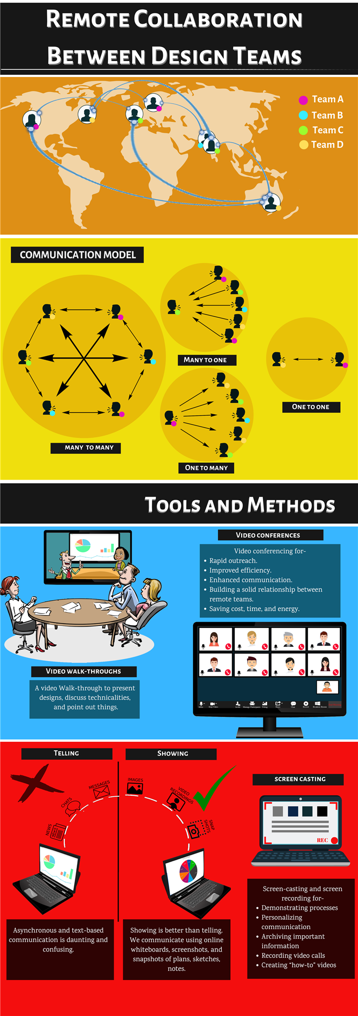
Remote Collaboration between Design Teams Infographic

Hamburger menu | To use or not to use

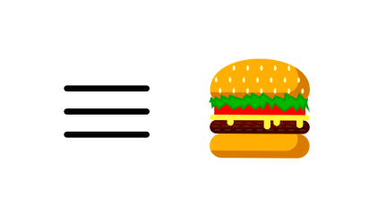
Even though it might seem like a contemporary design element but Hamburger menu is as old as our personal computers. It was designed by Norm Cox, design lead for the first ever graphical user interface made for Xerox Star.

Since then Hamburger icon has become synonymous with menu and a way to make the screens clutter free. Almost all of the internet recognizes it as the menu icon.

But as ubiquitous as the hamburger is, it is not going to stay that way. Here’s why

Makes feature discovery a task

Practically every designer has used hamburger menu as a goto navigation component. What a lot of people miss is the fact that it’s hidden and whatever is out of sight, is out of mind.

It’s proven that using hidden menu adds to the friction and user would rather skip than go through the difficulty of revealing and discovering hidden features.

Besides, people are more likely to use visible navigation than a hidden one.

Conflicts with system navigation

When smartphones sacrificed the capacitive and solid buttons for screen real estate, on-screen and gesture navigation had to make their way in the UI.

iOS apps have been struggling with hidden navigation long before no-buttons-all-screen went mainstream. Designer can only put so much in a navigation bar. It’s either menu or back button for navigation because none or both are a bad option for usability.

Non-glanceable

Adding a layer of difficulty just so that interface looks cleaner is bad for engagement and conversion. Visible menu such as tab bar lets the user see right away what’s what. It also makes notifications more contextual.

People find it easier to switch between tabs than discover hidden features via menus.

It’s just like choosing what to order when you’re hungry. What are you more likely to order, a dish for which you can see the ingredients for or a dish for which you can’t?

The former, of course, nobody likes to experiment on an empty stomach.

Now that the hamburger is out, what are your options

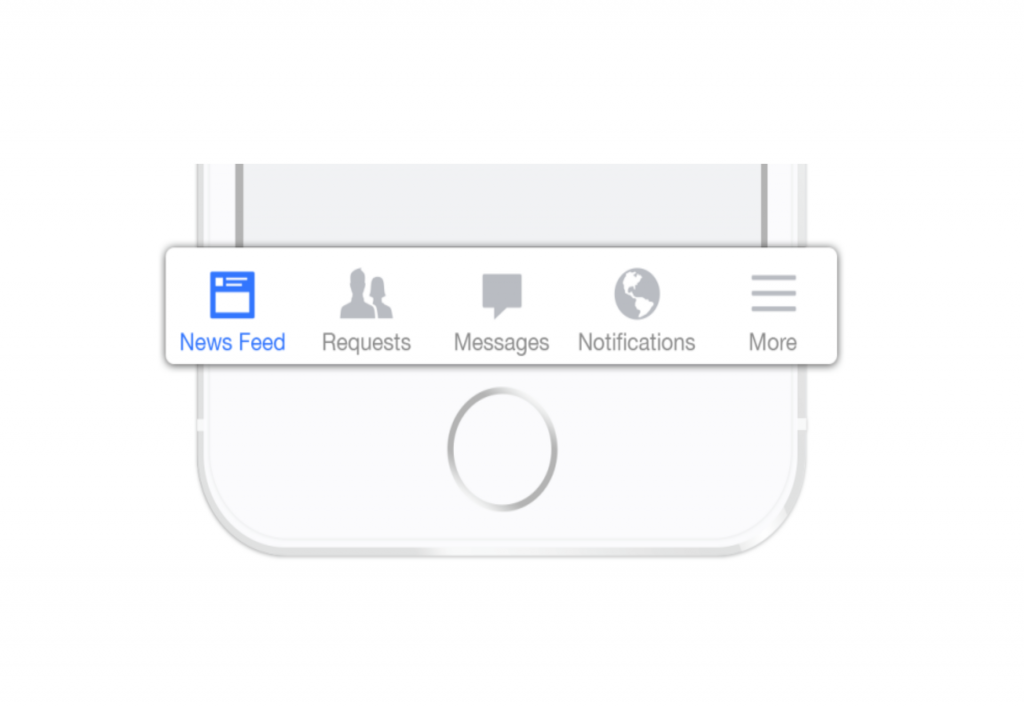
Tabbed navigation

This menu is prominently used in mobile phones. Smartphone screen sizes have increased substantially and single handed usage has become more difficult than ever. The hamburger which was easily approachable once with smaller sized screens is now even out of the stretch zone of the palm.

Tabbed navigation at the bottom brings the navigation down where everything is easily reachable within the reach of your thumb.

If you look at the Android UI Guidelines you will find that the Tab Bar is now a main navigation component. Which means that it’s more suitable for current and upcoming devices.

Progressively collapsing menu

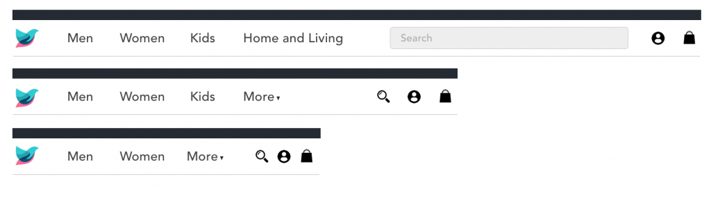
This is a progressive approach towards hamburger menu. But unlike hamburger, this navigation adapts to screen size without hiding the features.

This menu utilizes familiar iconography to collapse the navigation according to the screen size without losing much information.

Combination of tab and hamburger

Combination menu comes in handy in the scenarios where the design calls for more than 5 menu items. Phone screens are big but they can only be as wide as the grip of the palm. There is no way to accommodate the amount of items that a hidden menu can house.

A combination menu has four tabs and a hamburger to house more items.

Takeaway

Hamburger menu has its share of good and bad. A bad implementation doesn’t necessarily mean that the UI component is bad. There are apps where hamburger makes for an ideal choice and in other cases it causes friction in user experience.

It all boils down to what’s more suitable for your app or website. Any of the hamburger alternatives will work for you as long as it’s not hidden.

InVision Superman Versus Framer X Batman — Who’s Your Bet On?

If you’ve looked over these tools before, then you’ve probably wondered how they compare when facing off one with another. What’s InVision’s kryptonite? Why Framer X doesn’t play well with other superhero tools? And which is the best tool for web developers? Our article will help you make an informed decision regarding which platform is better suited for your web design team. We’ll walk you through the pros and cons of both platforms and tell you about each of their special features.

InVision Studio’s Strengths

Whether you and your team use Macs or PCs, InVision is available for both and allows for collaboration with a team in real time. Each collaborator has their own mouse, so you and your team can be working on the same project at the same time without worrying about only one person having control at one time. InVision Studio is incredibly teamwork friendly with their real-time version updates, permission management, and version control. You can also easily share components because their component library is built directly into the InVision Studio.

InVision’s Live Share interface even allows a VOIP chat and a free hand-drawing tool for making sketches within the program itself. It also syncs up to the rest of the InVision platform and can be created and managed on the cloud, making it all-encompassing. And, it’s easy to include team members from start to finish on any project.

They provide an indefinitely free trial, but it is limited to just one project, but that’s more than enough time to test out all of the platform’s capabilities.

  • Prototyping is seamless with InVision as you can drag and drop items from a comprehensive gesture list with instant playback and the ability to preview your work directly in Studio. It even simulates designs in a web-browsing experience for clearer UX previewing.
  • Integrated animations give you a frictionless experience. Not all pages and animations have to be static, right? These animation tools can help bring your pages to life for better UX.
  • Responsive design is music to every designer’s ears but add in an adaptive layout and it sounds so much better. InVision has advanced pinning and percentage geometry with responsive element flow, so it won’t matter whether your customers prefer desktops, tablets, or mobile devices when your designs look stunning on them all.

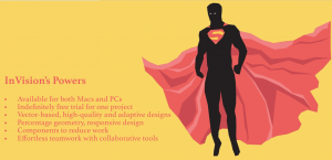
highlighting invision tool strength

InVision’s Superpower

InVision has an amazing public API with a library filled with UI and UX kits, icons, and apps, which will make your UX seamless.

InVision Studio’s Weaknesses

InVision’s kryptonite is that it’s on the pricier side, which may seem a little too high for simply being a hosting platform.

Since it’s a tool for building click-through prototypes and getting feedback on them, you cannot make designs in the platform itself, but rather have to make designs in another app and upload them.

Unlike Superman, InVision doesn’t always play well with other tools and that could be tedious. It does have all-in-one environment but because it doesn’t integrate with other tools, sometimes it can be an issue.

InVision’s Cons at a Glance

  •      Pricier for primarily being a hosting platform
  •      Designs have to be uploaded from an outside source
  •      No integration with outside tools

Framer X’s Strengths

If some of your team is newer to design or you have interns, then teaching them how to use complex design tools may not be very appealing. However, Framer X uses CoffeeScript for defining its animations so it has a low learning curve for newer designers and can even be used by non-programmers.

Framer X is already integrated with Framer Generation, so you’ll be able to import layers directly from Adobe Photoshop and/or Sketch. As you put your work together, you’ll be able to see an instant preview of the animation you’re currently making, giving you some real-time, visual feedback on your work. It also has drag and drop animations for data and rich media elements. It is all backed up by code so that you’re closer to development.

The SVG-based vector editing toolset that Framer provides has predictive snapping, curve bending, and angle locking to give your vector drawing a powerful edge.

You can prototype with high-fidelity flows on an infinite canvas with pop-up modals and slide-in overlay menus. You can also add horizontal and vertical scrolling in the same frame. It supports animation and interaction prototyping for multiple devices with 8 pre-installed devices from desktop, web apps and mobile platforms to choose from. You can create your own unique setup fairly quickly. Add that with their built-in, 60FPS transitions and you have a solid toolset.

It’s also easy to use. If you’re familiar with Sketch, then Framer X will be a breeze. They have Stacks, too, which allows you to easily create customizable lists and tables with automatic distribution and alignment.

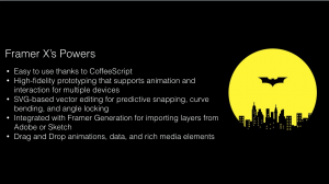
 framer x strength like that of batman

Framer X’s Superpowers

Like Batman, Framer X has a belt of gadgets for its superpowers. They have advanced features that include their Frame Tool for responsive layout, Stacks to help with grids and lists, and interactive Components. These components are also built into their codebase, React, which will make your prototypes feel real.

Framer X’s Weaknesses

It’s only compatible with Mac with no version for Windows or Linux. And since Framer uses CoffeeScript for UI app prototyping, it can be a problem for those who haven’t ever learned CoffeeScript before as they would have to learn a whole new programming language.

Collaboration is also weak for framer X as you can’t upload your prototype to the cloud or download it for offline use. You still have a share link, but once you close your project, that access closes off.

Framer X’s Cons at a Glance

  •      Mac only
  •      Learning curve if you don’t know CoffeeScript
  •      Weak collaboration/sharing tools

Conclusion

As you can see, there’s no true winner in a battle between Batman and Superman. But, we always have our favorites. Framer X will be a favorite of Mac users — similar to Batman, it doesn’t open up to just any other computer hero. And if you already know CoffeeScript, then Framer X will be a walk in the park for you.

On the other hand, InVision’s has advanced pinning and percentage geometry. Its responsive design is like Superman’s heat vision. Like Superman InVision is best for teams. And, just as Superman can power in with other members in Justice League, Invision can be used by both Mac and PC owners as it has really strong collaborator features.

Which do you prefer, Batman Framer X or Superman InVision? Vote in the comments and if you like this article, go take a look at our blog page for more content!

Digital Wellbeing in UX: Simplifying User Experiences

The average smartphone user interacts with their device over 2,600 times daily, profoundly influencing their mental health. This alarming statistic underscores the urgent need for digital wellbeing in UX design. For instance, a social media platform’s interface redesign to reduce addictive behaviors resulted in decreased user stress and improved public perception. Additionally, tools like Google’s Digital Wellbeing Dashboard highlight a shift towards more mindful tech use. This article explores the integration of digital wellbeing into UX design, underscoring the importance of creating human-centered, ethical, and emotionally intelligent digital products.

The Imperative of Digital Wellbeing in UX

Digital wellbeing in UX represents a shift from mere functionality to promoting healthier interactions between users and technology. As 65% of smartphone users manage their tech use through app or device settings, it’s clear that modern UX design must prioritize users’ mental and emotional states. Features like Google’s Dashboard, raising awareness of digital habits, have become essential in promoting healthier tech interactions.

Human-Centered UX Design: Enhancing User Satisfaction

Human-centered UX design now focuses on empathetic user interfaces. Incorporating elements that promote positivity, such as Spotify’s “Calm Down” feature, which creates personalized playlists and lowers notification volume after 10pm, demonstrates how UX can enhance user satisfaction. This approach is crucial in reducing technology-induced stress, affecting 72% of the population, and boosting daily engagement.

Ethical Design Practices

Ethical design practices are vital in today’s digital age, where 48% of adults experience disrupted sleep due to smartphone use before bed, according to a report by National Sleep Foundation, 2023. Ethical UX design, as exemplified by Apple’s Screen Time, prioritizes user wellbeing by encouraging healthy tech usage patterns and managing children’s digital habits.

Integrating Mindfulness and Mental Health into UX

Mindful UX strategies, essential for fostering digital wellbeing, involve designing interfaces that promote focus and mental well-being. For example, meditation apps introducing digital detox reminders have seen a 30% increase in user satisfaction. As rightfully highlighted by a Sensor Tower, 2024 Report, the rise of meditation and mindfulness apps, growing by 35% in downloads, indicates a growing demand for mindful UX strategies.

Emotional Design in UX

Emotional design in UX, aiming to evoke positive emotions, has shown a 40% improvement in user retention. YouTube’s “Take a Break” reminder, prompting users to pause after extended viewing, exemplifies how emotional design can encourage mindful engagement and prevent excessive screen time.

Addressing Diverse User Needs: Mental Health-Friendly Design

Designing for mental health involves understanding diverse user needs, such as offering customizable features like notification adjustments. Microsoft’s Focus Assist and apps like Forest and Headspace cater to mental health, demonstrating UX’s role in enhancing focus and learning in the digital age.

Balancing Technology and Wellbeing in the Workplace

In workplaces, where 63% of employees report burnout due to digital overload according to a report by Microsoft Work Trend Index (2024), balancing technology with wellbeing is essential. Moreover, As highlighted by Global Wellness Institute in a report, a user-centric design approach that fosters digital wellbeing can lead to a 13% increase in employee productivity.

Real-World Applications

Recent trends show that 78% of UX designers prioritize digital wellbeing, with users feeling more positive towards brands promoting it. Real-world examples like Google’s Digital Wellbeing Dashboard and Spotify’s “Calm Down” feature highlight this growing trend, showing significant increases in user trust and daily active users.

Partnering with Galaxy Weblinks for Digital Wellbeing

As the global digital wellbeing market is projected to reach $70 billion by 2027 (Statista, 2023), incorporating digital wellbeing into UX design is not just a trend but a responsibility. At Galaxy Weblinks, we focus on building digital products that support and enhance user wellbeing. By embracing a design philosophy that prioritizes user mental health, we ensure our products are not only innovative but also nurturing, contributing positively to the global narrative of digital wellbeing. Collaborate with us and create digital solutions that resonate with your users on a deeper, more human level.

Tool Alert: UI Faces: Easier Design Process IS Everything

Dear fellow designers, have you ever felt serendipitous? (yeah yeah I will monitor my Word Porn consumption). That is how I felt when I found UI Faces. The tiny little tool solves one of the most boring, if not major problems of the designing process. It’s an ode to all the hours that our brethren & sistren had lost while looking up for the right avatar of the UI Mockup. UI Faces is a simple aggregator of people avatars that you can use in your design mockups. It has got a whole collection of beautiful & diverse people who let you use their face in your design (faith in humanity, restored). You can save time & energy and keep your sanity to continue the rest of the design process. Every single picture on the tool is processed and tagged with age, gender, emotion, and hair color. You can easily filter for quick search and sort them by your requirements. No fuss and fume. Even my Scrum Master seemed impressed so you can take his word, if not mine. The users who have submitted their photos are aware that their pictures will be used. Also, as every picture on the website is reviewed personally by Alex, there are no copyright issues. Great guy tbh! You can use all the avatars either by the good ole’ copy-paste, API, and Sketch plugin. Easy peasy and quick! Also, this baby belongs to Mighty Alex, so go give him a shoutout!